Anthropogenic global warming how fossil fuels are thought to cause catastrophic
global warming By Dr J Floor Anthoni (2010)
www.seafriends.org.nz/issues/global/climate4.htm
(This chapter is best navigated in a normal window, and by opening
links in a new tab of your browser)
Humans have used the greater part of the biosphere
and burnt a lot of fossil fuel. It is feared that carbondioxide could cause
run-away warming, as could have happened to Earth's "sister planet" Venus.
Indeed a scary possibility, hence the establishment of the IPCC as independent
adviser of the situation. Unfortunately, their advice has not been independent
but highly political. In this chapter we'll dissect the science behind
the fears.
The IPCC is a suspect organisation, exposed by the Climategate scandal,
but apart from this, its reports and recommendations were not based on
scientific proof. This chapter explores its extraordinary claims.
The hockey stick graphs of both carbon dioxide and temperature have
enabled the IPCC to validate its computer models, and to make scary predictions.
But these graphs were made fraudulently.
The entire weight of the IPCC rests on its global circulation computer
models, even though these have severe limitations and only project what
is fed into them.
Introduction Humans have used over 60% of the productive land, excluding ice, desert
and rock, and used to extreme its resources like soil and water. It is
logical then to expect that this will have an effect on climate. The use
of fossil fuels has spurred the development of societies, with untold many
benefits, but now it is feared that it could change the world in a catastrophic
way.
Already before 1950, some scientists saw that our use of the atmosphere,
particularly through the release of carbondioxide, could also cause climatic
changes. CO2 is a very potent 'greenhouse' gas (GHG), as is methane. Both
could inhibit outgoing infrared radiation and thus affect the Earth's cooling.
A warmer Earth could lead to the melting of ice caps, the rising of oceans
and a whole lot of other disasters. In the worst case, it could create
'run-away global warming'.
These imminent catastrophes needed to be tackled in three ways:
extensive propaganda to warn people and politicians
more research for a better understanding
an international body to advise governments, the Inter-governmental Panel
on Climate Change (IPCC)
The decisive moment came with the Earth Summit in Rio de Janeiro
(1972) where influential activist Maurice Strong played an important role.
The IPCC was established in 1988 by the World Meteorological Organization
(WMO) and the United Nations Environment Programme (UNEP), two organisations
of the United Nations. In 1990 it produced its First Assessment Report
(FAR).
This was followed up in 1992 by the UN Conference on Environment
and Development in Rio de Janeiro with the Kyoto Protocol whereby nations
were lobbied to make a commitment to reduce carbon emissions. Already then
the organisers knew they were skating on thin ice, judging by their statements:
Maurice Strong: "We may get to the point where the only way of saving
the world will be for industrial civilization to collapse"
Richard Benedick US deputy assistant secretary of state: "A global warming
treaty must be implemented even if there is no scientific evidence to back
the greenhouse effect"
Timothy Wirth, US undersecretary of state: "We have got to ride the
global warming issue. Even if the theory of global warming is wrong, we
will be doing the right thing in terms of economic policy."
Sir David King, former science advisor of the British government: global
warming is a greater threat to humanity than terrorism
From here on it became a political battlefield, because it was clear that
reducing emissions was not going to be easy.
The FAR was followed up by the SAR (1995), the TAR (2001) and finally
AR4 (2007) (AR5 is expected in 2014). Finally some hard-hitting commitments
were to be agreed upon in the Copenhagen Summit (Dec 2009). But three things
happened just before: 1. a financial collapse had governments in its grip.
2. In September the Climategate [1] erupted over leaked e-mails from IPCC
leading authors, condemning the scientific process and the IPCC.
3. After almost a decade of climatic cooling, the Copenhagen Summit
experienced extreme cold weather after temperatures began to dip since
1998.
The Public and Politicians suddenly woke up to the biggest scientific
scandal of all times, which will change the IPCC and climate science forever.
Suddenly emissions reduction and emissions trading were no longer 'on the
agenda', and at the time of writing (2010), all IPCC recommendations are
on hold indefinitely. Finally some common sense is percolating through.
Even so, AR4 came up with some extraordinary claims:
Warming of the climate system is unequivocal,
as is now evident from observations of increases in global average air
and ocean temperatures, widespread melting of snow and ice and rising global
average sea level. {WGI 3.9, SPM}
Many natural systems, on all continents and in some oceans, are
being affected by regional climate changes. Observed changes in many
physical and biological systems are consistent with warming. As a result
of the uptake of anthropogenic CO2 since 1750, the acidity of the surface
ocean has increased. {WGI 5.4, WGII 1.3}
Global total annual anthropogenic GHG emissions, weighted by their
100-year GWPs, have grown by 70% between 1970 and 2004. As a result
of anthropogenic emissions, atmospheric concentrations of N2O now far exceed
pre-industrial values spanning many thousands of years, and those of CH4
and CO2 now far exceed the natural range over the last 650,000 years.
{WGI SPM; WGIII 1.3}
Most of the global average warming over the past 50 years is very likely
due to anthropogenic GHG increases and it is likely that there is a
discernible human-induced warming averaged over each continent (except
Antarctica). {WGI 9.4, SPM}
Anthropogenic warming over the last three decades has likely
had a discernible influence at the global scale on observed changes
in
many physical and biological systems. {WGII 1.4, SPM}
In order to investigate this further, we'll first explore the IPCC's Fourth
Assessment Report, then the hockey sticks of temperature and carbondioxide
and also the computer models on which it is based. Then we'll investigate
each of the extraordinary claims, only to discover that they are
not backed by extraordinary proof.
where extraordinary claims are made, extraordinary
proof is required also because mitigation requires extraordinary
effort and a debt on future generations.
Extraordinary claims are:
pre-industrial atmospheric CO2 was lower than today
atmospheric CO2 has steadily risen from its pre-industrial level to today's
level,
and is worrisome
Man's burning of fossil fuel is causing an increase in atmospheric CO2
level
atmospheric CO2 must have a long residence time (lifetime)
atmospheric temperatures are increasing and unprecedented
this is due to Man's burning of fossil fuel and other activities.
ocean levels are rising, due to fossil fuel burning.
Finally we'll investigate some conflicting findings.
Important points:
the IPCC and its scientific process are seriously
in limbo.
a massive scientific scandal has been exposed,
involving fraud, corruption of data, bullying, hiding data and procedures,
unwillingness to respond to Official Information Act requests, and much
more. [1]
forget the IPCC with its artificial 'projections'
and pay attention to real observations and read the Alternative Summary
for Policy Makers (SPM) [3] which raises many red flags.
America's Climate Choices The rot goes further. In May 2010, the National Resource Council of
the National Academy of Sciences published a report in three parts, America's
Climate Choices (http://americasclimatechoices.org/)
which could have been an imitation of AR4 (and peer-reviewed!). It is based
on the following 'science', signed by a panel
of contributing scientists:
"Science has made enormous progress toward understanding climate change.
As a result, there is a strong, credible body of evidence, based on multiple
lines of research, documenting that Earth is warming"
Thermometer measurements show that Earths average surface temperature
has risen substantially over the past century, and especially over
the last three decades.
These data are corroborated by a variety of independent observations showing
warming in other parts of the Earth system, including the oceans, the
lower atmosphere, and ice-covered regions.
Most of the recent warming can be attributed to fossil fuel burning
and other human activities that release carbon dioxide and other heat-
trapping greenhouse gases into the atmosphere.
Human activities have also resulted in an increase in small particles in
the atmosphere, which on average tend to have a cooling effect, but this
cooling is not strong enough to offset the warming associated with greenhouse
gas increases.
Changes in solar radiation and volcanic activity can also influence
climate, but observations show that they cannot explain the recent warming
trend.
Natural climate variability leads to year-to-year and decade-to-decade
fluctuations in temperature and other climate variables as well as significant
regional differences.
Human-caused climate changes and impacts will continue for many decades
and in some cases for many centuries. The magnitude of climate change
and the severity of its impacts will depend on the actions that human societies
take to respond to these risks
[sigh....More reports like these can be expected before common sense prevails
.... Science needs skeptics.]
[1] http://assassinationscience.com/climategate/
extensive Climategate analysis by John P. Costella. Important to
understand the magnitude of malfeasance.
[2] www.climatebasics.com
debunking the whole gamut of AGW.
[3] Alternative
Summary for Policy Makers by Joseph D'Aleo and Anthony Watts, January
2010. A damning critique of the temperature datasets held by NCDC and NASA
GISS, CRU, on which the IPCC bases its findings. The alternative SPM raises
many red flags. Read now.
[4] http://scienceandpublicpolicy.org/images/stories/papers/originals/surface_temp.pdf
- Joseph DAleo and Anthony Watts (2010): Surface temperature records:
policy-driven deception? (200 pages) "..so much fiddling and dishonesty
have been going on that it is impossible to say whether warming has occurred
at all". Surface temperature recordings are in a terrible mess. Important
read.
[5] Paulo N. Correa, Alexandra N. Correa (2008): Global
warming: an official pseudo-science. http://www.aetherometry.com/publications/direct/Global_Warming.pdf.
A scathing hard-hitting scientific critique by insiders, long before Climategate.
An important eye-opener and look behind the scenes, but read with care.
The IPCC
fourth assessment report (AR4) of 2007 The IPCC fourth assessment report, like its three predecessors, is
a massive volume of nearly 1000 pages, put together by a large number of
contributors from many nations. It is the result of many years of study
in trying to understand climate changes such that binding agreements for
mitigation can be entered into, costing some trillions of dollars. In this
chapter we'll have a critical look at this authoritative report.
The report consists of four parts:
Summary for policy makers: relies on all other information. It focuses
on 'projections' based on 'scenarios' of fossil fuel use.
Work group 1 (WG1): "The Physical Science Basis" . It focuses on
inputs and outputs of computer climate models. This is the supposedly scientific
basis for everything else in AR4.
Work group 2 (WG2): "Impacts, Adaptation and Vulnerability". It
is based on the findings of WG1, applied to the world we live in: climate
change, rising seas, problematic weather, and much more.
Work group 3 (WG3): "Mitigation of Climate Change". It is based
on the findings of WG1 and WG2.
Synthesis Report: is based on all of the above.
The report almost satisfies the definition of circular logic where
A explains B, B explains C; C explains A. In that respect, 980 pages out
of 1000 are irrelevant, all depending on pages 129-234 of WG1, which goes
awfully wrong right from the first page after the introduction: "How
do human activities contribute to climate change and how do they compare
with natural influences?". It gives high credence to the influences
of carbondioxide (increasing), methane (levelling off, irrelevant), nitrous
oxide (levelling, irrelevant), halocarbon gases (now controlled, irrelevant),
ozone (destroyed by halocarbons), aerosols (more of) and "Water vapour
is the most abundant and important greenhouse gas in the atmosphere. However,
human activities have only a small direct influence on the amount of atmospheric
water vapour". "Natural forcings arise due to solar changes and
explosive volcanic eruptions". And with these sentences, it dismisses
major atmospheric changes not due to humans, to the dustbin. Clunk ..
Then it defines the only influences on our climate system as 'radiative
forcings', 'a measure of how the energy balance of the Earth-atmosphere
system is influenced . . .' Thus the filtering effect of CO2
on a small part of the outgoing longwave radiation becomes identical to
an
increase in incoming short wave sunlight, expressed as a radiation
(energy, not a filter) in W/m2, or as a temperature increase for a doubling
in CO2 (300 to 600 ppm). One does not need computer models to predict what
will happen. But global circulation models can now predict where it will
happen and what will happen in the future. Here is their list of assumptions,
delicately tuned to give the desired results:
factor
radiative forcing W/m2
trend for CO2 doubling 300-600ppm
comment
CO2
CH4+N2O+halocarbons
ozone
water vapour
land use albedo
aerosols
cloud albedo
contrails
solar irradiance
Total
the main culprit causing
most warming
followed by CH4
+? traps incoming light
only, not infrared
totally ignored
Earth becomes brighter
clouds from aerosols brighten
clouds without vapour?
airplane condensation trails
the sun brightens somewhat
fits the graphs with great
uncertainty
See how totally dissimilar factors like filters, transporters and reflectors,
are all heaped together as if they were incoming sunlight (inputs= forcings=
energy). But various investigators disagree:
Miskolczi may be the only one who has it right, because
not only the radiation balance applies but also the thermal energy balance,
such that all greenhouse gases work together. If one increases, others
decrease and the universal greenhouse gas is water vapour, which rains
out if some other greenhouse gas takes its place. The total energy balance
(not radiative balance) remains the same. Earth's atmosphere is maintained
at a nearly saturated greenhouse effect, such that outward radiation
has no effect but clouds have [2]. Thus climate sensitivity to CO2 is negligible,
if CO2 had any effect at all. The same for any other greenhouse gas including
water vapour. Note that Miskolczi neglects heat conduction and convection.
Previous historical estimates for climate sensitivity: 5.5= Arrhenius
1896; 3.5= Plass 1956; 3.2= Phillips 1965; 3.0= Charney 1972; 1.2 =Hansen-Houghton
2001. - A downward trend also seen in successive IPCC reports.
CO2 can never become a source of energy
The
water vapor feedback fudge factor It is believed that due
to warming, the extra water vapour in the atmosphere may worsen the CO2
effect. Hence the invention of a feedback factor. To make it look
scientific, it is defined as
extra warming factor
= 1 / (1 - )
where = 0.5 to 0.8
in IPCC models leading to a two- to five-fold magnification of the effect
of CO2. In case = 1, the extra warming becomes infinite (division
by zero) and if =0, the extra warming factor becomes 1(no extra
effect).
It must be noted that this
formula does not have any basis in the science of feedback systems (cybernetics).
Nor does it have any basis in our understanding of climate. It is a fudge
factor.
The
fudge factor explained, by Gary Novak. http://climaterealists.com/index.php?id=5563 Fudge Factor: Heat increase
= 5.35 x ln( C / C0)
Temperature increase
= 0.75 x heat increase.
Where ln= natural
logarithm
because C increases exponentially
C = current CO2 concentration
C0 = some CO2 concentration
in the recent past
In simple language, the fudge
factor is nothing but a logarithmic curve (ln) for the increase
in CO2; and the only question is what would happen if the amount of CO2
in the atmosphere is doubled (C/C0 = 2). So the natural log
of 2 is used. Then to get the desired end result, the constant 5.35 is
multiplied times it. But this was published in 1988, when the desired result
was 3°C. Later, the 3°C became preposterous, and the desired temperature
change was reduced to 1.2°C. This would require the 5.35 to be reduced
to 2.31. Then recently, the temperature increase was said to be 1°C,
which would require the constant to be reduced to 1.92. But now, it is
reduced by 15% to supposedly account for overlap of the absorption curve
by water vapor. So the most recent rendition of the constant would be 2.26
minus 15% for water vapor. This number never shows up in print, because
it has no origins in physics, its just a fluid contrivance for getting
to the desired end point.
Determining where this
equation came from is no easy task. Steve McIntyre tried to trace down
the citations for it in the IPCC documents and failed. All of the references
led to no real explanation!
These
graphs show how the IPCC proceeded from its first to its fourth assessment
report. First assessments were more alarmist (green) than the third one
(blue), but these projected further in the future. From the projections
one can see that there is practically no difference between high and low
emissions scenarios. The yellow 'commitment' curve implies an almost close-down
of society. In the meantime temperatures have declined from a high in 1998
(in the graph labelled 'observed', black), stressing that there is something
seriously wrong with the IPCC projections. So where are the weaknesses
in the IPCC procedure? Acccording to their own words:
Key uncertainties as mentioned by the IPCC:
Climate data coverage remains limited in some regions and there
is a notable lack of geographic balance in data and literature on observed
changes in natural and managed systems, with marked scarcity in developing
countries. {WGI SPM; WGII 1.3, SPM}
Analysing and monitoring changes in extreme events, including drought,
tropical cyclones, extreme temperatures and the frequency and intensity
of precipitation, is more difficult than for climatic averages as longer
data time-series of higher spatial and temporal resolutions are required.
{WGI 3.8, SPM}
Effects of climate changes on human and some natural systems are difficult
to detect due to adaptation and non-climatic drivers. {WGII 1.3}
Difficulties remain in reliably simulating and attributing observed
temperature changes to natural or human causes at smaller than continental
scales. At these smaller scales, factors such as land-use change and
pollution also complicate the detection of anthropogenic warming influence
on physical and biological systems. {WGI 8.3, 9.4, SPM; WGII 1.4, SPM}
The magnitude of CO2 emissions from land-use change and CH4 emissions
from individual sources remain as key uncertainties. {WGI 2.3, 7.3,
7.4; WGIII 1.3, TS.14}
Read how Gavin Schmidt, a main actor within the IPCC, writing from the
staunchly pro-warming realclimate.org
explains the CO2
problem in 6 simple steps to understand the following points:
But what is really wrong, is totally ignored
and kept from the public:
atmospheric behaviour is falsely explained by
radiation and radiative forcings, based on a publication by Manabe
and Wetherald in 1967 [3,4]
all predictions are based on computer models,
and their limitations are not acknowledged (see computer
models below).
the models are circulation models (fluid dynamics)
and not atmospheric models.
failed model projections are not acknowledged:
the 1980-1990 models predicted 20th century warming 1.6-3.7 ºC; Actual
0.6ºC and now cooling by even more. Much of the warming is still due
to the urban heat island effect and corrupted data as well.
the whole edifice rests on a hockey stick curve
for CO2 and one for temperature, both fraudulently obtained (see
hockey
sticks below).
the CO2 hockey stick rests on a single ice core,
ignoring centuries of chemical CO2 measurements.
only anthropogenic causes are considered (fuel
gases, gases from living, gases from industry, land use), because "no
other explanations could be found", which is unscientific.
a positive feedback fudge factor is invented
to make CO2 seem worse than factual.
none of the radiative forcings have been proved.
They are just assumptions.
the external effects from outside the solar system
are ignored, even though these correlate well with measured facts.
the consequences of variations in solar radiation
and solar wind have been pooh-poohed.
they ignored warming seen on other planets of
our solar system and the moon.
the CO2 absorption by terrestrial plants has been
assumed to be constant, whereas plants grow faster in higher CO2 concentrations.
See Chapter5 Greening Planet
the effect of water vapour has been down-played,
"because
humans do not alter it".
the huge cost from the 'commitment' option is
underestimated.
the beneficial effect of mitigation is overestimated.
Computer
model projections show that full implementation of the Kyoto Protocol may
result in temperature reduction of an undetectable 0.06 Celsius by 2050
at a cost of about US$1,000,000,000,000 (one trillion). The 'full commitment'
option would cost that much every year.
no contingency is made for global cooling, its
effects and its mitigation, whereas cooling is much worse for society and
environment than warming, and is equally likely.
no mention is made of the beneficial effects of
CO2 and warming: better plant growth, more food, more area for agriculture,
less water required, less degradation of soils, less erosion. The IPCC
report is grossly unbalanced.
In summary, the IPCC has spread an unjustifiable scare for 'Catastrophic
Anthropogenic Global Warming (CAGW)'. Its Assessment Report is a fragile
house of cards resting on the flimsiest of evidence, backed by fraudulent
data and procedures. It has created a warming industry employing millions
of people (scientists, politicians, green activists, economists, engineers,
financiers, speculators and profiteers, and their support teams) for a
non-existent threat, while ignoring a real possibility of global cooling
and the benefits from CO2 and warmth. It has stolen from the poor an unimaginable
sum of money that could have been spent more wisely. And they have spread
a traumatic fear of the future among today's children.
The massive US government climate
change research gravy train alone totaled some $9 billion in grants during
2009. And the United Nations hands out over 1 trillion dollars for this.
Important points
the IPCC is an institution where politics comes
first, science second and truth last.
the IPCC reports are extremely biased and unbalanced.
Benefit from warmth and CO2 are not mentioned.
evidence for their claims is flimsy or non-existent.
their computer models are based on assumptions.
the assumptions are based on the false concept
of radiative forcings and 'feedback'. Earth's atmosphere does not work
this way. [4]
the science is far from settled. There are too
many scientific conflicts.
climate is always changing.
the magnitude of the climate is severely underestimated,
thinking that mitigation is possible.
the world is ill prepared for cooling.
The
sheer complexity of the climate system
The diagram above from Kellogg
(1982) and Smith (1985) shows some of the complexity of the climate system,
without even mentioning the influences of sunspots and cosmic radiation.
Neither does it show the influences of human activity. Practically none
of this complexity has been programmed into the IPCC circulation models,
and yet the world has now for over 20 years paid paramount importance to
their predictions.
Hockey sticks In
its First Assessment Report, the IPCC showed the bottom graph as the historical
record for the past thousand years (in Europe), but in its Third Assessment
Report (TAR 2001), the above Hockey Stick appeared, first published by
Mann, Bradley and Hughes in 1998 (MBH98). It showed more dramatic warming
in the last decade, hid the decline of the Little Ice Age and other periods
of cold, and the Medieval Warm Period that saw Europe flourish. It claimed
the 1990s as the warmest period in past 2 millennia. For a more detailed
graph of temperature changes in the past two millennia, and what happened,
click
globaltemp4000yr.gif.
For an excellent dissertation about the hockey stick
drama, read Bishop Hill (2008): Caspar and the Jesus paperhttp://bishophill.squarespace.com/blog/2008/8/11/caspar-and-the-jesus-paper.html
In
one diagram several hockey sticks are shown, as they changed somewhat over
time. The black curve is that published by Mann et al. 1998, with the wrong
statistical technique, leaving inconvenient data out (Briffa's divergence),
mixing tree ring data with instrumental data (the
stick was treemometer data, while the blade was from manipulated
thermometer data) and so on [1]. The blue curve is McKitrick &
McIntyre's correction for the same data, restoring the existence of the
Medieval Warm Period. Finally the green hockey stick appeared in the IPCC
AR4, spliced onto part of the instrumental record, leaving an inconvenient
bit off. The green dashed curve represents Briffa's 'divergence'
shown in many tree ring records, but conveniently left out by Mann et al.
Notice the many manipulations here, some cheating and also the vastly extended
vertical scale.
The IPCC argues that there was little natural climate change over the
last 1000 years, so that the temperature change of recent times (red curve)
is unusual and likely caused by human activities. A senior IPCC researcher
said in an email "We have to get rid of the Medieval Warm Period"
.
Christopher Monckton says "They did this by giving one technique,
measurement of tree-rings from bristlecone pines, 390 times more weighting
than other techniques but didn't disclose this. Tree-rings are wider in
warmer years, but pine tree rings are also wider when there's more carbon
dioxide in the air: it's plant food. This carbon dioxide fertilization
distorts the calculations. They said they had included 24 data sets going
back to 1400. Without saying so, they left out the set showing the medieval
warm period, tucking it into a folder marked "Censored Data". They used
a computer model to draw the graph from the data, but two Canadians [Ross
McKitrick and Stephen McIntyre] later found that the model almost always
drew hockey-sticks even if they fed in random, electronic "red noise" because
it used a faulty algorithm." The MBH 1998 report was never properly
peer reviewed before the IPCC used it in their publications."
McKitrick and McIntyre say in their paper "the dataset used to make
this construction contained collation errors, unjustified truncation or
extrapolation of source data, obsolete data, incorrect principal component
calculations, geographical mislocations and other serious defects. These
errors and defects substantially affect the temperature index. The major
finding is that the values in the early 15th century exceed any values
in the 20th century. The particular hockey stick shape derived in the
MBH98 proxy construction a temperature index that decreases slightly
between the early 15th century and early 20th century and then increases
dramatically up to 1980 is primarily an artefact of poor data handling,
obsolete data and incorrect calculation of principal components."
McIntyre and Ross McKitrick, showed that MBH98 was a sloppy, poorly
documented paper riddled with simple mistakes, unjustified assumptions,
collation errors and incorrect methodology. Data, for instance reported
to be from near Boston, Massachusetts actually came from Paris. Central
England Temperature data was truncated eliminating its coldest period.
Principal component analysis (PCA) had been done incorrectly. Drs Mann,
Bradley and Hughes published a terse reply on the Internet rejecting out
of hand the criticisms of MM03 and not admitting to a single error. Inappropriate
Bristlecone/Foxtail strip-bark proxies were used.
IPCC 2001 TAR on the hockey stick: New analyses of proxy data for
the Northern Hemisphere indicate that the increase in temperature in
the 20th century is likely to have been the largest of any century during
the past 1,000 years. It is also likely that, in the Northern Hemisphere,
the
1990s was the warmest decade and 1998 the warmest year
What really happened was the following:
there exists a true fear that global warming is
caused by increased levels of CO2, already since 1938, but proof eludes.
A catastrophic 'tipping point' is feared most of all. (Arrhenius, Callendar,
Revelle and popularised by Carl Sagan's books))
human emissions of CO2 look like a hockey stick,
thus the situation may get worse quickly. (exponential growth since
1900)
accurate measurements at several places (Mauna
Loa) show an unwavering increase from 1960 on. (The Keeling
curve)
if this is caused by human CO2, then there must
be a starting level before the industrial age, turning the Mauna Loa data
into a hockey stick, resembling the hockey stick of fossil fuel. ('begins'
at 280ppm)
this was found in the Siple and Law Dome ice cores,
even though they needed to be 'corrected'. The Siple Dome data also goes
back much further in time, past last ice age. (dissected in ocean
acidification)
now a temperature hockey stick was needed, and
MBH98 obliged fraudulently.
the Medieval Warm Period and the Little Ice Age
disappeared conveniently, giving the 1990s an "unprecedented highest
ever temperature". (the real past
looks different globaltemp4000yr.gif)
the correlation between human emissions, and the
temperature and CO2 hockey sticks was now perfect. (see correlation
below)
computer models could now confidently project
the future from any point in the past. (follow the hockey stick)
projections then became sufficiently scary (catastrophic)
to jolt the public into action. (hockey sticks are scary)
The fossil fuel
emissions hockey stick Our
use of fossil fuels has sky-rocketed since the beginning of the industrial
revolution which began in 1850 with the steam engine. There has been a
pause during the Great Depression and World War 2 after which it really
took off. The graphs show how coal has been replaced by oil, and later
oil by natural gas. Their combined carbondioxide has entered the atmosphere
but also left it to a surprising degree. Note that the CO2 from cement
production is rather small, but cement's absorption of CO2 over
time was omitted. Now extend the graph on its left to the year 1400, and
the black curve very much resembles a hockey stick.
Here is a table that characterises
each kind of fuel:
type of fuel
approximate combustion
formula
simple ratio C:O2:CO2
energy density MJ/kg
coal
oil
natural gas
dry biomatter/wood
cement from clay+limestone
average (weighted)
C + O2 => CO2
2CH2 + 3O2 => 2CO2 + 2H2O
CH4 + 2O2 => CO2 + 2H2O
CH2O + O2 => CO2 + H2O
.
.
CO2 and temperature We
know anthropogenic CO2 emissions quite precisely because the amounts of
coal, oil and gas exploited have been accounted for (blue curve). But when
it comes to CO2 concentrations in air, we only have the instrumental Keeling
curve from Mauna Loa, since 1960 (the fat right-hand part of the red
curve). Its leftmost part was derived from air bubbles in ice cores, and
is suspect. However, the two parts together make CO2 in air look as if
it was produced by anthropogenic CO2. The relationship between CO2 and
temperature, however, is not so clear, particularly when the downward trend
after 2000 is considered (truncated and not shown). Note how this temperature
curve does not look like the IPCC hockey stick.
There is something wrong with the above graph, which can't be seen because
it has been cut off. On the left it doesn't show that temperature comes
out of a deep dip, and on the right it won't show recent sharp cooling
since 1998.
Perfect correlation
between fossil fuel use and atmospheric CO2 increase Once
the CO2 hockey stick was created, it could be shown that there exists a
perfect relationship between cumulative carbondioxide emissions (from human
activity) and the amount 'added' to the air, as shown in this graph, spanning
about one century. There remains a small problem of course, that for 140
units of human emissions, only 80 remain in air (consistently 80/140 =
57% from 1960-2010). During this period of one century, nature has emitted
(link) about 60+60Gt from land
plus 100Gt from the sea, equals 220Gt per year, compared to about 700Gt
base line in air, or (220/700) x 330 = 100 ppmv per year. Thus in a century
100 x 100 = 10,000 ppmv during the same period as graphed here.
And of course, all that carbondioxide has disappeared. Only the human part
of 80ppmv remains, which is odd. There is something seriously wrong here.
(See
below for an explanation and
also Chapter5 with recent observations)
AR4 page 137 states: "A wide range of direct and indirect measurements
confirm that the atmosphere mixing ratio of CO2 has increased globally
by about 100ppm (36%) over the last 250 years from a range of 275 to 285
ppm in the pre-industrial era (AD 1000-1750) to 379ppm in 2005". Where
are these measurements apart from the Keeling curve? Surely not all from
ice cores?
Important points:
the temperature hockey stick is entirely fraudulent.
surface temperatures are in a terrible mess.
[2]
the CO2 hockey stick is based on questionable
ice core data for most of the past. (see below)
other CO2 measurements have been ignored or rejected.
CO2 in air increases at a steady 57% of human
emissions. [3] (strange)
Computer models The computer models used by the IPCC are mostly Global Circulation
Models (GCMs) based on the mathematics of fluid dynamics with added complexity.
So their main strength is in how temperature is spread around the globe
by the circulation of air, and more recently of ocean currents as well.
But they are severely deficient in dealing with the complexities of Earth's
climate, as this chapter will demonstrate.
Computer models have made great progress since the very first ones running
on IBM mainframe computers (1970s). Since then, computer crunching power
has increased dramatically and so has the complexity of climate models
[2]. The IPCC relies on about two dozen slightly different GCMs.
1970s
Very basic simulation of
a flat Earth with solar irradiation and an atmosphere with CO2 and water
circulation as rain.
1980s
The land surface is now
added and ice areas and clouds.
First Assessment Report
1990
A shallow 'swamp' ocean
is added with properties differing from those of the land. 500km squares.
2nd Assessment Report 1995
Volcanic activity, sulfates
from industry, melting ice and flat ocean circulation are added. 250km
squares.
3rd Assessment Report 2001
Aerosols are added and the
carbon cycle, as well as rivers which complete the water cycle. Also the
ocean now has an overturning circulation. 180km squares.
4th Assessment Report 2007
Some atmospheric chemistry
is added and interactive vegetation simulating land use. 110km squares.
IPCC AR4 proudly presents
this diagram showing all the factors taken into account in their GCMs but
most of these factors are entered as 'forcings' which are fixed parameters
equivalent to energy inputs, in other words, fudge factors.
The general criticisms of climate models are:
an incomplete understanding of the climate system: there are simply
too many unknowns and conceptual errors. Knowledge has not stood still.
an imperfect ability to transform our knowledge into accurate mathematical
equations: most effects are parameterised and 'tweaked' to reach
the desired effects. Most mathematical equations are simplified or linear.
the limited power of computers: even with 100km grids, present-day
supercomputers are not powerful enough.
the models' inability to reproduce important atmospheric phenomena:
the actual physics is left out which leaves the models open to runaway
fantasy, not limited by physical constraints.
inaccurate representations of the complex natural interconnections:
present models cannot connect population density to urban heat island effect;
land use change to a change in the hydrological cycle; and so on.
There are a number of inconvenient truths you should know about
GCMs:
They are not science because computer models, spreadsheets and computer
programs cannot be proved to be right (verified). They cannot be falsified
either, an important deviation from true science. GCMers circumvent
this problem by letting their models predict the past, while tweaking their
many assumptions, and then believing what they predict for the future must
be true. This is no proof and tweaking is not science either. GCMs
just follow the GIGO law of computing: Garbage In = Garbage Out.
If only a single assumption is wrong or a single factor has been left out,
the GCM and its prediction is simply WRONG, and the chance of a GCM being
RIGHT is infinitesimally small and wouldn't be recognised.
Imagine our planet the size of a billiard ball. Then the thickness of our
biosphere from the deepest ocean trench to the highest mountain and above
that, amounts to a smear of no more than a human hair in thickness. Within
this thin smear, everything happens from deep ocean circulation to surface
currents to surface weather to jet streams to troposphere and ozone holes.
Computer
models do not like the absurd difference between vertical and horizontal
dimensions (1000 times). So they work with all kinds of
assumptions
on how one layer affects the next. They are not EXACT. The computer power
to do better has not yet arrived. Present grid points are about 110km squares.
Compare this to a 10km troposphere and the models are still 30-50 times
too coarse.
GCMs treat the planet as a dead planet, but we know that
the planet reacts as if it were a living organism. We owe this to independent
scientist James Lovelock who concluded that Earth's atmosphere was so unlike
its sister planet ( Mars) because life had changed it. He also discovered
how Planet Earth as a living organism (GAIA), regulates its temperature.
GCMs leave out major drivers or 'connections'. The driver of global
warming is thought to be: more people -> more fossil fuel burning ->
more greenhouse gases -> global warming. But the GCMs concern themselves
only with the last step. However, the planet reacts:
more CO2 -> more
plant growth, thereby absorbing a very large part of human-made CO2.
Better still:
more CO2 -> more plankton -> more dimethylsulfide (DMS)
-> more clouds -> global cooling. Leaving this feedback effect out,
will simply give wrong results. One would expect that the global cooling
gas DMS has been studied extensively and monitored accurately since it
was first discovered, but not enough of this has happened, even though
NOAA is constructing a database of DMS concentrations for future use by
GCMs.
Changes in the water cycle: One of the largest drivers of climate
change has been ignored completely by GCMs: more people -> less forest
-> less water circulation -> less heat transfer -> major climate change.
It results in the centres of continents drying, deserts expanding, continental
glaciers shrinking, winds changing their paths, ice caps shrinking, and
ocean currents changing. This climate change began even before fossil fuel
use. What you need to understand is that heat transfer around the globe
is done mainly by water evaporating and condensating, and that all rain
and snow comes from the sea. If such a large driver is left out from GCMs,
how reliable can they be? What is the whole climate change debate worth
without it?
Changes in wind strength: We owe it to the late Joseph Fletcher
(Chapter7,must-read),
who asked "what is NORMAL climate change?"
and then discovered that wind speed was climate's most important driver,
but this is not included in circulation models.
Climate models are not predicting future
climate. They are predicting the current expectations of climate modelers
about future climate.
The application of models in climatology
appears to be used far more often to attempt to confirm a dogma rather
than to attempt to falsify a hypothesis. - Arthur Roersch, NL
But there are other serious defects in the GCMs:
they do not simulate atmospheric physics. Instead 'guestimated'
parameters are set. They do not simulate water vapour and cloud formation
behaviour with altitude; neither vertical heat transport.
they cannot handle a 'fluid' with variable density, as air is.
clouds cannot be parameterised correctly: clouds arise in response
to local conditions and little is known about it. Same for winds.
they are based on linear equations, not like the natural world which
experiences turbulence and chaos, and non-linear density, evaporation,
condensation and so on (see chapter2)
they cannot predict regular anomalies: seasons, volcanic eruptions,
El Niño, decadal cycles, sunspot variations, ice ages. Short-term
calibration of a long-term tool cannot unravel the long-period irregularities
in the climate system
forecasts are not separated from politics: they drive politics.
the various models are not independent: they are all alike, driven
by the same beliefs.
In 2007, Armstrong and Kesten C. Green of Monash University conducted a
forecasting audit of the IPCC Fourth Assessment Report (Green and Armstrong,
2007). The authors search of the contribution of Working Group I to the
IPCC found no references to the primary sources of information on
forecasting methods and the forecasting procedures that were described
[in sufficient detail to be evaluated] violated 72 principles. Many of
the violations were, by themselves, critical. David Henderson (Henderson, 2007), a former head of economics and statistics
at the Organization for Economic Cooperation and Development (OECD), said
the
IPCC process is directed by non-scientists who have policy objectives and
who believe that anthropogenic global warming is real and dangerous.
They conclude:
"The forecasts in the Report were
not the outcome of scientific procedures. In effect, they were the opinions
of scientists transformed by mathematics and obscured by complex writing.
Research on forecasting has shown that experts predictions are not useful
in situations involving uncertainty and complexity. We have been unable
to identify any scientific forecasts of global warming. Claims that the
Earth will get warmer have no more credence than saying that it will get
colder."
Mainstream climate scientists about GCMs and the IPCC:
Prof Freeman Dyson: "the models used to justify global warming alarmism
are full of fudge factors. They do a very poor job of describing the clouds,
the dust, the chemistry, and the biology of fields and farms and forests.
They do not begin to describe the real world that we live in"
Dr. Zbigniew Jaworowski: "the U.N. based its global-warming hypothesis
on arbitrary assumptions and these assumptions, it is now clear, are false."
Dr. Richard Lindzen: the IPCC is "trumpeting catastrophes that couldnt
happen even if the models were right."
Prof. Hendrik Tennekes: "there exists no sound theoretical framework
for climate predictability studies used for global warming forecasts".
Dr. Antonino Zichichi: "global warming models are incoherent and
invalid.
Prof Robert E Stevenson: "The science of climate has been buried alive
by an avalanche of ideology-based computer models"
Bill Gray Professor Emeritus, Colorado State University: The GCM simulations
are badly flawed in at least two fundamental ways:
1. Their upper tropospheric water vapor feedback loop is grossly wrong.
They assume that increases in atmospheric CO2 will cause large upper-tropospheric
water vapor increases which are very unrealistic. Most of their model warming
follows from these invalid water vapor assumptions. Their handlings of
rainfall processes are quite inadequate.
2. They lack an understanding and treatment of the fundamental role
of the deep ocean circulation (i.e. Meridional Overturning Circulation
MOC) and how the changing ocean circulation (driven by salinity variations)
can bring about wind, rainfall, and surface temperature changes independent
of radiation and greenhouse gas changes. These ocean processes are not
properly incorporated in their models. They assume the physics of global
warming is entirely a product of radiation changes and radiation feedback
processes. They neglect variations in global evaporation which is more
related to surface wind speed and ocean minus surface and air temperature
differences. These are major deficiencies.
Ferenc
M. Miskolczi: "..one would think that the strength of the greenhouse
effect (GHE) on Earth would be calculated based on atmospheric physics.
... That is, the computer models of the atmosphere would incorporate
the physics of how the greenhouse effect works, so that by inputting some
measured physical properties, the atmospheric gases, the models would determine
the strength of the greenhouse effect and the surface temperatures. Unfortunately,
this is not the case... Parameters are just set to obtain the observed
temperature. "
how many lies must one average to arrive
at the truth? - Floor Anthoni
Important points:
our knowledge about Earth's climate is still inadequate;
too inadequate to base computer models on.
our knowledge is changing rapidly.
computer models can never predict the future;
they are useful for studying the past.
computer models cannot be verified, nor proved
wrong. They are not scientific.
ignore the IPCC and pay attention to actual observations.
the whole IPCC report is a house of cards, based
on flimsy and concocted evidence.
Extraordinary proof Before the whole world considers spending extraordinary effort to remedy
and mitigate the catastrophic problem of CO2, extraordinary proof
is required first. Here we'll dissect the various extraordinary claims
of the IPCC.
Was pre-industrial CO2
lower than today? This
graph shows the most important measurements of CO2. The red curve is the
Keeling
curve of actual CO2 measurements at Mauna Loa, Hawaii. It is paralleled
by similar measurements elsewhere, all located by the ocean. Although CO2
concentrations there vary remarkably, a procedure is in place to record
minimum
values, considered 'the background level'. In recent years, this 'adjustment'
has been so perfect that natural variations are no longer visible [1].
Is this fraud? Preceding the
Keeling curve, are precise chemical
measurements done over a period of 150 years. They too show enormous noise
but also a consistent swing (the green curve). This would have been unacceptable
to the CAWG theory. Fortunately CO2 bubbles can be found in ice cores like
that from the Siple dome (brown). But it refuses to join up with the Keeling
curve. So it was shifted by 83 years, because the first 50 metres (4.5
bar) consist of loose firn rather than closed bubbles (is somewhat defensible).
The
corrected Siple curve spliced onto the Keeling curve gave the IPCC the
perfect IPCC hockey stick for carbondioxide.
The Siple curve is smooth because the ice core data is not a year by year
measurement for each depth. It is measurements of a range of layers, which
are not linearly connected. They then construct a CO2 average for each
year. This means that each year of data points is not a measurement; its
a calculation of disjointed averages. Hence any year-over-year specific
changes in CO2 (the detail and the variations) will be lost.
But many scientists disagree, as expressed by Prof
Jaworowsky: indeed CO2 gas dissolves readily in ice under pressure,
forming clathrates; drilling contaminates cores with drilling fluid
while forming cracks; as ice cores relax, dissolved CO2 gas from clathrates
expands and forms new bubbles; gas escapes from ice cores (likewise
for nitrogen and oxygen at different 'dissociation' pressures); average
pre-industrial CO2 concentration was around 330ppmv, not 260.[1] Another
fact is that CO2 is 70 times more soluble in water/ice than nitrogen and
30x more than oxygen.
In other words, CO2 disappears from bubbles in
ice over a period of up to a millennium, thereby falsely lowering the CO2
readings. It also diffuses through the ice, thereby effectively smoothing
natural variations. This is also borne out by CO2 levels in other warm
inter-glacial periods. Also archaeological studies of leaf remains show
that their breathing pores (stomata) did not adjust to lower CO2 levels.
Relative
CO2 concentrations can be inferred from sediment cores, some dating back
nearly one billion years ago. The graph here was produced by Budyko, already
back in 1977 and has been confirmed by many other
measurements, although small differences remain. It shows that CO2
in air has always been much higher than today at 2000-4000ppm. In the carboniferous
epoch land plants laid it down as coal, doing it again in the Permian.
During the Triassic and Jurassic epoch it allowed huge plants and animals
to prosper. In other words, carbondioxide is good. CO2 appears to be produced
by volcanism, which is now at a low.
Important points:
The Keeling curve does not measure average CO2
but minimum CO2.
the IPCC bases its claim on a single ice core(but
other ice cores also show lower concentrations).
there is no proof that the measured low CO2 is
indeed real and accurate.
conflicting evidence exists.
during the ice ages CO2 levels were indeed lower
but not as low as suggested by air bubbles in ice cores.
the world is still recovering from last ice age.
carbondioxide is enormously beneficial to life.
See chapter 5 Greening Planet.
volcanism appears to control CO2 levels in the
distant past; ocean temperature in the recent past and human emissions
somewhat in the present.
IPCC claims are wrong.
Is burning of fossil fuels
responsible for the rise in CO2? Many studies point to the fact that CO2 from fossil fuel is now found
in plants, ocean and atmosphere, where it didn't occur before the industrial
age (fact). So it is a new addition to the carbon budget
of the world. At the same time we see CO2 concentrations in air rising
steadily, creating a strong correlation between the two (see above). So
the overwhelming consensus is that anthropogenic CO2 is indeed the cause
of rising carbondioxide levels in the atmosphere, even though conflicts
remain and proof eludes.
Present thinking goes as follows:
anthropogenic CO2 => some goes into land + some goes into sea + some
remains in air for a long time
But could there be an other explanation?
The
Mauna Loa CO2 curve (Keeling curve) is sufficiently
known, but this graph shows detailed seasonal fluctuations of this curve,
and also from other stations. Going from north to south, the fluctuations
become less: Barrow Alaska (green), Mauna Loa Hawaii (blue), Samoa near
equator (purple), South Pole (red). From this, one can conclude that CO2
is mainly produced in the northern hemisphere (where most people live),
where it also disappears (because most land plants live there too). Note
that the rise in CO2 is always more gradual than its decrease, which dips
in the months 6-8 (June-August), the growing season in the north. It suggests
that the northern continents absorb most CO2, whereas the oceans (Mauna
Loa, Samoa) do very little. It also suggests that the residence time
of CO2 in air is no more than a few months rather than years, because
in 4 summer months nearly all of the increase of the whole year, is undone.
But isotope analysis suggests 5-14 years, most likely 5 years. The IPCC
says several centuries.
This
beautiful 'carpet' graph from NOAA shows the CO2 fluctuations by latitude
and year. It confirms again that most of the CO2 is produced and consumed
in the northern hemisphere and that atmospheric mixing (transfer from north
to south) does not appear significant within one year. High absorption
rates over the continent-rich northern hemisphere suggests that the oceans
are not the ones absorbing CO2.
CO2
is not entirely equally distributed over the globe as the map shows for
concentrations measured at 8000 metres height, at the top of the troposphere,
during the northern summer. Note that the scale is exaggerated, like that
of the carpet graph above. The variation is only around 15ppm on a maximum
of 380ppm. During the northern summer CO2 concentrations are lowest in
the northern hemisphere as shown before. Remarkably, the highest concentrations
are not found above industrialised areas but in the subtropics bordering
the desert zones. Lowest concentrations are found in the polar vortexes
(whirling winds), with a deep trough around Antarctica. It is remarkable
that for a gas which is heavier than air, its concentration changes little
from the surface to the top of the troposphere. Note that the colour scale
is deceptive, changing 3 colours for 5ppm at its high end and not changing
colour at its low end.
CO2
residence time paradoxes There
exists a paradox about the residence time of carbondioxide in air. This
diagram was taken from the place where the carbon pipe idea was explained
(acid2/pipe important reading!). CO2
is returned to air by animals who breathe it out after 'burning' some of
their food, but most of the food chain is decomposed by bacteria and fungi
who have a difficult job of stripping C,H and O from dead biomatter, returning
CO2 in the process. But in the sea most of it is done in several weeks
(residence time 1 month, say). We also discovered that plants and bacteria
team up in the process of symbiotic decomposition in order to speed
the process up and more importantly, to complete it. Thus the stream of
carbondioxide to roots is fast, but it never enters the atmosphere. Similarly
in the sea between plant plankton and its symbiotic decomposers.
Thus CO2 has very short and also long residence times.
There is a continual exchange
between sea and land, in the form of an imaginary carbon pipe. When an
ice age begins, the sea cools and absorbs CO2, which it steals from
the land. The land vegetation becomes poorer. In a warm interglacial, the
reverse happens and the land vegetation becomes richer. The circulation
in this carbon pipe can be quite fast, even though CO2 concentrations do
not change notably. But with higher concentrations, plants are more productive
and the flow through the pipe is faster.
The reason the IPCC scientists
estimate a CO2 residence time of centuries, comes from believing that the
increased concentration is entirely due to humans and that it is still
growing. Having 80 ppm left after say 50 years, with about 3ppm added each
year of which 2 ppm remains, means that should we stop burning fossil fuel
today, it will still take a couple of centuries before the air is back
at pre-industrial 290ppm at a rate of about -1ppm per year. The IPCC treats
human CO2 as a separate leaky bucket with a 0.5-1ppm/y hole in it. This
bucket is filled to 80ppm and its level is rising with 3ppm/y, and the
other bucket has no hole in it and is filled to 290ppm while staying steady.
So this is what they told their computer models, but could there be a better
explanation?
It is clear that land plants have an uncanny ability to remove CO2 from
air, and that this ability keeps up with additional amounts of CO2. However,
their rate of absorption can increase only if the background level of CO2
increases. In other words, rather than being a leaky reservoir with
a residence time, the atmosphere works more like a pipe with
a throughput depending on the CO2 concentration (pressure).
The higher the pressure, the higher the flow. We coined and explained this
idea in ocean acidification/carbon pipe (important
read). This idea is also supported by the fact that during ice ages carbon
flows from land to sea while during warm interglacials the opposite happens.
So we must be prepared to face the unthinkable, which also does away
with a number of other paradoxes:
expelled CO2 from oceans + human CO2 => more plant growth + residual
in air for faster plant growth
In other words, the rise in CO2 is only partly from humans, but it does
not matter because nature adjusts to more 'food'. The oceans have been
expelling CO2 ever since the warm interglacial began. Life as we know it,
and civilisation, would otherwise not have been possible. In the past century
we saw it rise by 0.6ºC with considerable fluctuations.
However, the experimental determination of 'missing oxygen' (see
further) insists that all residual CO2 in air is caused by humans and
that the sea absorbs nearly half of it, instead of expelling it, thus:
human CO2 => more plant growth + residual in air for faster growth
+ more absorbed by oceans
Prediction
and example Just to tie this new understanding
together, let's make a prediction (which is falsifiable = can be proved
wrong), by way of example. At the moment the sun has ended its most active
period that led to a rise in ocean temperature (+0.6ºC). Henry's law
says that about 3% gas exchanges per degree C (at present temperature).
If only half the ocean takes part (19,000GtC), 0.6 degree warming would
expel 360 GtC, or 360/700 x 330= 170ppmv. Human emissions 140 ppm. Thus
the sea is an important contributor.
The sun has entered a period
of low activity and the sea has begun cooling, but will do so more rapidly
than warming (2-3 times). Thus soon the sea will be absorbing an amount
equal to half of human emissions, leaving the other half for land plants.
The Keeling curve will flatten out and even reverse direction, fast, because
plants are bigger now and hungrier, trying to compete with the sea. Residual
CO2 will diminish as also suddenly IPCC's residence time for CO2 becomes
zero or even goes negative! Please note that these figures are rough
and an improvement is welcome.
Even if the sea absorbs rather
than expels CO2 now, this prediction may still come true, as the sea then
absorbs more due to cooling.
June 2011: indeed the Keeling
curve has begun flattening, and also the rise in sea levels.
Indeed
the ocean's heat content has been declining as measured by the reliable
ARGOS drifting autonomous depth buoys, operating since 1995 [1]. In blue
the raw Ocean Heat Content (OHC) anomaly (increase/decrease) and in red
the averaged ocean temperature. See also Chapter 3 measuring_temperature/ocean_temperature_measurement.
Note that a much longer period of observation is needed before conclusions
can be drawn. Note also that the surface temperature rather than heat content
determines whether the oceans absorb or release CO2, and wind speed is
also important.
there exists overwhelming (see missing
oxygen) consensus that human made CO2 is the cause of rising carbondioxide
levels.
but the science is not settled. There are too
many conflicts.
CO2 does not have a long residence time. Most
of it recycles very fast (weeks to one year) but some of it lingers in
air much longer (several years), called a residual.
CO2 has been measured accurately and reliably
only since 1960. But there are questions about the method.
short cycle times cannot be measured with radioactive
isotopes. see further.
during an ice age, carbon goes from land to sea
and during warm interglacials, from sea to land.
Are atmospheric temperatures
increasing and is this unprecedented? This
question should be easy to answer, but surprisingly, it is not. We've just
seen the drama of the hockey stick and in chapter3
about measuring temperatures we've stumbled over a number of insurmountable
problems. So let's go back to the end of last ice age. The temperatue then
may have been 20 degrees lower (in Greenland) but for the world more likely,
only 8-10 degrees (some say 2-4). In this graph also the hockey stick is
shown (in grey/red, top right), which immediately refutes that the 1990s
have been the warmest period, and that higher temperatures could be catastrophic.
In fact, the world has seen worse temperature swings in the past 5 million
years, shown in the graph below, and temperature has been above today's
(dotted line) for a long time. This immediately refutes that a rise in
temperature would be catastrophic. Note how sea levels first rose by 17mm/year
(melting of ice caps), but gradually flattened to 1-2mm/y, which means
that the sea is still warming and therefore expelling CO2. At some time
soon, this can be expected to end.
Climate swings have progressively become worse over 5 million years. The
last ice age is on left. Further back in time even warmer climates occurred.
The IPCC hockey stick would not be visible on this scale.
The
temperature record from land-based thermometers and ships' thermometers
is not perfect but it shows a large agreement between them. Both show a
steady rise from the beginning of the industrial age, but land temperatures
outrun sea temperatures as expected. Alas, land temperatures have been
fiddled with, so the downturn after 1998 is not visible. They also suffer
from urban heat, which makes the sea temperatures therefore more reliable.
Sea temperatures are more important anyway because of their large size
and very large mass. Superimposed on the upward trend is a slow 40-60-year
wave of unknown origin, but tracking solar strength, and a ten year cycle
is also visible, identified as the Pacific Decadal Oscillation. The sea
appears to have warmed by +0.4ºC and the land by some +1 degree.
Ocean heat content
and temperature This
graph of ocean heat content and surface temperature shows a slightly different
picture, although it is based on the same sources [4]. Interesting is how
all curves have a very similar trend, meaning that the temperatures of
ocean and Earth's surface, are closely linked. It is also interesting to
note that the ocean varies in temperature to a depth of 3000m, which means
that there is unexpectedly good mixing down to that depth, and that the
whole water column to 3000m depth may contribute to either outgassing of
CO2 or its absorption. It is strange, however, that rather large swings
in ocean heat content did not mirror itself in the two temperature records.
It is stranger still that the deepest part of the oceans (green curve)
experiences the largest swings (volcanic activity? or the effect of 'reconstruction'
with models by Levitus 2001?).
Meteorologist Joe D'Aleo: "... leading meteorological institutions
in the USA and around the world have so systematically tampered with instrumental
temperature data that it cannot be safely said that there has been any
significant net 'global warming' in the 20th century."
This
very interesting graph relates periods of warming and cooling over 4000
years to known historic events. (click for a larger
version) It is even uptodate to Nov 2009 after cooling began in 1998.
Study it to let the effect of temperature on civilisation, sink in. In
every warm period, civilisations flourished, only to languish or disappear
in successive cold periods when there was not enough food. The most recent
cold period was the Great Potato Famine (Dalton mimimum, 1845-1852) and
before that the Little Ice Age when the Thames froze over (Maunder minimum
1645-1715), which caused hunger, disease and mass emigrations to the USA.
Important points:
forget the land temperature data: both air and
land store very little heat. Look only at the ocean data.
oceans contribute to a depth of over 3000 metres.
Not so sure.
the recent history of instrumental temperature
is still questionable, particularly the land part.
it is not certain that recent temperatures have
been rising. Most of it is caused by urbanisation and fiddling or 'adjustments'
as they are called.
warming as claimed by the IPCC is not unprecedented.
1998 was not the warmest in this millennium.
warming by 2 degrees has happened before without
catastrophic effects.
warming is good; cooling is bad.
the IPCC claim is wrong.
Is warming caused by fossil
fuel burning? The whole panic about CO2 is based on the fear that increasing levels
of 'greenhouse gases' may cause runaway global warming as 'happened' on
our 'sister planet' Venus. But Venus is a strange
planet, producing more heat than it receives. Still, the IPCC bases
its computer models almost entirely on the assumption that CO2 causes warming.
Yet a vast amount of evidence proves that this cannot be the case.
All
ancient records, from ice cores to sediment cores, to corals to dripstones,
show that temperature changes preceded CO2 changes by 100-800 years. But
even the most recent records show this. Here are the fluctuations in temperature
and CO2 (from Mauna Loa) from 1958, also showing that temperature mainly
leads CO2. This overwhelming fact means that CO2 does not cause
temperature changes.
Leading or lagging? - phase diagram The diagram shows how one can conclusively plot whether a consistent
time lag exists between two signals. On left an imaginary plot of temperature
(red) leading CO2 (green) as the time scale runs from right to left. Both
are perfect oscillations with a 90 degree phase shift, such that when one
is plotted against the other (in an X-Y plot), a perfect circle is run
in the clockwise direction. So clockwise means the bottom axis (red) is
in the lead, and counterclockwise means the opposite.
Jeffrey
Glassman [2,3] has taken the detailed data from the Vostok core and plotted
each [temperature, CO2] pair on an X-Y plot, leaving them interconnected.
The result is a squiggle with a consistent clockwise rotation, proving
that temperature (bottom axis) is always in the lead.
He did something more amazing, by fitting the complement of solubility,
the part in air that is in equilibrium with water (green curve), which
gives an even better fit than a polynomial. This provides very strong
evidence that the outgassing of the sea is the main cause of CO2 in air
(it could also mean solubility in the ice of ice cores). What's more, this
curve fits better than a polynomial fit through all data points. The green
line shows a residual CO2 in air of about 100/15= 6ppmv/ºC,
as it cannot show how much CO2 flows from ocean to land and back. We'll
come back to this later. The outgassing-from-oceans relationship is also
supported by Endersbee, giving a straight line correlation (link).
Endersbee's line arrives at a residual of 150ppm/ºC over a
short period of 20 years.
Ole Humlum et al[1]. looked at the recent phase
relationship between CO2 and temperature, concluding that "changes
in CO2 always lagging changes in temperature".This means that
temperature changes cause CO2 changes and not the other way around.
[1] Humlum, O et al (2012): The phase relation between
atmospheric carbon dioxide and global temperature.Sciencedirect
link.
Important points
Venus is a young planet with a hot surface and
very dense atmosphere. It is not our "sister planet". There has never been
a runaway greenhouse effect. It radiates more heat than it receives.Chapter1.
wherever CO2 and temperature were measured, in
ice cores and sediment cores, corals and dripstones, and even in air, temperature
changes always preceded CO2 changes. This means that warming causes CO2
to rise, and not the other way around.
Glassman established a strong correlation between
ocean's outgassing and residual CO2.
Earth has been through periods with much higher
CO2 concentrations (up to 4000ppm) and this was only beneficial. Budyko.
there have been epochs with high CO2 concentrations
but low temperatures.
CO2 is such a potent greenhouse gas that its effect
is fully saturated. Chapter1.
there exists no experimental proof that CO2
causes warming.
the assumptions of the IPCC have no basis. Its
report is just a house of cards (very fragile).
Are sea levels rising?
Coming out of the last ice age, sea levels have indeed been rising at 17mm
per year for six millennia, but for nearly 1 millennium, sea levels rose
more slowly at 1-2mm/year. This graph shows that 2-3 centuries ago in the
Little Ice Age, the rise halted, only to continue at a steady 1.7mm/y since
1850, the industrial age. Very recent measurements with TOPEX and JASON
satellites, show that a rise of 3.2mm/y (righthand graph =the top of left-hand
graph) has flattened out and begun to decline.
Because
continents rise and sink while bobbing on the underlying 'liquid' mantle,
measuring sea levels was always a dodgy affair. Today with very precise
satellite altimetry, the level of the sea can be determined with such accuracy
that even anomalies can be observed. This world map shows where the highs
and lows are, but they cannot yet be explained. The two hemispheres also
behave differently. Normally one expects high barometric pressure to cause
a lower sea level.Note that data is missing for the polar areas because
Topex/Poseidon orbits SW to NE rather than S-N. See also Chapter
7.
The
sea level story is a bit more complicated as shown in the actual sea topography
with its hills and valleys. The balancing point is zero (yellow) on this
scale and what immediately strikes is the deep and large trough of up to
two metres deep around Antarctica, caused by very strong westerly winds
which due to Ekman spiral,
move water away from Antarctica towards the equator. The balancing bulge
(red) goes only to one metre high and is more widely distributed.
Thus depending on wind strength around the poles, more or less water is
pushed towards the western sides of ocean basins while water is borrowed
from the eastern sides of these basins and from the poles.
A
network of sea level measuring stations is scattered along many coasts
and oceans and maintained by the University of Hawaii. It so happens that
very few operate in the poles and many of these are not working. Thus the
majority of stations is located in the bulge of the seas. When it is reported
that 90% of stations see a sea level rise, this is true but does not mean
that the whole of the ocean is rising, as the sinking trough around the
poles is not adequately represented.
The
COADS database (NASA) [5] documents how wind speed has been changing by
up to 30% over one century and that it has in the past 40 years been climbing
again and very recently (since 2000) been dipping. Thus where sea levels
were previously rising, they will now begin to dip and vise versa where
they were dipping, will now rise and the whole network of stations will
dip [5].
Important points
sea levels rose by 70-100m in the 7 millennia
after last ice age at a rate of about 17mm/y
sea levels are not rising more than they always
did for recent 1 millennium (1-2mm/y)
it appears that seas have stopped rising for a
while, since 1998.
winds affect sea level considerably and with little
delay, and different for different places
the subpolar westerly winds are the strongest
on Earth and those around Antarctica of greatest influence
Arctic
ice Much ado has been made of the melting of polar ice caps but remember
that these always melt in summer, to recover in winter again. Scientists
and scare mongers mainly looked at sea ice extent, which, because it is
sandwiched between major habitats ( water and air), is not a reliable measure.
It would be better to look at sea ice thickness instead. But the spiral
diagram named "Arctic sea ice volume death spiral" (courtesy of Andy
Lee Robinson) shows considerable permanent loss of sea ice. The coloured
curves plot ice volume for each month, beginning in 1979 and ending in
2013, based on a computer model extending actual measurements. The volume
scale runs from 0 to 30,000km3(cubic km). Understandably, there is more
ice in the coldest winter months Jan-Apr. Seasonal loss of ice is nearly
half (50%) and monthly variation up to 10,000km3 (10-30%), most variation
occurs in the warm summer months Aug-Oct.. But notice the slight up-tick
in 2013.The simple graph underneath shows sea ice extent rather than volume,
agreeing with the spiral. But notice an apparent "standstill" since
2008, similar to the nineties.
Antarctic sea ice Contrary
to the Arctic, Antarctica enjoyed solid growth in recent years, consistent
with recent global cooling. Notice the large seasonal variation
and that the total area is very large (19.4 million km2).
Sea ice extent is a poor indicator of global temperature.
It is a sensitive boundary between major habitats:
water+ currents+ waves and air+wind+snow
It depends more on currents (+winds) and precipitation
(snow) rather than temperature.
Normal fluctuations are large.
The polar regions are not representative of global
climate (little moisture, excessively low temperatures,small area, dark
winter, high albedo).
There is a large difference between north and
south, still unexplained.
Although the Arctic shrank, Antarctica expanded
with an amount of ice dwarfing the northern sea ice.
The Arctic shrank fastest in the early 2000s but
no longer.
Both ice caps appear to be growing again.
[graphs from National Snow & Ice
Data Centre nsidc.org]
Conflicts In this subchapter we'll discuss a number of topics which do not directly
alter what was discussed before. It is a kind of rats-and-mice (various
items) section, but some of them are potential indicators of the human
cause.
The missing carbon-13 The
isotope carbon-13 was discussed in chapter3
with this diagram. Carbon-13 is a stable carbon isotope which occurs at
1.1% in the atmosphere, which calibrates to a 'delta' of -7 compared to
the C-13 standard. But fossil fuels mysteriously contain less, by as much
as -50 (-5%). Thus when fossil fuels are burnt, and their carbon mixes
into the biosphere, the atmosphere ends up containing less Carbon-13. Society
also makes cement from fossil carbonates, but these add (+1) to the atmosphere
(-7). However, for a first estimate we can ignore this.
The
diagram here shows that the air becomes indeed deficient in carbon-13.
Note that the black curve shows annual emissions, whereas the red
curve (Keeling 2005) shows what is missing from air and is thus cumulative.
Note also that the red C-13 scale is upside down. This trend has been measured
at many sites, all roughly agreeing with one another. Missing from the
red curve is seasonal variation [1] which is a steady 0.4 or the whole
size of the red curve! From 1980 to 2000 about 0.4 went missing compared
to a -7.8 baseline or about 5% of the available C-13. During that period
fossil fuel emissions amounted to about 120GtC with a deficiency in C-13
of -50. If all that carbon had remained in air, it would have contributed
to 120 / 700 x 50 = -8.6 loss rather than -0.4.
Another way of looking at it: 8 corresponds to 700GtC, and 0.4 or
35GtC 'missing'. To replace this by carbon which is 6 times more deficient
requires 1/6 of 5/6, or 7GtC of fossil fuel or one year's burning. Very
little indeed. But these calculations are rather coarse, and some fossil
carbon comes from coal which was laid down by plants, and which is thus
less 'deficient', making the 7GtC more.
The most important point to draw is that fossil fuel carbon has disappeared
almost completely, and this is no surprise because plants prefer 'classic'
carbon-12.
So what does it all mean?
fossil fuel emissions are happening and becoming
part of the biosphere. (big deal)
most of it is recycled into the biosphere.
As expected.
recycling is very fast, suggesting a short residence
time. (seasonal swing is as large as the loss in 20 years)
what remains in air is a small amount (5%
or 17ppmv over 20 years)
there must be another source of CO2 slightly depleted
in C-13. (ocean?)
Conversion tips To convert from GtC to ppmv,
divide by 2.13 or multiply by 0.471. Thus 700GtC = 329 ppmv.
To convert from ppmv to
GtC, multiply by 2.13.
12kg carbon is equivalent
to 44kg carbon dioxide
Each human being breathes
out app. 1kg CO2 daily ~ 100kg C annually; global population ~ 7 billion
= 0.7GtC/y
Thus CO2 from human respiration
is app. 1/10 total human emissions (not including methane etc from domestic
animals)
The sea emits 3.42% CO2
per degree C at 8.6ºC (Glassman). Total store is 38,000 GtC of which
600Gt recycles quickly
Photosynthesis CO2 + H2O
=> CH2O + O2 makes 10% more oxygen than CO2 used because the formula is
an approximation. Likewise, decomposition needs 10% more oxygen. Conversion
factor O2/CO2 = 1.1.
Combustion requires 45%
more oxygen than the CO2 it produces, due to H combustion. Conversion factor
O2/CO2 = 1.45. See fossil fuel properties
above.
The missing oxygen or anoxia In
AR4, the IPCC shows this graph with the Keeling curve from 1970
and the missing oxygen curve from Bender (2005) [1,2] (Bender curve?).
It clearly shows that the rising CO2 concentration was caused by the burning
of fossil fuel because this 'new' fuel required 'new' oxygen in order to
be burnt, and apparently in the same quantities. However, the graph was
intentionally misleading because the vertical scale for oxygen (magenta)
is very different from that of carbondioxide (black). In chemistry, volumes
of gases can be compared because a certain volume containing oxygen, has
the same number of molecules as the same volume of any other gas (pressure
and temperature must be the same of course). Thus numbers expressed in
ppm-by-volume or ppmv, can be compared chemically with one another. However,
the per meg unit needs to be divided by 4.8 to give ppmv oxygen
because oxygen is 20.95% in air, and (N2+O2)/O2=100/20.95=4.77.
There appears something conflicting here. Take the decade of the 1990s.
During that decade humans burnt 65GtC (+ 45% hydrogen [4]) or 30*1.45=
43ppmv oxygen. During that same period, about 200 per meg = 200
/ 4.8 = 41ppmv oxygen went missing, closely matching human burning, but
not the residual CO2 in air (17ppmv). Therefore:
Assume that the natural world is in balance, each year consuming and
producing oxygen and carbondioxide in equal quantities, then the residual
CO2 over a decade would be zero.
Now humans are disturbing this balance by burning fossil fuel and requiring
more oxygen than they return, resulting in a gradual increase in CO2 for
a corresponding loss in oxygen, about 41ppmv O2 per decade. One cannot
have lost oxygen without also having found CO2.
What we observe is that although we consumed the 41ppmv oxygen, there
is only 17ppmv of CO2 remaining, instead of the 30ppmv caused by fossil
fuel burning and 13ppmv CO2 went missing. Thus:
CO2 is missing for no equal amount of oxygen returned to air. This excludes
unaccounted sequestration like:
plants making more biomass because that returns oxygen.
plankton making more biomass because that returns oxygen.
the only conclusion remaining is that the sea absorbed it because the concentration
in air was supposedly higher than the average concentration in the sea
(pCO2aq).
but this has been going on for at least 60 years at a very steady rate.
as if the sea has either been cooling or remaining at a constant temperature
or still too cold to expel CO2.
Assume that we didn't know how much we have been burning (we really don't
know how much burning goes on), then the residual CO2 of 17ppmv demands
that it was obtained by burning the corresponding amount of 1.45x17= 25ppmv
O2.
However, we are missing 41ppmv oxygen. In other words, we are missing
a residual 16ppmv O2. Where could that have gone?
O2 is missing without a corresponding amount of CO2 returned:
excludes animals and bacteria because they would return CO2
excludes unaccounted burning for the same reason.
excludes fossil fuel burning for the same reason.
excludes dissolution in the sea because oxygen is 30 times less 'willing'
to dissolve than CO2.
but plankton can absorb oxygen while returning CO2 to the sea without it
leaving the sea. Because dead plankton sinks to the sea bottom, it takes
hydrocarbons (body mass) with it, made from both oxygen (animals) and CO2
(plants).This process is often referred to as "the carbon pump".
Its magnitude varies from place to place and is unknown.
oxidation of other compounds like iron to rust, rock, etc. Not likely significant.
oxidation of CO2 to CO3 by corals and the deep sea. Unknown.
This thinking leads to a dead end.
The bottom line is that the missing CO2 is most likely absorbed by the
sea. It is important to realise that if the sea was otherwise an expeller
of CO2, the small amount of human CO2 in air has effectively stopped it
from doing so. And in case the world begins to cool, the seas will absorb
more and more CO2, possibly even causing the rising Keeling curve to flatten
and descend. Time will tell.
Important points:
the experiment or a conversion factor could be
wrong. Not likely but we remain skeptic.
seas must be absorbing CO2 rather than expelling
it.
seas must be absorbing CO2 at a constant rate.
this must have been going on for at least 60 years.
the missing O2 suggests that humans are responsible
for the rising residual CO2 level in air.
if residual CO2 doubled to 800ppm, oxygen
would diminish by -1200ppm from 20.95 to 20.83% which is unnoticeable.
when seas cool further, the residual CO2
is bound to diminish.
there exists little uncertainty about all this.
This chapter was changed according to suggestions from Ferdinand
Engelbeen, July 2011.
[1] Bender, Michael L et al. (2005) Atmospheric O2/N2
changes, 1993-2002: implications for the partitioning of fossil fuel sequestration.
Global Biochem Cycles 19, GB4017, 2005
[2] Battle M et al. (2000): Global carbon sinks and
their variability inferred from atmospheric and d-13C. Science, 287,
2467-2470.
[3] the per meg delta value is not exactly the
same as ppmv as it is based on the ratio of oxygen to nitrogen (21/78)=27%
whereas oxygen ppmv is 210,000 (21%). The delta is calculated as in delta-O-13:
deltaO2/N2 = ((O2/N2sample - O2/N2standard) / O2/N2standard) x 1E6, (in
moles) which is 30% higher than delta expressed as ppmv. Bender quotes
a conversion factor of 4.8 from ppmv to per meg delta(O2/N2), which
is close enough.
[4] for O2:CO2 ratios of fossil fuel burning see table
at the beginning of this chapter.
The dilution of
radioactive carbon-14, Seuss effect Because
fossil fuel has been underground for a very long time (millions of years),
its radioactive carbon component with a half-life of about 5000 years,
has been extinguished. Thus CO2 from fossil fuel has no radioactive carbon
left, which causes it to dilute the radioactive carbon in air and biosphere.
This is also called the Seuss effect. (Hans Eduard Suess 1909-1993
was an Austrian physical chemist and nuclear physicist). During a short
period of 7 years, the dilution of the radioactive isotope carbon-14 was
measured at the north (Pt Barrow) and south poles [1], resulting in two
straight trends with opposite seasonal fluctuations. Carbon-14 decline
was measured in carbondioxide, so it gives us another idea of how much
fossil carbon dioxide remains in air. The graph shows a 100 (10%) decline
in one decade.
Carbon-14 occurs at the low concentration of 1 part per trillion (0.0000000001%)
of the carbon in the atmosphere (0.001ppm), but this is irrelevant. If
its concentration became 10% less, this corresponds to a dilution from
fossil fuel of 700 / 10 = 70Gt or 70 / 2.13 = 33ppmv in one decade, which
is 55% if emissions during that decade were about 60ppmv.
This agrees with previously
calculated cumulative fossil fuel used and remainder left in air (57%),
supporting the idea that the increase in CO2 is caused by human emissions.
However, the following processes also play a role:
radioactive carbon is made constantly by neutron bombardment of nitrogen
N2, at an altitude of 8-15km. It also reacts with oxygen to form radioactive
CO2, which is easily washed out of the atmosphere by water. It then takes
part in the carbon cycle.
the production of C-14 depends mainly on solar activity and cosmic radiation.
it also depends on volcanic and seismic activity (CO2 from volcanoes has
no C-14).
the C-14 measurements are compared to a standard oxalic acid from 1955.
thus radiation changes since 1955 and in the period 1984-1992 must also
be taken into account.
plants prefer classic CO2 over the 'heavier' radioactive CO2.
classic CO2 'evaporates' more readily than radioactive CO2. Thus the oceans
exhale low-C-14 carbondioxide, almost indistinguishable from fossil fuel
CO2.
Important points:
the dilution of carbon-14 agrees strongly with
the idea that the rise in CO2 concentration in air is proportional to human
emissions, suggesting that it is caused by human emissions.
the origin of the diluting CO2 cannot be ascertained
because the ocean's outgassing is also poor in radioactive carbon.
for inexplicable reasons the measurements were
discontinued and the Suess effect is no longer current with global warming
advocates.
[1] Meyer H A J et al. () High Accuracy 14C Measurements
for Atmospheric CO2 Samples from the South Pole and Point Barrow, Alaska
by Accelerator Mass Spectrometry http://cdiac.ornl.gov/trends/co2/meijer/Meijer_14C.html
[2] Thomas Higham: Measuring,
calculating age and reporting radioactive carbon. http://www.c14dating.com/agecalc.html
Other greenhouse gases The
caption to these five graphs from IPCC AR4 reads: "Global trends in major
long-lived greenhouse gases through the year 2002. These five gases account
for about 97% of the direct climate forcing by long-lived greenhouse gas
increases since 1750. The remaining 3% is contributed by an assortment
of 10 minor halogen gases, mainly HCFC-22, CFC113 and CCl4."
As has been shown before, both carbondioxide and methane trap infrared
radiation so eagerly that their effects saturate at a mere few metres in
air, thus becoming part of convection with no distinction from oxygen and
nitrogen. Note that methane emissions have been levelling off, and it is
not known why. Fugitive releases escape during the production of gas, shale
gas and coal, and surprisingly, coal has least of these [2].
Methane Methane is natural gas CH4 which burns cleanly to carbon dioxide and
water. Methane is eagerly sought after as fuel for electric power plants
because of its ease of transport and because it produces the least carbondioxide
for the most power. Also cars can be powered with compressed natural gas
(CNG) for short distances. In many countries CNG has been widely distributed
as the main home heating fuel. As a consequence, methane has leaked to
the atmosphere in large quantities, now firmly controlled. Grazing animals
also produce methane in their complicated stomachs and methane escapes
from rice padies and peat bogs like the Siberian permafrost.
It is thought that methane is a very potent greenhouse gas because it absorbs
some infrared wavelengths 7 times more effectively than CO2, molecule for
molecule, and by weight even 20 times. As we have seen previously, this
also means that within a distance of metres, its effect has saturated,
and further transmission of heat occurs by convection and conduction rather
than by radiation.
Even if the IPCC radiative greenhouse theory were true, methane occurs
only in minute quantities in air, 1.8ppm versus CO2 of 390ppm. By weight,
CH4 is only 5.24Gt versus CO2 3140Gt (on this assumption). If it truly
were twenty times more potent, it would amount to an equivalent of 105Gt
CO2 or one thirtieth that of CO2. A doubling in methane would thus have
no noticeable effect on world temperature. However, the factor of 20 is
entirely misleading because absorption is proportional to the number of
molecules (=volume), so the factor of 7 (7.3) is correct and 20 is wrong.
With this in mind, the perceived threat from methane becomes even less.
Further still, methane has been rising from 1.6ppm to 1.8ppm in 30 years
(1980-2010), assuming that it has not stopped rising, this amounts to a
doubling in 2-3 centuries. In other words, methane can never have any measurable
effect on temperature, even if the IPCC radiative cooling theory were right.
Because only a small fraction in the rise of methane in air can be attributed
to farm animals, it is ludicrous to worry about this aspect or to try to
farm with smaller emissions of methane, or to tax it or to trade credits.
The fact that methane in air has been levelling off in the past two
decades, even though we do not know why, implies that it plays absolutely
no role as a greenhouse gas.
Important points:
methane occurs in very small concentrations compared
to CO2, 600 times less.
the IPCC radiative warming factor of methane is
7 rather than the oft quoted 20.
methane concentrations have stopped growing.
even if methane concentrations kept growing, its
effect would still remain unnoticeable.
as shown in climate1,
perceived greenhouse gases cannot have any effect.
(methane, CO2 and water vapour)
it is ludicrous to worry about methane.
[1] Flood, Wilson (2011): The methane misconceptions.
Energy&environment 22-3. Free
PDF.
[2] Clemente, Frank (2011): A Test of Prudence Favors
Coal -- Part Two. link.
tropical cyclones, typhoons and hurricanes The CAGW fear mongers regurgitate ad-nauseam that global warming causes
more and more violent storms, because such storms thrive on atmospheric
moisture and temperature. But facts show otherwise and it is not known
why.
After the disastrous typhoon Haiyan hitting the Phillipines in
Nov 2013, the above graph was published, showing that typhoon activity
decreased in the recent 50 years. Reports mention a 5m tall storm surge
(see oceanography/storms) arriving
like a tsunami (see oceanography/special_waves).
One must not forget that storm damage is also related to other
factors like:
population: there are not only more people on Earth, with their
infrastructures of villages and cities, but more and more people are forced
to inhabit risky low areas close to the coast. Others do so by choice.
welfare: A long period of prosperity after World War Two allowed
people to amass more, and more valuable belongings.
chance: Major storms happen by chance and they generate other chance
effects like storm surges andtrapped
waves. Wind strength is also very erratic.
rain: Hurricanes bring three kinds of damage: winds+waves+rains.
When a typhoon decreases strength over land where no moisture is added,
it loses its moisture as heavy rainfall, causing flooding
with
its related damage. Occasionally flash floods
occur, when a typhoon chases its own river flow down-stream.
periods of calm: long periods of calm can trick people and
catch them unprepared. Building codes may become lax. In coastal areas
with hardly any tides, the coast was never shaped to resist waves and tides,
such that an occasional tsunami can run far inland, destroying vast low-lying
coastal areas.The map below shows where large and small tides occur, the
Philippines and Japan both vulnerable. It is unlikely that tsunamis and
storm surges can cause much damage in the red-coloured coasts, unless miraculously
occurring on a spring high tide which was the case in the Netherlands,
1953.
IPCC pronunciations Finally we'll review a number of oft-repeated pronunciations and claims
made by the IPCC and by extension, also by those who firmly believe in
the IPCC's findings (our comments in blue):
"The mitigation measures suggested for climate change (reduced use of
carbon-based fuels, more renewable energy sources, carbon capture and storage,
less use of nitrogen-based fertilizers) are all part of a portfolio of
approaches that are needed to produce a more sustainable world." This
statement reveals the true political motivation in the IPCC. The global
warming scare is intended to jolt the world into action for a more sustainable
world using less carbon-based fuels and other things. A noble goal achieved
through lies, but more to the point: 1) renewable energy sources like wind
mills, have proved to produce more rather than less CO2; 2) carbon capture
and storage are technological nightmares that do not deliver on energy
efficiency; 3) less use of nitrogen-based fertilisers is possible by having
more carbondioxide in air.
"It is simple physics that these extra gas concentrations will trap
an increased amount of outgoing solar radiation reflected off the Earths
surface, of the order of 1.5 watts per square metre of the Earths surface."
The
physics is far from simple as explained in the preceding chapters. The
1.5 W/m2 heat retention by greenhouse gases is purely a guess, unsubstantiated
by fact or by observation. The truth is that so-called greenhouse gases
can not, have not and will not have any measurable effect on temperature
- ever.
"It is also clear that the oceans absorb about 85% of the excess heat
resulting from this radiative forcing by greenhouse gases (as well as about
40% of the carbon dioxide). Detailed measurements of the changes in oceanic
heat content, and the temperature rise that accompanies this, agree quantitatively
with the predicted radiative forcing." Oceans do
NOT absorb heat from the air, but warm up due to solar irradiation (by
day) that can reach 100m deep. Whether oceans exhale or inhale CO2 is uncertain.
Radiative forcing is a failed concept and the models based on it are equally
unscientific.
"The amount of extra carbon accumulated in the ocean and the atmosphere
matches the known quantity emitted by the combustion of fossil fuels."
They
don't. Huge discrepancies and paradoxes remain.
"It is a plain fact that human activities have significantly increased
the concentrations of greenhouse active gases in the atmosphere, particularly
since the mid-20th century." Incorrect. It is true
that humans have added greenhouse gases to the atmosphere, but most of
this has been absorbed by plant life. There has been a rise in atmospheric
carbondioxide since 1960 but where it came from, is unknown. There is no
solid proof that the oceans absorbed the excess carbon. There is no proof
whether oceans are outgassing or absorbing CO2. During this time the sun
has been active, but since 2000 is entering a state of reduced activity.
The great climate science centres
around the world are more than well aware how weak their science is. If
you talk to them privately theyre scared stiff of the fact that they dont
really know what the clouds and the aerosols are doing We do need skepticism
about the predictions about what will happen to the climate in 50 years,
or whatever. Its almost naive, scientifically speaking, to think we can
give relatively accurate predictions for future climate. There are so many
unknowns that its wrong to do it. - James Lovelock
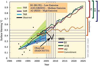 These
graphs show how the IPCC proceeded from its first to its fourth assessment
report. First assessments were more alarmist (green) than the third one
(blue), but these projected further in the future. From the projections
one can see that there is practically no difference between high and low
emissions scenarios. The yellow 'commitment' curve implies an almost close-down
of society. In the meantime temperatures have declined from a high in 1998
(in the graph labelled 'observed', black), stressing that there is something
seriously wrong with the IPCC projections. So where are the weaknesses
in the IPCC procedure? Acccording to their own words:
These
graphs show how the IPCC proceeded from its first to its fourth assessment
report. First assessments were more alarmist (green) than the third one
(blue), but these projected further in the future. From the projections
one can see that there is practically no difference between high and low
emissions scenarios. The yellow 'commitment' curve implies an almost close-down
of society. In the meantime temperatures have declined from a high in 1998
(in the graph labelled 'observed', black), stressing that there is something
seriously wrong with the IPCC projections. So where are the weaknesses
in the IPCC procedure? Acccording to their own words: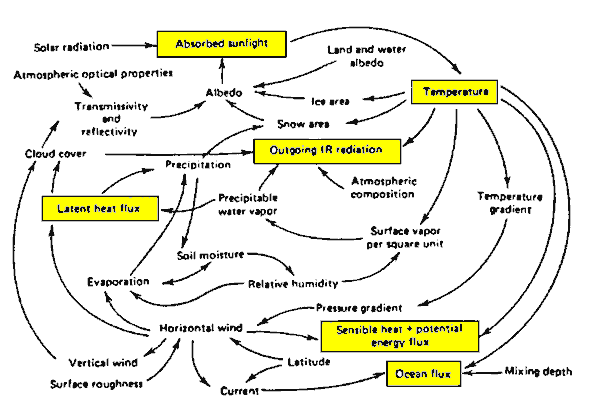
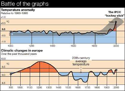 In
its First Assessment Report, the IPCC showed the bottom graph as the historical
record for the past thousand years (in Europe), but in its Third Assessment
Report (TAR 2001), the above Hockey Stick appeared, first published by
Mann, Bradley and Hughes in 1998 (MBH98). It showed more dramatic warming
in the last decade, hid the decline of the Little Ice Age and other periods
of cold, and the Medieval Warm Period that saw Europe flourish. It claimed
the 1990s as the warmest period in past 2 millennia. For a more detailed
graph of temperature changes in the past two millennia, and what happened,
click
In
its First Assessment Report, the IPCC showed the bottom graph as the historical
record for the past thousand years (in Europe), but in its Third Assessment
Report (TAR 2001), the above Hockey Stick appeared, first published by
Mann, Bradley and Hughes in 1998 (MBH98). It showed more dramatic warming
in the last decade, hid the decline of the Little Ice Age and other periods
of cold, and the Medieval Warm Period that saw Europe flourish. It claimed
the 1990s as the warmest period in past 2 millennia. For a more detailed
graph of temperature changes in the past two millennia, and what happened,
click
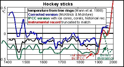 In
one diagram several hockey sticks are shown, as they changed somewhat over
time. The black curve is that published by Mann et al. 1998, with the wrong
statistical technique, leaving inconvenient data out (Briffa's divergence),
mixing tree ring data with instrumental data (the
stick was treemometer data, while the blade was from manipulated
thermometer data) and so on [1]. The blue curve is McKitrick &
McIntyre's correction for the same data, restoring the existence of the
Medieval Warm Period. Finally the green hockey stick appeared in the IPCC
AR4, spliced onto part of the instrumental record, leaving an inconvenient
bit off. The green dashed curve represents Briffa's 'divergence'
shown in many tree ring records, but conveniently left out by Mann et al.
Notice the many manipulations here, some cheating and also the vastly extended
vertical scale.
In
one diagram several hockey sticks are shown, as they changed somewhat over
time. The black curve is that published by Mann et al. 1998, with the wrong
statistical technique, leaving inconvenient data out (Briffa's divergence),
mixing tree ring data with instrumental data (the
stick was treemometer data, while the blade was from manipulated
thermometer data) and so on [1]. The blue curve is McKitrick &
McIntyre's correction for the same data, restoring the existence of the
Medieval Warm Period. Finally the green hockey stick appeared in the IPCC
AR4, spliced onto part of the instrumental record, leaving an inconvenient
bit off. The green dashed curve represents Briffa's 'divergence'
shown in many tree ring records, but conveniently left out by Mann et al.
Notice the many manipulations here, some cheating and also the vastly extended
vertical scale.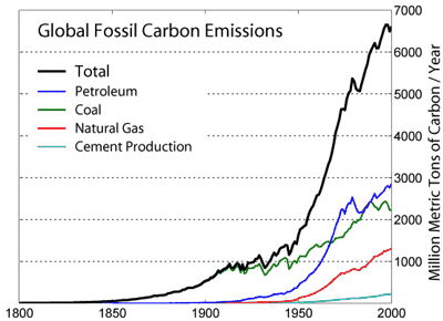 Our
use of fossil fuels has sky-rocketed since the beginning of the industrial
revolution which began in 1850 with the steam engine. There has been a
pause during the Great Depression and World War 2 after which it really
took off. The graphs show how coal has been replaced by oil, and later
oil by natural gas. Their combined carbondioxide has entered the atmosphere
but also left it to a surprising degree. Note that the CO2 from cement
production is rather small, but cement's absorption of CO2 over
time was omitted. Now extend the graph on its left to the year 1400, and
the black curve very much resembles a hockey stick.
Our
use of fossil fuels has sky-rocketed since the beginning of the industrial
revolution which began in 1850 with the steam engine. There has been a
pause during the Great Depression and World War 2 after which it really
took off. The graphs show how coal has been replaced by oil, and later
oil by natural gas. Their combined carbondioxide has entered the atmosphere
but also left it to a surprising degree. Note that the CO2 from cement
production is rather small, but cement's absorption of CO2 over
time was omitted. Now extend the graph on its left to the year 1400, and
the black curve very much resembles a hockey stick.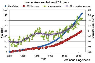 We
know anthropogenic CO2 emissions quite precisely because the amounts of
coal, oil and gas exploited have been accounted for (blue curve). But when
it comes to CO2 concentrations in air, we only have the instrumental
We
know anthropogenic CO2 emissions quite precisely because the amounts of
coal, oil and gas exploited have been accounted for (blue curve). But when
it comes to CO2 concentrations in air, we only have the instrumental 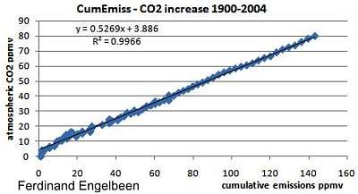 Once
the CO2 hockey stick was created, it could be shown that there exists a
perfect relationship between cumulative carbondioxide emissions (from human
activity) and the amount 'added' to the air, as shown in this graph, spanning
about one century. There remains a small problem of course, that for 140
units of human emissions, only 80 remain in air (consistently 80/140 =
57% from 1960-2010). During this period of one century, nature has emitted
(
Once
the CO2 hockey stick was created, it could be shown that there exists a
perfect relationship between cumulative carbondioxide emissions (from human
activity) and the amount 'added' to the air, as shown in this graph, spanning
about one century. There remains a small problem of course, that for 140
units of human emissions, only 80 remain in air (consistently 80/140 =
57% from 1960-2010). During this period of one century, nature has emitted
(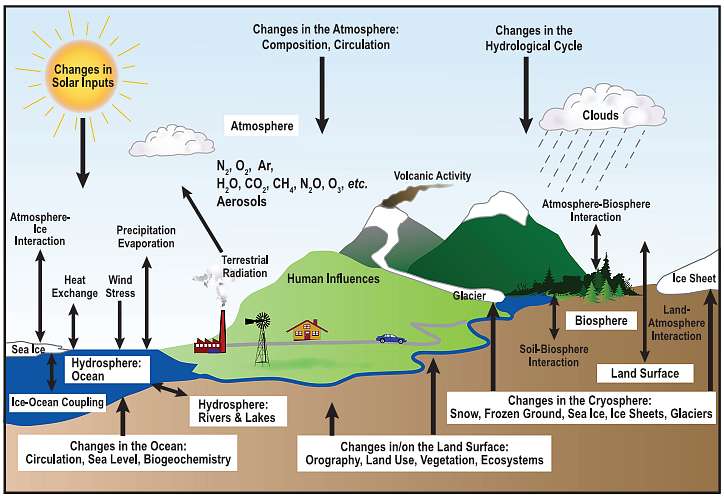
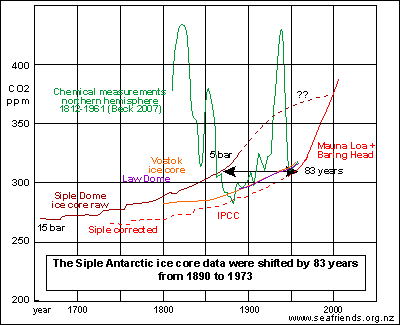 This
graph shows the most important measurements of CO2. The red curve is the
This
graph shows the most important measurements of CO2. The red curve is the
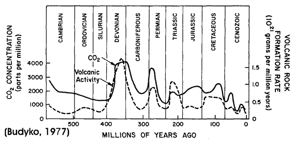 Relative
CO2 concentrations can be inferred from sediment cores, some dating back
nearly one billion years ago. The graph here was produced by Budyko, already
back in 1977 and has been confirmed by
Relative
CO2 concentrations can be inferred from sediment cores, some dating back
nearly one billion years ago. The graph here was produced by Budyko, already
back in 1977 and has been confirmed by 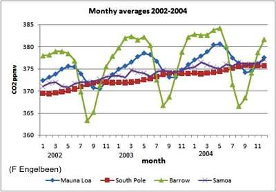 The
Mauna Loa CO2 curve (
The
Mauna Loa CO2 curve (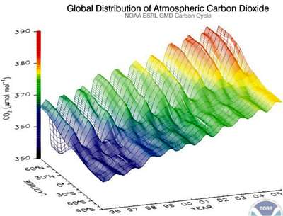 This
beautiful 'carpet' graph from NOAA shows the CO2 fluctuations by latitude
and year. It confirms again that most of the CO2 is produced and consumed
in the northern hemisphere and that atmospheric mixing (transfer from north
to south) does not appear significant within one year. High absorption
rates over the continent-rich northern hemisphere suggests that the oceans
are not the ones absorbing CO2.
This
beautiful 'carpet' graph from NOAA shows the CO2 fluctuations by latitude
and year. It confirms again that most of the CO2 is produced and consumed
in the northern hemisphere and that atmospheric mixing (transfer from north
to south) does not appear significant within one year. High absorption
rates over the continent-rich northern hemisphere suggests that the oceans
are not the ones absorbing CO2.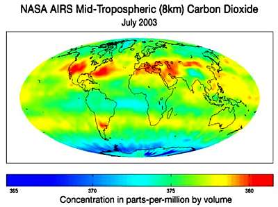 CO2
is not entirely equally distributed over the globe as the map shows for
concentrations measured at 8000 metres height, at the top of the troposphere,
during the northern summer. Note that the scale is exaggerated, like that
of the carpet graph above. The variation is only around 15ppm on a maximum
of 380ppm. During the northern summer CO2 concentrations are lowest in
the northern hemisphere as shown before. Remarkably, the highest concentrations
are not found above industrialised areas but in the subtropics bordering
the desert zones. Lowest concentrations are found in the polar vortexes
(whirling winds), with a deep trough around Antarctica. It is remarkable
that for a gas which is heavier than air, its concentration changes little
from the surface to the top of the troposphere. Note that the colour scale
is deceptive, changing 3 colours for 5ppm at its high end and not changing
colour at its low end.
CO2
is not entirely equally distributed over the globe as the map shows for
concentrations measured at 8000 metres height, at the top of the troposphere,
during the northern summer. Note that the scale is exaggerated, like that
of the carpet graph above. The variation is only around 15ppm on a maximum
of 380ppm. During the northern summer CO2 concentrations are lowest in
the northern hemisphere as shown before. Remarkably, the highest concentrations
are not found above industrialised areas but in the subtropics bordering
the desert zones. Lowest concentrations are found in the polar vortexes
(whirling winds), with a deep trough around Antarctica. It is remarkable
that for a gas which is heavier than air, its concentration changes little
from the surface to the top of the troposphere. Note that the colour scale
is deceptive, changing 3 colours for 5ppm at its high end and not changing
colour at its low end.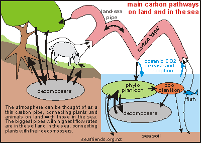 There
exists a paradox about the residence time of carbondioxide in air. This
diagram was taken from the place where the carbon pipe idea was explained
(
There
exists a paradox about the residence time of carbondioxide in air. This
diagram was taken from the place where the carbon pipe idea was explained
(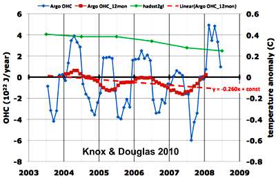 Indeed
the ocean's heat content has been declining as measured by the reliable
ARGOS drifting autonomous depth buoys, operating since 1995 [1]. In blue
the raw Ocean Heat Content (OHC) anomaly (increase/decrease) and in red
the averaged ocean temperature. See also Chapter 3
Indeed
the ocean's heat content has been declining as measured by the reliable
ARGOS drifting autonomous depth buoys, operating since 1995 [1]. In blue
the raw Ocean Heat Content (OHC) anomaly (increase/decrease) and in red
the averaged ocean temperature. See also Chapter 3 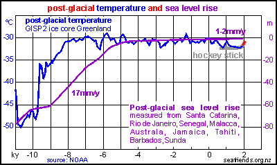 This
question should be easy to answer, but surprisingly, it is not. We've just
seen the drama of the
This
question should be easy to answer, but surprisingly, it is not. We've just
seen the drama of the 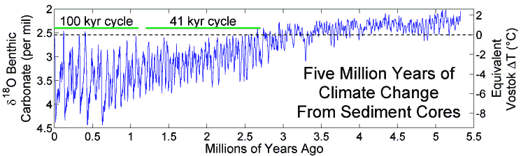
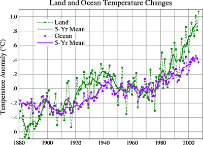 The
temperature record from land-based thermometers and ships' thermometers
is not perfect but it shows a large agreement between them. Both show a
steady rise from the beginning of the industrial age, but land temperatures
outrun sea temperatures as expected. Alas, land temperatures have been
fiddled with, so the downturn after 1998 is not visible. They also suffer
from urban heat, which makes the sea temperatures therefore more reliable.
Sea temperatures are more important anyway because of their large size
and very large mass. Superimposed on the upward trend is a slow 40-60-year
wave of unknown origin, but tracking solar strength, and a ten year cycle
is also visible, identified as the Pacific Decadal Oscillation. The sea
appears to have warmed by +0.4ºC and the land by some +1 degree.
The
temperature record from land-based thermometers and ships' thermometers
is not perfect but it shows a large agreement between them. Both show a
steady rise from the beginning of the industrial age, but land temperatures
outrun sea temperatures as expected. Alas, land temperatures have been
fiddled with, so the downturn after 1998 is not visible. They also suffer
from urban heat, which makes the sea temperatures therefore more reliable.
Sea temperatures are more important anyway because of their large size
and very large mass. Superimposed on the upward trend is a slow 40-60-year
wave of unknown origin, but tracking solar strength, and a ten year cycle
is also visible, identified as the Pacific Decadal Oscillation. The sea
appears to have warmed by +0.4ºC and the land by some +1 degree.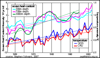 This
graph of ocean heat content and surface temperature shows a slightly different
picture, although it is based on the same sources [4]. Interesting is how
all curves have a very similar trend, meaning that the temperatures of
ocean and Earth's surface, are closely linked. It is also interesting to
note that the ocean varies in temperature to a depth of 3000m, which means
that there is unexpectedly good mixing down to that depth, and that the
whole water column to 3000m depth may contribute to either outgassing of
CO2 or its absorption. It is strange, however, that rather large swings
in ocean heat content did not mirror itself in the two temperature records.
It is stranger still that the deepest part of the oceans (green curve)
experiences the largest swings (volcanic activity? or the effect of 'reconstruction'
with models by Levitus 2001?).
This
graph of ocean heat content and surface temperature shows a slightly different
picture, although it is based on the same sources [4]. Interesting is how
all curves have a very similar trend, meaning that the temperatures of
ocean and Earth's surface, are closely linked. It is also interesting to
note that the ocean varies in temperature to a depth of 3000m, which means
that there is unexpectedly good mixing down to that depth, and that the
whole water column to 3000m depth may contribute to either outgassing of
CO2 or its absorption. It is strange, however, that rather large swings
in ocean heat content did not mirror itself in the two temperature records.
It is stranger still that the deepest part of the oceans (green curve)
experiences the largest swings (volcanic activity? or the effect of 'reconstruction'
with models by Levitus 2001?).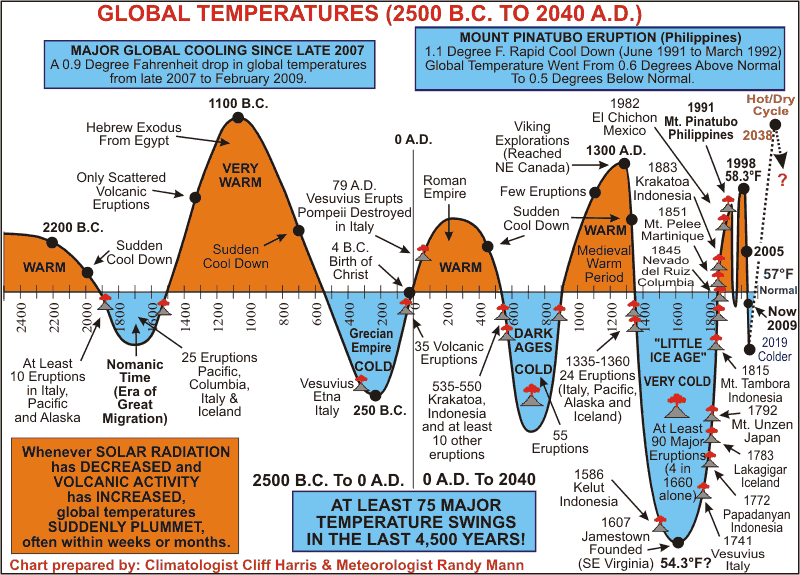
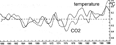 All
ancient records, from ice cores to sediment cores, to corals to dripstones,
show that temperature changes preceded CO2 changes by 100-800 years. But
even the most recent records show this. Here are the fluctuations in temperature
and CO2 (from Mauna Loa) from 1958, also showing that temperature mainly
leads CO2. This overwhelming fact means that CO2 does not cause
temperature changes.
All
ancient records, from ice cores to sediment cores, to corals to dripstones,
show that temperature changes preceded CO2 changes by 100-800 years. But
even the most recent records show this. Here are the fluctuations in temperature
and CO2 (from Mauna Loa) from 1958, also showing that temperature mainly
leads CO2. This overwhelming fact means that CO2 does not cause
temperature changes.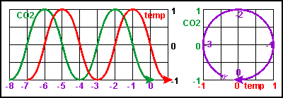
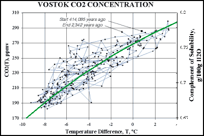 Jeffrey
Glassman [2,3] has taken the detailed data from the Vostok core and plotted
each [temperature, CO2] pair on an X-Y plot, leaving them interconnected.
The result is a squiggle with a consistent clockwise rotation, proving
that temperature (bottom axis) is always in the lead.
Jeffrey
Glassman [2,3] has taken the detailed data from the Vostok core and plotted
each [temperature, CO2] pair on an X-Y plot, leaving them interconnected.
The result is a squiggle with a consistent clockwise rotation, proving
that temperature (bottom axis) is always in the lead.
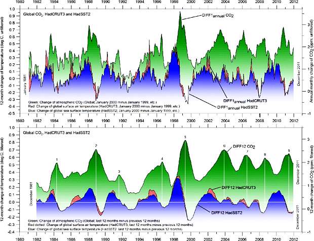
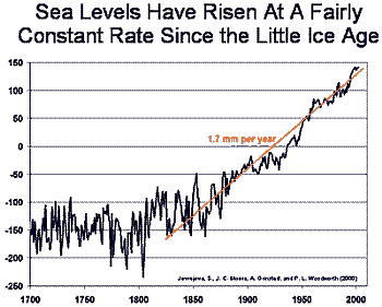
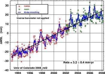
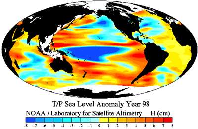 Because
continents rise and sink while bobbing on the underlying 'liquid' mantle,
measuring sea levels was always a dodgy affair. Today with very precise
satellite altimetry, the level of the sea can be determined with such accuracy
that even anomalies can be observed. This world map shows where the highs
and lows are, but they cannot yet be explained. The two hemispheres also
behave differently. Normally one expects high barometric pressure to cause
a lower sea level.Note that data is missing for the polar areas because
Topex/Poseidon orbits SW to NE rather than S-N. See also
Because
continents rise and sink while bobbing on the underlying 'liquid' mantle,
measuring sea levels was always a dodgy affair. Today with very precise
satellite altimetry, the level of the sea can be determined with such accuracy
that even anomalies can be observed. This world map shows where the highs
and lows are, but they cannot yet be explained. The two hemispheres also
behave differently. Normally one expects high barometric pressure to cause
a lower sea level.Note that data is missing for the polar areas because
Topex/Poseidon orbits SW to NE rather than S-N. See also 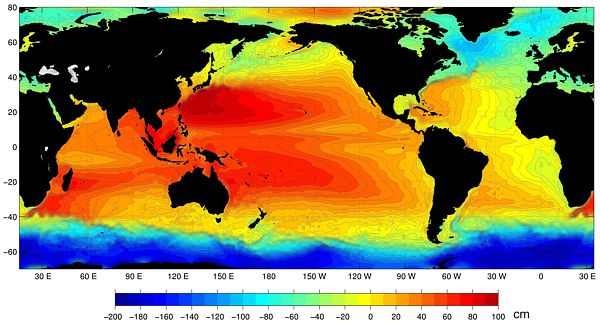 The
sea level story is a bit more complicated as shown in the actual sea topography
with its hills and valleys. The balancing point is zero (yellow) on this
scale and what immediately strikes is the deep and large trough of up to
two metres deep around Antarctica, caused by very strong westerly winds
which due to
The
sea level story is a bit more complicated as shown in the actual sea topography
with its hills and valleys. The balancing point is zero (yellow) on this
scale and what immediately strikes is the deep and large trough of up to
two metres deep around Antarctica, caused by very strong westerly winds
which due to 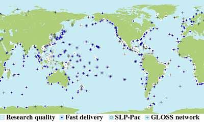 A
network of sea level measuring stations is scattered along many coasts
and oceans and maintained by the University of Hawaii. It so happens that
very few operate in the poles and many of these are not working. Thus the
majority of stations is located in the bulge of the seas. When it is reported
that 90% of stations see a sea level rise, this is true but does not mean
that the whole of the ocean is rising, as the sinking trough around the
poles is not adequately represented.
A
network of sea level measuring stations is scattered along many coasts
and oceans and maintained by the University of Hawaii. It so happens that
very few operate in the poles and many of these are not working. Thus the
majority of stations is located in the bulge of the seas. When it is reported
that 90% of stations see a sea level rise, this is true but does not mean
that the whole of the ocean is rising, as the sinking trough around the
poles is not adequately represented.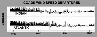 The
COADS database (NASA) [5] documents how wind speed has been changing by
up to 30% over one century and that it has in the past 40 years been climbing
again and very recently (since 2000) been dipping. Thus where sea levels
were previously rising, they will now begin to dip and vise versa where
they were dipping, will now rise and the whole network of stations will
dip [5].
The
COADS database (NASA) [5] documents how wind speed has been changing by
up to 30% over one century and that it has in the past 40 years been climbing
again and very recently (since 2000) been dipping. Thus where sea levels
were previously rising, they will now begin to dip and vise versa where
they were dipping, will now rise and the whole network of stations will
dip [5].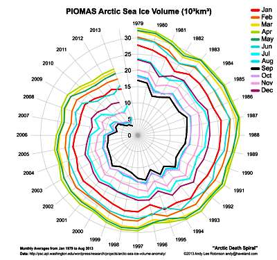 Arctic
ice
Arctic
ice
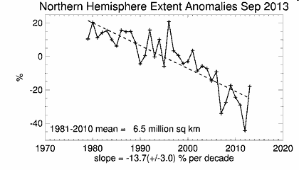
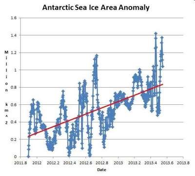 Contrary
to the Arctic, Antarctica enjoyed solid growth in recent years, consistent
with recent global cooling. Notice the large seasonal variation
and that the total area is very large (19.4 million km2).
Contrary
to the Arctic, Antarctica enjoyed solid growth in recent years, consistent
with recent global cooling. Notice the large seasonal variation
and that the total area is very large (19.4 million km2).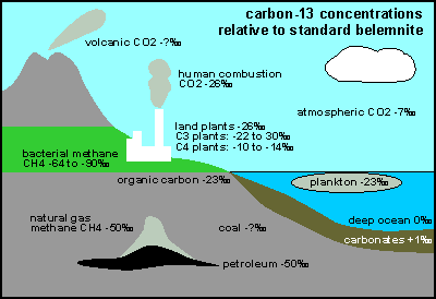 The
isotope carbon-13 was discussed in
The
isotope carbon-13 was discussed in 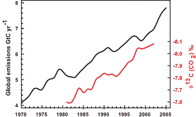 The
diagram here shows that the air becomes indeed deficient in carbon-13.
Note that the black curve shows annual emissions, whereas the red
curve (Keeling 2005) shows what is missing from air and is thus cumulative.
Note also that the red C-13 scale is upside down. This trend has been measured
at many sites, all roughly agreeing with one another. Missing from the
red curve is seasonal variation [1] which is a steady 0.4 or the whole
size of the red curve! From 1980 to 2000 about 0.4 went missing compared
to a -7.8 baseline or about 5% of the available C-13. During that period
fossil fuel emissions amounted to about 120GtC with a deficiency in C-13
of -50. If all that carbon had remained in air, it would have contributed
to 120 / 700 x 50 = -8.6 loss rather than -0.4.
The
diagram here shows that the air becomes indeed deficient in carbon-13.
Note that the black curve shows annual emissions, whereas the red
curve (Keeling 2005) shows what is missing from air and is thus cumulative.
Note also that the red C-13 scale is upside down. This trend has been measured
at many sites, all roughly agreeing with one another. Missing from the
red curve is seasonal variation [1] which is a steady 0.4 or the whole
size of the red curve! From 1980 to 2000 about 0.4 went missing compared
to a -7.8 baseline or about 5% of the available C-13. During that period
fossil fuel emissions amounted to about 120GtC with a deficiency in C-13
of -50. If all that carbon had remained in air, it would have contributed
to 120 / 700 x 50 = -8.6 loss rather than -0.4.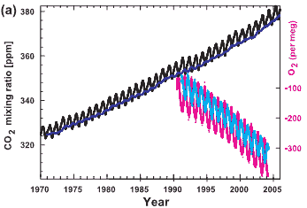 In
AR4, the IPCC shows this graph with the Keeling curve from 1970
and the missing oxygen curve from Bender (2005) [1,2] (Bender curve?).
It clearly shows that the rising CO2 concentration was caused by the burning
of fossil fuel because this 'new' fuel required 'new' oxygen in order to
be burnt, and apparently in the same quantities. However, the graph was
intentionally misleading because the vertical scale for oxygen (magenta)
is very different from that of carbondioxide (black). In chemistry, volumes
of gases can be compared because a certain volume containing oxygen, has
the same number of molecules as the same volume of any other gas (pressure
and temperature must be the same of course). Thus numbers expressed in
ppm-by-volume or ppmv, can be compared chemically with one another. However,
the per meg unit needs to be divided by 4.8 to give ppmv oxygen
because oxygen is 20.95% in air, and (N2+O2)/O2=100/20.95=4.77.
In
AR4, the IPCC shows this graph with the Keeling curve from 1970
and the missing oxygen curve from Bender (2005) [1,2] (Bender curve?).
It clearly shows that the rising CO2 concentration was caused by the burning
of fossil fuel because this 'new' fuel required 'new' oxygen in order to
be burnt, and apparently in the same quantities. However, the graph was
intentionally misleading because the vertical scale for oxygen (magenta)
is very different from that of carbondioxide (black). In chemistry, volumes
of gases can be compared because a certain volume containing oxygen, has
the same number of molecules as the same volume of any other gas (pressure
and temperature must be the same of course). Thus numbers expressed in
ppm-by-volume or ppmv, can be compared chemically with one another. However,
the per meg unit needs to be divided by 4.8 to give ppmv oxygen
because oxygen is 20.95% in air, and (N2+O2)/O2=100/20.95=4.77. 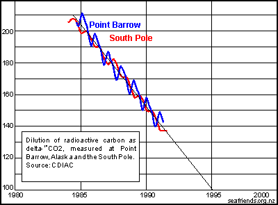 Because
fossil fuel has been underground for a very long time (millions of years),
its radioactive carbon component with a half-life of about 5000 years,
has been extinguished. Thus CO2 from fossil fuel has no radioactive carbon
left, which causes it to dilute the radioactive carbon in air and biosphere.
This is also called the Seuss effect. (Hans Eduard Suess 1909-1993
was an Austrian physical chemist and nuclear physicist). During a short
period of 7 years, the dilution of the radioactive isotope carbon-14 was
measured at the north (Pt Barrow) and south poles [1], resulting in two
straight trends with opposite seasonal fluctuations. Carbon-14 decline
was measured in carbondioxide, so it gives us another idea of how much
fossil carbon dioxide remains in air. The graph shows a 100 (10%) decline
in one decade.
Because
fossil fuel has been underground for a very long time (millions of years),
its radioactive carbon component with a half-life of about 5000 years,
has been extinguished. Thus CO2 from fossil fuel has no radioactive carbon
left, which causes it to dilute the radioactive carbon in air and biosphere.
This is also called the Seuss effect. (Hans Eduard Suess 1909-1993
was an Austrian physical chemist and nuclear physicist). During a short
period of 7 years, the dilution of the radioactive isotope carbon-14 was
measured at the north (Pt Barrow) and south poles [1], resulting in two
straight trends with opposite seasonal fluctuations. Carbon-14 decline
was measured in carbondioxide, so it gives us another idea of how much
fossil carbon dioxide remains in air. The graph shows a 100 (10%) decline
in one decade.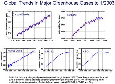 The
caption to these five graphs from IPCC AR4 reads: "Global trends in major
long-lived greenhouse gases through the year 2002. These five gases account
for about 97% of the direct climate forcing by long-lived greenhouse gas
increases since 1750. The remaining 3% is contributed by an assortment
of 10 minor halogen gases, mainly HCFC-22, CFC113 and CCl4."
The
caption to these five graphs from IPCC AR4 reads: "Global trends in major
long-lived greenhouse gases through the year 2002. These five gases account
for about 97% of the direct climate forcing by long-lived greenhouse gas
increases since 1750. The remaining 3% is contributed by an assortment
of 10 minor halogen gases, mainly HCFC-22, CFC113 and CCl4."
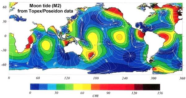
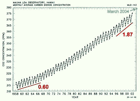
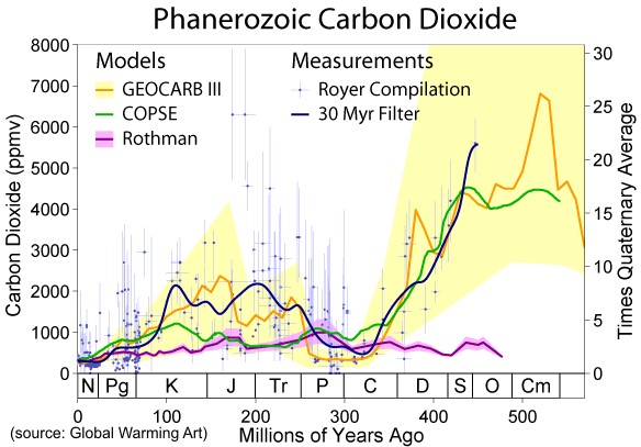