Measuring temperature how temperatures are measured By Dr J Floor Anthoni (2010)
www.seafriends.org.nz/issues/global/climate3.htm
(This chapter is best navigated by opening links in a new tab of your
browser)
The whole fear for greenhouse global warming
is based on actual temperature measurements all over the world, because
these would confirm whether computer model projections are right. Not just
today's record is important, but also that of historic times, to show that
temperatures began to rise critically with the combustion of fossil fuels.
Many methods for measuring temperature both now and in the distant past,
are available and these are discussed in this chapter. It is also shown
how major fraud has occurred.
People change their environments and shield themselves from harsh weather.
They also burn fossil fuels. As a result, thermometers in their neighbourhoods
show false warming.
Most heat on Earth is stored in the oceans, so measuring the oceans'
temperatures is very important. First done by ships, later by ever more
intelligent buoys.
Thermometers are found where people live, so they are prone to urban
heat. The areas where no people live are so large that the 'average world
temperature' cannot credibly be reconstructed.
Past temperatures can be inferred from proxies like boreholes, tree
rings, calcite skeletons and sediments. How do they differ and what are
their shortcomings?
The summer-winter temperature signal is very large compared to its
average trend, while also minima and maxima show different trends. The
southern hemisphere has even been cooling in the past 40 years while the
northern hemisphere warmed.
Since the climategate leak of e-mails, the instrumental temperature
data has been found severely corrupted in many ways, with the obvious purpose
to 'prove' global warming.
Introduction Measuring temperature should be a most simple scientific exercise,
which a primary school student could do to full satisfaction. It is therefore
a surprise that it becomes a major problem to do right, in such a way that
temperatures all over the world can be compared, and stored in a database.
Today there are still two temperature scales in use: Fahrenheit (UK
previously and USA still today) and Celsius (the rest of the world). The
Fahrenheit scale has been replaced scientifically by the Celsius scale
(called Centigrade in the UK and USA), and later by the Kelvin scale, which
has identical one degree steps.
Fahrenheit: runs from zero at the melting temperature of salty ice
past 32º at pure water's melting point, to 212 at water's boiling
point. The range for pure water is thus 212-32=180º. To convert from
C to F: F = (C x 9/5) + 32
Celsius: runs from zero at pure water's melting point to 100º
at water's boiling point. To convert from F to C: C = (F - 32) x 5/9.
Kelvin: or absolute temperature runs from absolute zero (-273ºC)
at increments identical to the Celsius scale. Thus 0ºC is about +273K.
(Note that the degree symbol º is not needed for Kelvins, thus 273K
is correct)
In this chapter we'll have a close look at available thermometers and how
they differ. To exclude rain and unwanted radiation, thermometers are placed
in a standard Stevenson Screen, found all over the world. But the Urban
Heat Island effect still has its warming influence. Temperatures are also
measured by weather balloons, and ultimately by satellite, each posing
its own problems.
Ocean temperatures were previously measured by ships, but now thousands
of sophisticated diving buoys do the work with high precision. With all
these measurements in place, one would be able to measure average world
temperature, but even this is a failing effort.
Temperatures in the past can be measured from isotopes and from various
proxies, each having its own set of problems.
Finally we'll analyse where the world's warmth or coolth is stored,
and whether temperature measurements can be used reliably to measure the
amount of cooling or warming of the planet.
Thermometers Temperature is an important quality in daily life, science and industry.
Just about all processes depend on temperature because heat makes molecules
move or vibrate faster, resulting in faster chemical reactions. Heat is
wanted and wasted, and so is cold. When substances are cold, the processes
within proceed more slowly, as in chilled or frozen foods. It does not
surprise therefore that many ways have been invented to measure and control
temperature.
Based on known extension of a known substance When a substance (solid or liquid or gaseous) is heated, it extends
or expands (with few exceptions). When such an extension can be seen, a
thermometer can be made. Substances with high expansion coefficients are
of course most suitable but there are other requirements.
The mercury thermometer is the classical thermometer, based on
the known expansion of mercury, a liquid metal. Its principle is simple:
a (relatively large) volume of mercury inside a rigid class 'bulb' is warmed
and expands into a narrow capillary tube of rigid glass. The larger the
bulb and the smaller the capillary, the more sensitive the instrument becomes.
Medical mercury thermometers are capable of measuring to tenth of a degree
Celsius. The mercury thermometer has the following properties:
+ mercury expands easily
+ it conducts heat easily, being a liquid metal
+ it is silvery opaque and clearly visible
+ it does not stick to glass
+ a minimum-maximum thermometer can be made with it
+ it has a high boiling point (357ºC) and can thus be used for
high temperatures
- it freezes at -39ºC and this could cause the bulb to crack
- it is relatively expensive
- it is considered an ecological hazard, even though liquid mercury
is harmless
The alcohol thermometer is also widely used, with the following
properties:
+ it expands easily, even more than mercury
- it is not a good conductor of heat
+ it can be coloured in any colour to be easily visible
- it has a low boiling point of +78ºC
+ it has a low freezing point of -112ºC and is suitable for low
temperatures
+ it is inexpensive
- it wets glass and gives a less precise readout
+ it is not harmful to the environment
The Six's maximum and minimum thermometer is a clever use of an
alcohol bulb thermometer with some mercury in its capillary, topped up
with more alcohol and ending in an empty bulb with some vacuum. Because
mercury is so dense, a magnetic metal needle will float on it, and can
be pushed against some friction (a magnetic back plate). At maximum temperature
the furthest needle will stay behind, attracted by the metal backing plate.
Likewise at minimum temperature, the closest needle will stay behind. After
reading the thermometer, the two needles can be re-set (drawn onto the
mercury level) with an external magnet, or by pushing the metal back plane
away from the magnetic needles, which then descend by the pull of gravity.
The Six's thermometer has the advantages and disadvantages of both mercury
and alcohol thermometers. But its capillary must be wide enough to place
the metal floating pins, which means that it cannot be read very accurately
(0.5ºC is difficult).
Please note that bulb thermometers are sensitive to outside pressure
and are thus less suitable for deep sea temperature measurements, unless
they are encased inside a rugged mantle.
still to do: drawing of these thermometers
The industrial bulb thermometer consists of a relatively large
copper bulb with long capillary tube that can be bent and guided through
the innards of an appliance. At its end it has a tiny pressure sensor (manometer)
which operates an electrical switch. With a screw its setting can be altered.
These thermo-controllers are extensively used in air conditioners, washing
machines and other appliances.
A metal spring thermometer can be made by coiling a metal strip
with an indicator attached to its loose end. When the strip expands, the
coil unwinds somewhat, which moves the indicator. This kind of thermometer
is useful where a wide range of temperatures needs to be measured with
low accuracy, as in cooking food and for ovens.
The bi-metal thermometer is based on the difference in extension
between two metal strips, sandwiched together and riveted or spot-welded
at both ends. This causes the strip to bend when temperature changes. The
strip can be bent, folded or coiled to amplify its effect. Bi-metal thermometers
are extensively used in temperature controllers to switch electrical devices
like warmers and coolers on or off. They are less suitable for absolute
temperature measurement. Some bi-metal thermometers are dimpled to give
a click-clack effect, a positive transition at a certain temperature (click),
but with hysteresis (lagging behind) when clacking back.
Electric thermometers Temperature also makes electrons move faster inside conductors like
metal, thereby changing their resistance.
The platinum resistance thermometer is based on its resistance
changing precisely with temperature. The change in resistance can be measured
with an electronic circuit and amplified as an electrical signal and shown
on a voltage indicator. To minimise external influences like supply voltage
variations, a 'bridge' circuit is used which essentially measures the difference
in voltage between the platinum resistance and another known resistance.
Because platinum is a noble metal, the thermometer is very stable while
able to operate under a very wide range of temperatures. For ultimate precision,
linearising circuits are applied, and the 'known' resistor may be kept
at a known temperature.
The thermocouple thermometer is based on the difference in conductivity
(electron mobility) between two metals, brought into contact with one another
or spot-welded together. When two dissimilar conductors are brought together,
a voltage difference occurs, which can be measured. When warmed, the voltage
increases due to a higher electron mobility. Thermocouple thermometers
can measure a large range of temperatures and are very stable. They are
also independent of the contact area, and are thus easy to make. They are
also insensitive to outside pressures. However, thermocouples occur in
pairs and one of them must be kept at a constant known temperature.
When thermocouples are stacked in series, their sensitivity increases
proportionally, known as a thermopile. They can be used for measuring
heat flow.
The thermistor thermometer is based on the conductivity of a
semiconductor, which is quite sensitive to temperature. So it acts like
a resistance thermometer. Unfortunately the resistance change is not linear
and can be corrected only to some degree. It also has a very limited range.
Thermistor thermometers are suitable for measuring the temperature of living
organisms, like humans. They can be made rather small (less than 1mm).
Infra-red thermometers measure the infra-red (IR) radiation of
substances. Therefore they do not need to be in direct contact with them.
But the measured object must be warmer than the infra-red detector. So
they are more suitable for measuring high temperatures at a safe distance.
By cooling the IR detector to a known temperature, also lower temperatures
like that of living organisms, can be measured. Note that the CO2 in air
absorbs IR radiation, which limits their use but manufacturers excluded
the CO2 absorption band. The accuracy of IR thermometers is limited.
Passive infra-red (PIR) detectors also detect warmer-than-air objects,
but they are used for detecting movement of such objects, and not their
precise temperature.
The Stevenson Screen The
Stevenson screen was designed by Thomas Stevenson (1818-1887), a British
civil engineer, in order to more accurately measure air temperatures rather
than side effects like solar irradiation heating up the thermometers. To
reflect heat back, it is painted white, but better still would have been
reflective aluminium. It has louvered sides to let the air through but
not the sunlight. Once it became an accepted standard, the Stevenson Screen
is now spread all over the world. It now allows temperatures to be compared
wherever they are measured.
A lot of thought and experience went into its design: the door swings
down rather than to one side so that the wind won't catch it on windy days
and rip it off the hinges, and it opens facing north, to keep the sun from
shining directly on the thermometers while reading the thermometers.
Inside it one finds two normal thermometers (alcohol for cold areas,
mercury for warm places), but one of these has its bulb wetted by a wick
soaked in a bottle of water. This wet bulb thermometer gives an indication
of evaporation, because evaporation of water causes cooling. There is usually
also a max-min thermometer. The thermometers are placed such that they
can be read with ease and replaced with minimum effort.
An important consideration is also that the louvered box stands a fixed
distance above the ground, for least interference with low objects that
may impede wind flow (and snow).
Temperature reading errors Suppose we have stations with the finest thermometers inside the most
standard Stevenson screens and located in rural areas, away from urban
disturbances, then surely, readings must always be accurate? They are not,
for various reasons:
readings are done by humans. It involves going out in the rain, snow and
sleet to the remotely placed weather station. There the finely scaled thermometers
must be read to within 0.1 degrees, with fogging spectacles and suchlike.
The data must be written up with a pen that won't work on soggy paper,
etc. So shortcuts are taken.
Let's skip today because it is much like yesterday and we'll use those
figures instead.
John is sick and no-one else can do it today
Who will do it during the summer holidays?
The broken thermometer has still not been replaced.
etc.
it is difficult to read a thermometer over the meniscus (curving
surface of the liquid inside) square-on (without parallax error).
there can also be a bias caused by the time that the reading is done. Air
warms up during the day and is warmest a couple of hours after mid-day.
During the night it cools and is coolest just before dawn. So in the morning
one reads the maximum of previous day and the minimum of today. Are these
two noted down for the same date? In the afternoon the reading shows today's
maximum and today's minimum.
thermometers have hysteresis (a kind of friction), which
means that once they go up, it takes a little longer before they go down
again.
the glass of thermometers is a liquid which hardens (drifts) over
time, producing an error of about 0.07ºC per year.
the liquid inside may evaporate, and condense in the top of the tube, thereby
producing a lower reading.
electronic thermometers must be calibrated regularly (and a log kept),
because they also drift over time.
when thermometers are replaced, often a jump in temperature is recorded.
sometimes moisture or snow are blown onto the thermometers, which affects
their readings.
It is important to note that most of the above problems even out over time,
and that they do not affect the trend in temperature. In addition to these
problems, there are more serious ones related to location:
temperature decreases with height at the standard lapse rate of
0.6ºC per 100m altitude, but this is not always true.
stations located near the sea measure sea temperature during sea winds
and land temperature during land winds, with usually a large difference
between them. What do we want to measure? Air temperature over land or
sea temperature? There are years with more land than sea winds and years
the other way.
the weather changes from hour to hour and place to place. What is the right
reading?
The upshot of all this is that a large number of sites and observations
is needed to even out reading errors, but one can never truly correct for
UHI, altitude and distance to the sea.
Temperature
uncertainty In
a paper [1] scientists are reminded of the natural uncertainty (or inaccuracy)
in thermometer measurements, arising from reading errors, instrument errors,
time of day errors, poor location and weather short-term fluctuations.
It creates a band of almost 1 degree C around observations. In scientific
terms, it means that it cannot be said with certainty that the world has
warmed since 1880. Draw a horizontal line from just above 0 on left to
right and it will traverse through the grey envelope. In the words of the
authors:
"The ±0.46ºC
lower limit of uncertainty shows that between 1880 and 2000, the trend
in averaged global surface air temperature anomalies is statistically indistinguishable
from 0 C at the 1-sigma level [half the width of the grey envelope]".
One cannot, therefore, avoid the conclusion that it is presently impossible
to quantify the warming trend in global climate since 1880."
What
do we measure? What do we measure with Stevenson Screen meteorological thermometers?
The problems with temperature measurements do not end with the ones described
above, because the real question is what do they measure? It is claimed
that they measure Earth's surface temperature, but is that really so? What
do the maximum and minimum temperatures tell us? Is the day's average equal
to the middle between maximum and minimum? The graphs show some of the
problem.
A day begins with the blue curve of net sunlight beginning just before
six in the morning and ending just after six in the evening (apparently
in spring). It doesn't take long before the air begins to warm too (sensible
heat, orange) due to the warming of the surface, and later still some evaporation
happens (latent heat, cyan). But watch what infrared out-radiation does
(net IR, magenta), shown upside down because it goes out rather than in.
It increases somewhat during the day and is still present at night, in
total area equalling that of sensible heat (conduction and convection).
In other words, the idea of infra-red out-radiation from the surface is
only half supported by measurements. The part that does, is soon absorbed
by air molecules and converted into sensible heat. Source [1].
This
graph shows measured temperatures during a single year. MSAT means Meteorological
Surface Air Temperature, the temperature inside the Stevenson Screen. It
has two outomes, Min MSAT, the minimum temperature (black) and Max MSAT,
the maximum (magenta). The average between these is considered the surface
temperature for the global temperature datasets. But as you can see, it
does not represent the actual surface temperature, 1.5m lower, shown in
blue (Max) and yellow (Min). The average between these two is considerably
larger. [2] Also note that the Min MSAT follows the minimum surface temperature
and that Max MSAT comes close to the real average..
Urban Heat Islands
(UHI) It is human nature to change his environment for maximum comfort, which
means shutting out the nasty aspects of weather like rain, cold wind and
intolerable heat. So where people live, one finds wind breaks, shading
trees, houses, roofs, concrete, parkings, roads, air conditioners, cars,
air planes, all contributing to a change in air temperature. And they all
cause extra heat. Where Stevenson screens once stood isolated in a meadow,
over time they find themselves surrounded by civilisation, causing the
air temperature to rise. This is called the Urban Heat Island effect, which
can corrupt temperature data substantially.
This
image (courtesy Anthony Watts) shows the urban heat island effect over
Reno California USA before midday. The temperature measured varies from
47-57ºF (by 5ºC). so the question is what is THE temperature
of Reno? Is it the average (51) or the minimum (47)? Clearly, the UHI
causes a formidable difference between cities and rural places and more
so with bigger cities. Its main problem lies in its unpredictability from
place to place and over time.
Tokyo
with its 18 million inhabitants and massive urbanisation and transport
systems, has a very significant UHI signature, as shown in this graph (from
Anthony Watts). It has increased by a massive 3ºC in the past century
and is still increasing further. By comparison nearby Hachijo island which
has also suffered some urbanisation, shows a modest temperature increase
of less than 0.5ºC in a century. Which of the two stations would you
exclude from a world temperature database? Guess what the people of Tokyo
are more interested in? Note also that temperature swings (a decadal cycle)
are larger at Hachijo, perhaps caused by swings in sea temperature.
The
graph shown here was derived from 47 counties in California, averaging
their temperature trends for the period 1940-1996 and plotting them against
their population size. Rural stations on left and urban stations on right.
From the data points a straight line can be drawn which would cross the
zero temperature trend. Also shown on this graph are the six stations "X"
used by NASA GISS from which global averages are calculated. As can be
seen, five out of six are located where a significant Urban Heat Island
(UHI) effect is experienced, of about 0.6 degrees. Not shown is the historical
growth of these counties over the 56 years, but it is evident that much
of 'global warming' consists of the UHI. Many similar studies exist, all
consistently showing that UHI seriously pollutes the instrumental record.
In
1996 Goodridge grouped Californian counties by population size and obtained
these three temperature curves for the 20th century, using standard temperature
datasets. Once more it showed that population density (UHI) is the main
contributor to 'warming'.
Weather balloons On a daily basis, 1600 weather balloons are released from 800 stations,
usually at the same time: 0:00 UTC and 12:00 UTC. The 2m diameter rubber
latex balloon is filled with hydrogen gas. Its mission is to measure temperature,
relative humidity and pressure, which are used for weather forecasting
and observation. Modern weather balloons can now also measure position
and wind speed by using GPS positioning.
The data is transmitted by a rugged box of electronics, at a frequency
of ~1680MHz or ~404MHz (300mW) at intervals of 2-5 seconds. During its
short flight of several hours, it may rise to above the troposphere and
travel for over 300km. Its mission is to transmit data up to an altitude
of 7 km (0.4 bar) above which the balloon will burst. The electronics package
then parachutes back to the ground.
The
advantage of weather balloons is that they truly measure the air's temperature,
unaffected by Urban Heat Island effects. Satellite temperature measurement
also have this advantage, but cannot measure over a range of altitudes.
This graph compares the three methods over a period of 20 years. Note how
balloons and satellites agree, and how the surface temperatures show an
urban heat island effect of some +2 degrees. Not shown is how regular adjustments
aim to bring these measurements into agreement. For instance, the starting
point in this graph has been aligned this way, and perhaps 1998 as well.
Ocean
temperature measurements Ocean
surface temperatures have been measured by ships for several centuries.
First it was done by collecting surface water in a bucket while steaming
on, but later the engine's cooling water inlet was used. Unfortunately
this made a difference, because the water inlet is at some depth under
water. Today this may serve to advantage because satellite can measure
only the top few centimetres of the sea because infrared radiation is rapidly
absorbed by water. Because water continually evaporates from the sea, the
surface film is somewhat colder than a few metres down. This map from Reynolds
(2000) shows where the ships' tracks are, and that their measurements are
in no way representative of the entire oceans.
The
graph shows both land and ocean temperatures from thermometers, since 1880.
As can be seen, the land temperature rises more steeply than the sea temperature,
most likely caused by the Urban Heat Island effect. Even so, both follow
similar oscillations; a steep short decline followed by a long slow incline.
The sea warms by about 0.5 degrees per century whereas the land warms by
about 1.2 degrees per century. Compare this with the UHI effect of Tokyo
above. What is omitted from this graph is the steep decline before 1880.
Ocean temperature buoys Since
the year 2000, and benefiting from technological advancement, an aggressive
programme was begun to measure the oceans entirely, with tide gauge stations,
moored buoys, drifters and ships of opportunity. The ARGOS satellite system
circles Earth to collect the data, while the AOML has responsibility for
the logistics of drifter deployment and quality control of the resulting
data [1]. The map shows the locations of ARGOS drifters from the USA (blue)
and UK (red/orange). Of course their positions change daily.
A main advantage of the ocean drifters is that they collect data of
the air as well as the sea at various depths, and entirely without human
error.
A drifting buoy is an inexpensive,
autonomous device which is deployed by ships of opportunity. Distributed
throughout the oceans of the world, it is designed to drift freely with
the ocean surface currents, has an average lifetime of more than a year,
and can measure sea surface temperature, surface currents, and sea level
pressure. The buoy is a round sphere of about 0.5m diameter, from which
an array of cables and sensors hangs. It measures temperature, salinity
and ocean currents. The collected data are then transmitted back to shore
via satellite. In July 1995, data were logged from more than 750 buoys.
An expendable bathythermograph
(XBT) is another inexpensive device which is also deployed by ships
of opportunity. An XBT is a small instrument that is dropped into the ocean
from a ship. During its descent at a constant rate, an XBT measures the
temperature of the seawater through which it descends, and sends these
measurements back to the ship through two fine wires that connect the ship
to the instrument. XBTs generally have a depth limit of 750 meters, but
some reach depths of 1800 meters. Many ships relay summaries of the vertical
profiles of temperature back to the shore by satellite. Meteorological
centers throughout the world receive data from both the XBTs and the buoys
via a global communications network, and use it to prepare the analyses
that are essential for forecasts of weather and climate. The complete vertical
temperature profiles are sent to data collection centers after the ships
reach port. The Upper Ocean Thermal Center at AOML has responsibility for
quality control of an average of 2,000 XBTs per month.
The latest drifters are semi-autonomous, being capable of making deep
dives to 200m, drifting there for 9 days, and surfacing at intervals to
transmit their data and recharge their batteries. Over 3000 of these autonomous
drifters have been released so far. As their technology becomes more sophisticated,
they could perhaps at some time also measure clarity, light extinction
with depth, pH, pCO2, plankton concentrations, oxygen and carbon fluxes,
etc.
Satellite Sea Surface Temperatures (SST) Since
satellites began to be used for measuring environmental variables (GOES),
both land and sea temperatures have been measured with good accuracy. The
map here shows average ocean temperatures for a given year. It is important
to remember that this represents only the very thin surface of the oceans.
The advantage of satellite measurements is that they truly cover the
whole of the world. Their disadvantage is that they cannot measure absolute
temperatures, and that they vary slowly with time (drifting).
Important points:
atmospheric heat does not go down into the ocean.
the ocean's surface heat comes from solar irradiation.
ocean drifters will soon give an almost complete
picture of ocean temperatures and where warmth is stored.
satellites measure only the top few centimetres
of the ocean, which is more related to irradiation and evaporation.
satellite radiometers drift over time and
need to be recalibrated to bring them in agreement with land temperatures
the ocean is still warming after the end of the
recent ice age.
the land temperature record has been 'adjusted';
that of the sea temperature not.
Thermometer locations The places where thermometers are placed were never selected with a
view of collecting a representative set of temperatures from which
the world's average could be calculated. They are simply located where
people live, and that introduces the urban heat island effect. The two
maps below, show that the world is not adequately or evenly covered. To
make matters worse, many temperature stations are pretty recent and do
not have a long-term record. Others do not satisfy stringent quality requirements.
This map shows where today's reliable weather stations are located
and at which altitudes (colour-coded).
The above two images show the sizes of the areas around the south pole
(left) and north pole (right), of unknown temperatures. Also large unknown
areas in the centres of continents, exist, just visible on the sides of
the two hemispheres. Global temperature databases attempt to fill these
areas in with the temperatures surrounding them, which invites fraud. The
fact remains that global temperature cannot be guessed at from the available
thermometers.
Averaging the temperature data From the above maps one can see that it is impossible to arrive
at an average temperature for every square on the grid. Besides, the squares
become smaller towards the poles (but this can be accounted for). Yet this
is precisely what NASA (USA), and the Climate Research Unit (UK) have done,
with disastrous results. These results were then used in the IPCC reports
as if they were reliable.
To make matters worse, these scientists have been 'adjusting' the original
data to fit their expectations. It is important to remember that 'world
average' temperatures mean less than a good time series of a single remote
station. It also implies that the evidence from thermometers to support
'global warming', is entirely unreliable.
There is also a thermodynamic 'finer point': if one wishes to know the
effective out-radiation, which is proportional to the fourth power of absolute
temperature (T x T x T x T), then this should be taken into account, making
the effective temperature noticeably larger than the average
temperature.
Finally, were average temperatures to have any meaning, it should also
be related to the heat content where it was measured. Ice caps
and oceans have large latent heat, whereas deserts have low latent
heat. Thus in climatology, one should be very cautious about 'temperature
averages'.
Important points:
most thermometers are at sea level, by the sea,
which is a sharp habitat boundary. Depending on wind direction, they measure
either land or sea temperatures.
thermometers are found where people live (also
by the sea), hence the large influence of the UHI.
the southern hemisphere is severely misrepresented.
large land masses are misrepresented.
large gaps exist with no data.
'average world temperature' cannot be calculated
by filling in the blanks.
Paleothermometers For various known and unknown reasons, the chemical elements found
on Earth have 'sister' elements or isotopes (Gk: isos=equal;
topos=
place; as in the same place in the periodic
table of elements). Isotopes behave chemically alike but have different
bulk (different number of neutrons). Some isotopes are unstable and fall
apart by radioactive decay (alpha, beta or gamma radiation).
Carbon-14 One of the best known isotopes is radioactive carbon-14 which is created
in the atmosphere from the element nitrogen. Because of its beta-decay
(emitting an electron) and half-life of about 5000 years, it is extensively
used in radio-carbon dating of biological substances (wood, shell, hair,
etc.). Carbon-14 measures time rather than temperature.
Carbon-14 occurs in minuscule amounts, e.g. making
up as much as 1 part per trillion (0.0000000001%, 1E-12) of the carbon
in the atmosphere (CO2). The half-life of carbon-14 is 5,730±40
years. It decays into nitrogen-14 through beta decay (emitting electrons).
The activity of the modern radiocarbon standard is about 14 disintegrations
per minute (dpm) per gram carbon.
Fortunately, plants concentrate CO2 more than
thousand-fold so that enough carbon-14 is accumulated for testing. But
measuring carbon-14 in air with some precision, remains impractical.
Important points
C-14 has for a long time been the best method
for dating objects
objects must contain carbon, such as artefacts
of living creatures (wood, bone, etc.)
C-14 is polluted by atomic tests (making lots
of it) and by the burning of fossil fuel (has none of it) and life (using
it)
C-14 is common enough for testing air and water
Note that the correct notation for isotope
carbon-14 is: 14C Tip: for the ºdegree symbol hold the ALT
key while typing 167 (ALT+167)
Similarly = ALT+0137 and the ñ in La
Niña = ALT+164. Micro µ = ALT+0181 Beta ß = ALT+0223
Beryllium-10 Beryllium is the fourth element in the Periodic
Table, after Lithium and before Boron. It has an atomic mass of 9,
made up by 4 protons and 5 neutrons. It can be made as a fragment from
heavier elements (nitrogen 14, oxygen 16) by cosmic bombardment (spallation)
which expels protons and neutrons. Also cosmic radiation itself contains
beryllium. Radioactive Beryllium-10 has a half-life of 1.51 million years,
and decays by beta decay to stable Boron-10 with a maximum energy of 556.2
keV.
It dissolves in liquids with a pH of 5.5 or less (acidic) and occurs in
rain water which has a pH of about 5. When water reaches the soil or the
sea, it becomes less acidic and berillium precipitates out, also being
incorporated into sediments. As a result, beryllium in general, does not
move and neither does it take part in the biochemical cycles of life, which
is a disadvantage of carbon-14 for interpreting solar and cosmic irradiation.
As such it is a very good indicator of combined solar and cosmic activity
reaching Earth. Be-10 is also found in ice cores. [1,2]
This
figure shows two different proxies of solar activity during the last several
hundred years. In red is shown the Group Sunspot Number (Rg) as reconstructed
from historical observations by Hoyt and Schatten (1998a, 1998b). In blue
is shown the beryllium-10 concentration (10E4 atoms/(gram of ice)) as measured
in an annually layered ice core from Dye-3, Greenland (Beer et al. 1994).
Beryllium-10 is a cosmogenic isotope created in the atmosphere by
galactic cosmic rays. Because the flux of such cosmic rays is affected
by the intensity of the interplanetary magnetic field carried by the solar
wind, the rate at which Beryllium-10 is created reflects changes in solar
activity. A more active sun results in lower beryllium concentrations (note
inverted scale on the blue plot). Note that the sun's variability is much
more than suggested by the satellite record (the solar constant).
Important points
the Be-10 method is quite young and needs to mature
before far-reaching conclusions can be drawn
it is not certain how much of the effect is due
to the brightness of the sun
the Be-10 method can look further into the past
than the C-14 method
the Be-10 method is not influenced by life
Oxygen-18 Oxygen-18
or 18O has two extra neutrons instead of the usual 8 (10n+8p).
It is a mysterious element that occurs in concentrations of around 0.2%
and is stable (not radioactive). Practical measurements have shown that
it correlates with temperature: higher concentrations mean lower temperatures,
but the why and how eludes somewhat. The graph shows 18-O variations in
foraminifers which are usually found on sea bottoms in the shallow coastal
zone.
It is known that the heavier 18-O is more reluctant to evaporate (it has
a lower vapour pressure). Thus the vapour from the sea (which is rather
constant in 18-O), has less 18-O than the sea itself. As the vapour condenses
into rain, 18-O does so more eagerly because of its lower vapour pressure.
Thus plants feed themselves with water that is higher in 18-O. Ice is therefore
also higher in 18-O. But then it becomes shaky, as this concentration differs
with latitude: 0.67 /ºC Greenland, 0.76 /ºC Antarctica, and
0.33/ºC in ice cores. So remember that it cannot be compared from
place to place and it cannot measure absolute temperature. 18-O can
measure only relative temperature changes in one place. But it gets
worse.
Present thinking is that colder temperatures cause ice caps to expand,
which are deficient in O-18, leaving the sea more abundant in 18-O. Thus
the delta-18-O measures the amount of ice in ice caps rather than actual
surface temperature. As a consequence, the 18-O signature lags many
hundreds of years behind surface temperature. When Earth is cooling,
water is transported through air to the ice caps, so the time lag is maximal
as also the rate of the 18-O signature is more gradual than that of surface
temperature. When Earth is warming, ice caps melt and meltwater flows almost
instantaneously back to the sea. So the warming part of the 18-O signature
lags less and changes more steeply.
Scientists use the symbol delta for the
Greek letter 'd', for differences in quantities.
The variations in isotopes are expressed as a percentage (%) (or promille
) and calculated the way one would calculate relative profit:
profit (%) = ( (sales -cost)/ cost) x 100%
Likewise the delta-18-O = ((measured value - standard value)/
standard value) x 1000
where the standard value is either a standard sample (as in PeeBee Belemnite
for 13-C) or any other sample.
Important points:
oxygen-18 is a stable isotope in its behaviour
over time and its quantity on Earth.
temperature measurements with it join up to today's
temperature, giving high credibility.
the delta values are qualitative and must be calibrated
against known temperatures in the past for each site.
temperature measurements with 18-O are highly
consistent but interpreting them is not.
higher delta-18-O values mean colder; lower values
mean warmer.
the cooling slope in the 18-O signature lags considerably
and is always gradual.
the warming slope in the 18-O signal lags less
and is steeper than the cooling slope.
Carbon-13 (13C) Carbon-13
is a natural stable isotope of carbon and has one extra neutron (7n + 6p).
It makes up about 1.1% of all natural carbon on Earth. Whereas isotopes
are normally detected by mass spectroscopy, carbon-13 can sensitively be
detected with Nuclear-Magnetic Resonance (NMR). It is also a mysterious
isotope that is preferentially avoided by plants. Thus wherever 13-C is
used, there is less of it. C-13 is always measured against a world standard
called PeeBee Belemnite or similar. Belemnite is a calcium-rich deposit
from the soft internal shells of ancient belemnite inkfish, with a delta-13-C
agreed to be the zero base.
The diagram shows typical concentrations (almost always negative),
and where they occur. Note that the modern 'grasses' (maize, sorghum, sugarcane)
have a four-step photosynthetic process (C4) which is more efficient than
the much more common three-step (C3) process, but requires more warmth.
See our soil section for more.
12-C and 13-C can be used as temperature tracers that explain ocean
circulation. Plants find it easier to use the lighter isotopes (12-C) when
they convert sunlight and carbon dioxide into food, thus large blooms of
plankton (free-floating organisms) draw large amounts of 12-C into the
oceans. If those oceans are stratified layers of warm water near the top,
and colder water deeper down) the water cannot circulate, thus when the
plankton dies it sinks and carries 12-C with them, making the surface layers
relatively rich in 13-C. Where the cold waters well up from the depths
(North Atlantic) it carries the 12-C with it. Thus, when the ocean was
less stratified than today, there was plenty of 12-C in the skeletons of
surface-dwelling species. Other indicators of past climate include the
presence of tropical species, coral growth rings, etc.
Due to differential uptake in plants as well as marine carbonates of
13-C, it is possible to use these isotopic signature in earth science.
In aqueous geochemistry, by analyzing the delta-13-C value of surface and
ground waters the source of the water can be identified.
However, there are some insurmountable problems
with this isotope for detecting a 'human footprint' in CO2:
it is a new field and little is known
the biology of 13-C uptake is not understood
there is too much variation from place to place
and species to species.
human emission are small 5.5Gt/y; plants 121Gt/y
there are more C4 plants since 1850: maize, sugarcane,
sorghum
no hard conclusions can be drawn from results.
The very slight decline in 13-C since 1850 is not significant. It could
be from deforestation or bacterial methane
there are too many paradoxes
13-C/18-O clumped-isotope geochemistry There is a slight thermodynamic tendency for heavy isotopes to form
bonds with each other, in excess of what would be expected. Thus the occurrence
of a CO2 molecule made up of one 13-C atom, one 18-O atom and one normal
16-O atom, adding up to a molecular weight of 47 (13+18+16) is just common
enough to be used to detect temperature changes.
Lab experiments, quantum mechanical calculations, and natural samples
(with known crystallization temperatures) all indicate that delta-47 is
correlated to the inverse square of temperature. Thus delta-47 measurements
provide an estimation of the temperature at which a carbonate formed. 13-C/18-O
paleothermometry does not require prior knowledge of the concentration
of 18-O in the water (which the delta18-O method does). This allows the
13C-18O paleothermometer to be applied to some samples, including freshwater
carbonates and very old rocks, with less ambiguity than other isotope-based
methods. The method is presently limited by the very low concentration
of isotopologues of mass 47 or higher in CO2 produced from natural carbonates,
and by the scarcity of instruments with appropriate detector arrays and
sensitivities.
Proxies In the previous chapter we've discussed isotopes to measure temperature
and, strictly spoken, these are also proxies (L:procurare=
to cure, to deal with. proxy= substitute, delegate, representative)
even though they are methods rather than substitutes. Here we'll look at
various other ways scientists have tried to measure past temperatures.
Boreholes This
graph from Globalwarming Art (after Huang & Pollack, 1998) shows a
borehole temperature reconstruction (showing 1ºC warming), aligned
with the trace from the instrumental record from Brohan et al. 2006, (which
shows the most warming of all instrumental records, watch out!). The graph
goes back some 500 years, but the further back in time (depth), the bigger
the error rate and the flatter the curve, as also details disappear. The
basis for borehole temperature measurements stems from the fact that rock
is a very poor temperature conductor, but eventually, over time, a small
temperature change will happen deeper down.
With difficulty, such small changes can be measured, and past temperatures
reconstructed. Note that there exists an 'expected' geothermal gradient,
the geothermal warming with depth (25-30ºC per km), which must be
accounted for. Note also how the red line looks like a hockey stick and
does not show recent temperature variations, which is suspect. Neither
does it show the Little Ice Age.
The
year before (1997) the same authors (Huang & Pollack) produced a radically
different graph, from the same 6000 boreholes and this one showed the Little
Ice Age and the Medieval Warm Period earlier on. The 1998 publication selected
358 boreholes out of the qualifying set of 6000. What made the authors
change their minds? The hockey stick was published in 1998. Co-incidence?
Peer pressure? Fraud?
Strengths
and weaknesses:
+ direct measurement of temperature;
no proxies. + relatively simple + some reconstructions go back 20,000 years + boreholes in ice are also informative; no
rock strata - easily corrupted by water seepage - there is a geothermal gradient which
eventually dominates - geological strata play havoc with
continuity - the data are corrected by an 'expected'
geothermal gradient, which invites fraud - short-term temperature fluctuations
disappear - there are large variation from one
borehole to another
The graph shows how difficult it is to make sense of borehole temperature
data. In fact, it makes little sense. Researchers try to work backwards
from the borehole data, using computer models, to a surface temperature
record that looks plausible. This is not reliable.
Look at the grey cluster of actual measurements to notice that nearly
half the samples disagree with the other half. In other words, they
disprove
what the others are saying. In real science one cannot average such
disagreements to arrive at a single agreement. It is called
nonsense.
"How many lies does one need to average
to arrive at a single truth?" - Floor Anthoni
Ice cores Some of the ice masses on Earth have remained for hundreds of thousands
of years, like on Antarctica and Greenland. An ice core is drilled with
a hollow core drill, in 6m sections at a time. The technique is surprisingly
difficult and has been improved over time. The ice mass consists of layers
accumulated from snow on top. As layer upon layer forms, the lower layers
experience pressure and compaction. At some depth the firn (loose
ice and snow) becomes compacted enough such that enclosed air becomes isolated.
From here on the ice remains surprisingly similar in texture, with year
bands, until a zone is reached where the ice 'flows' as described in part2/glaciers.
From here on the age of the ice can no longer be ascertained from year
bands.
From the enclosed bubbles in the ice, the history of carbon dioxide and
trace gases can be followed. At times also deposits from volcanic eruptions
can be seen. Ancient temperatures are inferred from oxygen-18 isotopes.
Important points:
some ice cores go back several million years.
(Vostok 5.5 My)
inert trace gases like fluorocarbons can be measured
accurately
CO2 remains controversial because some of it 'disappears'
in the first 1000 years, beyond which it produces a credible record. Thus
the CO2 values come out too low.
drilling is difficult and contamination can easily
occur.
inexplicable variations between ice cores occur.
oxygen-18 temperature records appear truthful,
with inexplicable differences between the Arctic and Antarctic.
Tree rings Some trees grow very old, and within their stems they somehow have
traces of ancient climates. The width of tree rings represent growth rate,
and are thought to agree with temperature because trees grow faster when
it is warmer. But such trees depend even more on thaw, cloud level, nutrient
availability, sunlight, moisture, CO2, root space, root competition and
bacterial activity. A tree surrounded by larger trees, receives less light.
During droughts trees won't grow and may die. In other words, the widths
of tree rings are poor proxies for ancient temperatures.
The oldest known trees are bristlecone pines, eking out a living on the
mountain's frost line. So it is thought that these would make perfect 'treemometers'.
But what is (again) overlooked that it is scientifically
wrong to do measurements on habitat boundaries, because these
fluctuate from a variety of causes.
Tree rings have been used by the Climate Research Unit (CRU) team to
produce the infamous 'hockey stick' temperature graph. In the process they
have been able to do some creative selection to arrive at the result they
wanted.
Important points:
tree rings are poor proxies for temperature.
But they may be very useful to measure overall living conditions in the
past, such as monsoons.
there are too many other factors affecting plant
growth: nutrients, thaw, sunlight/shade, moisture, CO2, root space
and root competition.
bacterial activity is important to recycle nutrients.
Soil must be thawed and not water-logged. Temperature is very important
to bacterial productivity. Bactaria also produce CO2.
it is scientifically wrong to do measurements
at habitat boundaries.
forget about tree rings as a proxy for temperature.
Critical
comments about CRU tree ring 'hockey stick' as used by the IPCC The
infamous hockey stick graph produced by Mann, Bradley & Hughes (98),
and used by the IPCC in their Third Assessment Report as the 'smoking
gun' of Global Warming, has been criticised and rebutted scientifically:
McKitrick [1]: "..
our model performs better when using highly autocorrelated noise rather
than proxies to predict temperature. The real proxies are less predictive
than our fake data."
McShane and Wyner
[2]: "We find that the proxies do not predict temperature significantly
better than random series generated independently of temperature. Furthermore,
various model specifications that perform similarly at predicting temperature
produce extremely different historical backcasts. Finally, the proxies
seem unable to forecast the high levels of and sharp run-up in temperature
in the 1990s either in-sample or from contiguous holdout blocks, thus casting
doubt on their ability to predict such phenomena if in fact they occurred
several hundred years ago." - "Furthermore, it implies that up to half
of the already short instrumental record is corrupted by anthropogenic
factors, thus undermining paleoclimatology as a statistical enterprise."
The
word fraud comes to mind
[1] McKitrick R (2005):
What
is the Hockey Stick Debate About? APEC Study Group, Australia
link.
[2] McShane B M and
Wyner A J (2010): A Statistical Analysis of Multiple Temperature Proxies:
Are Reconstructions of Surface Temperatures Over the Last 1000 Years Reliable?
Annuals Appl, Phys Sep 2010? link.
Calcite Calcite or calcium carbonate (CaCO3) is a common building material
for sea creatures. Because it has both carbon and oxygen, it can be used
for the carbon-14 (time) and oxygen-18 (temperature) proxies.
Dripstones (Photo
of a sea cave in Niue. Can you see the person in the middle?)Dripstones
or stalagtites (hanging down) and stalagmites (growing upward
from below) form where ground water drips from a ceiling.
Dissolved in the groundwater are several minerals, among which dissolved
limestone. As the water slowly drips down, while pausing at a low point
of the stalagtite (the upper part hanging down from the ceiling), some
of the water may evaporate, leaving a little bit of limestone behind at
a rate of 0.1-3mm per year. Because moisture has an annual cycle, year
rings can be seen. At the bottom a stalagmite is formed, and at some time
the two meet. Dripstones are surprisingly hard. The stalagmites have a
more consistent form because droplets splatter and moisture is spread more
evenly.
Dissolution of limestone:
CaCO3(solid) + H2O + CO2(aq) => Ca(HCO3)2(aq), carbonic acid dissolved
in water)
Formation of limestone:
Ca(HCO3)2(aq) => CaCO3(solid) + H2O + CO2(aq)
Important points:
stalagmites (on the bottom) have more reliable
shapes and year rings.
dripstones are easily polluted by people visiting
caves.
dripstones form faster when air can circulate
in and out of the cave.
both carbon-14 and oxygen-18 can be measured from
dripstones.
unpolluted dripstones are rare.
Foraminifers Foraminifers (L:foramen= a hole; Gk: phero= to bear;
hole-bearers) are complex single-celled animals, mostly living on the sea
bottom, particularly in the shallow coastal zone. They occur in a great
variety of species, often in zones defined by subtle changes in living
conditions. All have a hard outer skeleton made of calcite, riddled with
holes through which they extend long 'hairy' arms for feeding and for moving
slowly.
Their numbers keep up with coastal sediment, eventually becoming part of
the sediment record. Through tectonic upheaval the sediment can become
hard mud stone and eventually re-surface within reach of scientists. But
deep sea drilling has also brought this sediment record to the surface.
still missing: image of foraminifers
Important points:
deep sea sediments accrued in a very tranquil
environment and do not suffer from surface effects like erosion, waves,
tsunamis.
their layers are crisp and undisturbed.
they contain additional information about species
and land-blown dust and pollen.
lake sediments also grow in tranquil depths.
lake sediments carry additional information about
pollen, soot and so on, indicators of historical land use.
Corals Corals
are animal polyps that live in clear sun-lit waters in symbiosis with plant
cells within their skins. They build extensive coral skeletons that join
up to make coral reefs. The individual hard corals are joined up by crustose
calcareous algae which are technically red sea weeds that also build limestone
skeletons. As coral reefs grow, they incorporate a chemical history of
the atmosphere, but their mass is too chaotic.
But there are some coral colonies that slowly grow to massive forms
of several metres tall and wide, like Porites corals. These are
called 'massive' corals even though their polyps remain small. Their mass
is neatly ordered in growth layers like those of a tree, and can be used
for analysis. One coral analysis has been dissected on this web site and
is worth studying (Declining coral calcification
..).
Important points:
corals grow faster in higher temperatures.
coral growth is affected by pollution from run-off
and eutrophication, which are devastating coral reefs.
corals live in the light zone, close to the damaging
force of storms.
massive corals like Porites show ordered
growth rings.
old corals (100-400 years) still living today,
are rare and are becoming rarer.
Past temperatures The world has experienced a wide variability in temperature. Particularly
the most recent period of ice ages shows great instability. For a good
overview visit http://www.climate4you.com/GlobalTemperatures.htm.
But here we will show the most important facts. First what we know from
measured fact.
The measurement of delta-O18 from ice cores gives a good idea of general
temperatures over a large area because it is proportional to the amount
of ice. Note that the present is on left. For over 5 million years Earth's
temperature became colder and temperature swings larger. We are now living
in the warm phase of an inter-glacial in a long period of 2.5 million years
of cold.
The most recent 450,000 years have experienced 4 ice ages with 5 warm interglacials.
Note that the present is now on right. Note also that our current warm
period is not as warm as previous ones, but not by far. Note also that
we may have arrived at the end of our inter-glacial, with possibly the
next ice age approaching soon (within a couple of thousand years).
The past 10,000 years show that our present warm period pales compared
to previous warm periods, the most recent of which are the Minoan, Roman
and Medieval warm periods, during which civilisations bloomed.
A
most interesting analysis was done by J Storrs Hall (link)
who compared how temperatures rose after significant cold periods. The
dark blue curves are the most recent, following an average shown in black.
By comparison our present warm period is shown in red dots, following very
much what we could have expected from the past. All curves begin at their
lowest points.
Important points:
Earth's temperature has experienced large swings,
particularly in the past 2 million years.
present temperatures are rather low compared to
past episodes.
the recent rise in temperature is not abnormal
in any way and follows what can be expected.
global
temperature in perspective Average global
temperature has little meaning without viewing it in perspective, which
is what Australian wine maker Erland Happ did from publicly available NCEP
data [1]. As a wine maker he noticed that Australia has been cooling rather
than warming, and he set out on a quest to understand what the story is.
He divided the world into three zones, the arctic where hardly anyone lives
(blue zone), the northern hemisphere where most of the world lives (green
zone), and the southern hemisphere down to where no more people are found
(red zone). His results are shown in the three panels below.
A number of things strike immediately:
the yearly swings in temperature are vastly larger than the trends, prompting
one to wonder what the global warming fuss is all about.
the minima and maxima have different trends. Which is more important? Food
growers and wine makers depend on the maxima, the temperature in the growing
season of summer. Because average temperature is calculated as the mean
between max and min, it is of little relevance to agricultural productivity.
However, corals may be more concerned about maxima connected to bleaching.
the arctic (top panel) has a steadily rising minimum but a declining (1960-1980),
then rising (1980-2010) maximum, but whatever it does, is of no relevance
to living populations. It is also a small area where evaporation plays
no role. It is a heat sink.
in the northern hemisphere where people live (middle panel), there is a
decline (1950-1975), a rise (1975-2000) and a levelling off (2000-2010)
in both minima and maxima.
in the southern hemisphere where people live (bottom panel), there is first
a steep rise (1950-1975), followed by a slow decline (1975-2010) in both
maxima and minima, with a significant dip around 1995 and a significant
decadal variation.
knowing that 25ºC is optimal for plant growth, we see that the temperatures
are much too low in all latitudes, and a global warming of a few degrees
would be most advantageous to nature and humanity.
There is obviously more to global warming than a simple greenhouse
effect. See also the influence of wind in Chapter7.
Temperature corruption In the chapters on Urban Heat Island
and thermometer locations above, we've
seen that the instrumental temperature dataset is rather primitive and
not representative of global temperature. But at least those from rural
stations could have shown credible temperature trends. Unfortunately the
institutions charged with collecting temperature data, have been making
adjustments, in order to show global warming. In this chapter we'll examine
how they've done that and to what extent.
These are the main culprits:
NOAA/NASA: NCDC, The United States National Climatic Data Center
(NCDC) in Asheville, North Carolina is the world's
largest active archive of weather data. The Center has more than
150 years of data on hand with 224 gigabytes of new information added each
day. NCDC archives 99 percent of all NOAA data, including over 320 million
paper records; 2.5 million microfiche records; over 1.2 petabytes of digital
data residing in a mass storage environment. NCDC has satellite weather
images back to 1960. NCDC also maintains World Data
Center for Meteorology. The four World Centers (US, Russia, Japan
and China) have created a free and open atmosphere in which data and dialogue
are exchanged. NCDC maintains the US Climate Reference Network datasets
amongst a vast number of other climate monitoring products.
CRU: The Climatic Research Unit (CRU) is a component of the University
of East Anglia/UK and is one of the leading institutions concerned with
the
study of natural and anthropogenic climate change. CRU has contributed
to the development of a number of the data sets widely used in climate
research, including one of the global temperature records used to monitor
the state of the climate system. One of the CRU's most significant products
is the global near-surface temperature record compiled in conjunction with
the Hadley Centre for Climate Prediction and Research. First compiled in
the early 1980s, the record documents global temperature fluctuations since
the 1850s. The CRU compiles the land component of the record and the Hadley
Centre provides the marine component. The merged
record is used by the Intergovernmental Panel on Climate Change in all
its publications.
NCAR/UCAR: The National Center for Atmospheric Research is a nongovernmental
institute (business) in the United States that conducts collaborative
research in atmospheric and Earth system science. The center has multiple
facilities, including the I. M. Pei-designed Mesa Laboratory headquarters
in Boulder, Colorado. NCAR is managed by the nonprofit University Corporation
for Atmospheric Research (UCAR, a climate business)
and sponsored by the National Science Foundation (NSF). Studies include
meteorology, climate science, atmospheric chemistry, solar-terrestrial
interactions, environmental and societal impacts. UCAR also keeps and adjusts
all ice core data.
WMO: The World Meteorological Organization (WMO) is an intergovernmental
organization with a membership of 189 Member States and Territories. It
originated from the International Meteorological Organization (IMO), which
was founded in 1873. Established in 1950, WMO became the specialised agency
of the United Nations for meteorology (weather and climate), operational
hydrology and related geophysical sciences. It has its headquarters in
Geneva, Switzerland. It is the UN system's authoritative
voice on the state and behavior of the Earth's atmosphere, its interaction
with the oceans, the climate it produces and the resulting distribution
of water resources.
The data changes hands more times than
a basketball at a Globetrotter event. And with each hand, changes are made
to the data, either intentionally or through normal errors that occur in
transport and interpretation of data. I should note, that often the words
raw and un-adjusted, when discussing temperature data, often take on
Orwellian characteristics and mean opposite the connotation these words
conjure. My point is, by the time GISS gets done doing whatever it is that
they do to the data, it has been so homogenized, normalized, and any other
ized you can think of, Ive little reason to believe they accurately
reflect reality. - James Sexton 2011
As one can see, the climate data is in the hands of a very few actors,
which invites for corrupting the data towards political ends. Fortunately
much of the data is freely available (after adjustments), even though much
also has been kept under wraps (CRU), as exposed by the Climategate
scandal. Determined skeptics like Ross McKitrick, Stephen McIntyre, Anthony
Watts, Joe d'Aleo, Fred Singer, John Daly and many others, managed to show
how much the temperature data has been corrupted, mainly in four invisible
ways:
hushing up instrument failure: temperatures are measured from space
by radiometers, which do drift over time, as also other components fail
or age. To keep using the satellite data, arbitrary adjustments are made
and/or interpolations between more reliable stations and/or other satellites.
Even though scientists are obliged to document and report such failures,
they make an exception for 'global warming'. link.
drifting satellite measurements: temperature is measured at a distance
by a radiometer. Although these instruments have great short-term
acuracy, they have the habit of 'drifting' over time, which makes baseline
adjustments necessary. The way this is done, is to bring the satellite
data in agreement with (corrupted) ground data. See orbiting
thermometers in chapter1.
undocumented arbitrary adjustments: arbitrary adjustments have been
made to past records (downward) and recent records (upward), giving the
impression of a steady rise. No documents have been kept to explain these
adjustments. 1,
2,
selecting favourable stations: fraud can be committed simply by
selecting certain stations over others.
promoting urban thermometers: by gradually phasing out rural thermometers
in favour of urban thermometers, the Urban Heat Island effect became dominant,
giving the impression of steady global warming as world's populations and
cities grew.
promoting lowland thermometers: the number of sites at higher altitudes
(thus colder) diminished in favour of more lowland sites that are warmer.
promoting low-latitude thermometers: the number of sites closer
to the equator increased and those from higher latitudes (thus colder)
decreased.
promoting daily maxima: while downplaying minimum temperature measurements,
the maximum readings became more prominent where it suited, and minima
in other periods.
accidental data corruption: where data was corrupted accidentally,
it was not corrected when the error gave warming.
For more details see the Policy-driven
deceptions below. At this point it must be clear that very serious
scientific misconduct has been allowed to happen and to continue
for at least four decades. We'll now investigate these matters further.
Q: Where would you safely store
precious ice cores? A: In the desert (UCAR, Boulder, Colorado
USA)
Rural USA temperature
records The
graph here shows average temperature over the USA from 1895 to 1996, spanning
a whole century. Even though it includes urban thermometers, it shows no
appreciable rise in temperature. The 1960-1970s were cooler whereas the
1930-1940s were warmer. Unanimously, rural records [1] have shown no significant
rise in temperatures. Please note that this is a very important scientific
test of the AGW hypothesis, since any exception to the hypothesis
(global + warming) disproves it. We may ask ourselves why the scientific
method has been abandoned when it comes to global warming.
Over two centuries of temperature measurements at 5 locations in Europe,
track one another remarkably well. They show no remarkable warming or cooling.
Central England Temperature
CET, annotated
This graph shows Central England Temperature since 1659. Note that it cannot
be said whether warming or cooling has occurred since 1659, even though
recent temperatures show some warming. Note also that these temperatures
have been 'adjusted' and that present rate of warming is no exception.
Note also that this graph does not show recent cooling since 2003, and
that climate variability is rather high compared to a possible trend.
Visit http://news.thatsit.net.au/Science/Climate/Global-Temperatures.aspx
for more thermometer sites around the world, showing basically no significant
warming either.
Scientific
method abandoned? Reader please note that the scientific method protects against nonsense.
It goes as follows:
A hypothesis is pronounced (global warming occurs due to rising CO2 levels).
The consequence (prediction) is that temperatures go up (not down) as more
CO2 stays in the atmosphere. In fact, by about +2ºC for 100ppm additional
CO2 (IPCC).
CO2 is spread quite evenly through the atmosphere and from north to south.
So all places should experience some or similar warming.
In the past century we've seen CO2 increase by about 100ppm, thus the world
must have warmed by +2ºC (not cooled).
Indeed the IPCC temperature record comes close to this, due to the UHI,
and fraudulent adjustments (see below).
But all rural records disagree: there is no warming, and many show even
slight cooling. A temperature station does not just produce data; each
is an independent 'experiment', testing the hypothesis, and their results
must be seen in this light. Hundreds if not thousands of these 'experiments'
falsified (proved wrong) the hypothesis.
Indeed NONE of the projections (predictions) made by the IPCC have happened
- enough to disprove the hypothesis on the basis of its own predictions.
Thus CO2 does NOT produce warming. The hypothesis is false. End of scientific
debate. The scientific method protects against nonsense.
Reader, the importance of the above cannot be overstated, yet somehow
the scientific fraternity (brotherhood) did not adhere to its own scientifiic
principles in the case of Catastrophic Anthropogenic Global Warming (CAGW)
- an unforgivable misbehaviour.
"It doesn't take 100 scientists to
prove me wrong, it takes a single fact'." - Albert Einstein
"It is a typical soothsayer's trick to
predict things so vaguely that the predictions can hardly fail: that they
become irrefutable." - Sir Karl Popper
We'll now investigate how climate fraud was commited.
Hushing up instrument
failures Where
'global warming' is involved, it has become common practice not to report
instrument failures, particularly where such faults produce lower temperature
readings. The satellite that first ignited the fury is NOAA-16. But as
we have since learned there are now five key satellites that have become
either degraded or seriously compromised, resulting in ridiculous temperature
readings. Even though the Indian government was long ago onto these faults,
researcher Devendra Singh tried and failed to draw attention to the increasing
problems with the satellite as early as 2004 but his paper remained largely
ignored outside of his native homeland. For at least five years and perhaps
longer, NOAA National Climatic Data Centre (NCDC) has been hushing up the
faults in their satellites [1], which is a cardinal sin for any scientist
or scientific institute. The picture shows how the path scanned, failed
to reproduce the landscape below, resulting in an erroneous stripy pattern,
now known as 'barcode'. The data was automatically fed into climate
records. This scandal places the entire satellite record in doubt [2],
and the use the IPCC made of it.
Dr. Timothy Ball: At best the entire incident indicates gross
incompetence, at worst it indicates a deliberate attempt to create a temperature
record that suits the political message of the day. [1] CO2insanity.com: link.
[2] climatechanedispatch.com link.
Undocumented adjustments The
graph shows temperatures and their adjustments in Darwin (a smallish town
in NW Australia). The blue curve is actual temperature which suffered a
drop in 1940, thought to be 'unusual', but happening again around 1987.
The average trend of the raw data (blue) shows 0.7 degrees cooling per
century. After undocumented adjustments (black curve), the red curve was
arrived at, showing warming of 1.2 degrees per century. This is a very
blatant case of cooking the temperature, and many such cases have
been documented from all over the world. For more information, visit http://climateaudit.org/.
Upward adjustment of all raw
US temperatures Steven
Goddard discovered that all US temperatures have been gradually adjusted
upward
by a whopping 0.5ºF without appropriate documentation. The reasoning
behind this adjustment was entirely arbitrary: "many sites were relocated
from city locations to airports and from roof tops to grassy areas. This
often resulted in cooler readings than were observed at the previous sites."
The graph shows the difference between what the thermometers read (RAW
data), and the temperatures corrected by the USHCN. One would have expected
that adjustments canceled one another out as thermometers are relocated.
Could one call this fraud?
http://stevengoddard.wordpress.com/2010/09/25/thermometer-magic/
This
table is from the 7 important temperature stations of New Zealand, showing
raw and adjusted trends. Averaging the unadjusted trends arrives at +0.08ºC
per century, but after adjustment, the trend becomes +0.59ºC per century.
The New Zealand temperature database is managed and kept by NIWA who have
not been able to explain the adjustments, since the culprit, Jim Salinger
left. For more details see http://www.climatescience.org.nz/
who are fighting for the truth.See also an overview with links: http://wattsupwiththat.com/2012/03/07/the-cold-kiwi-comes-home-to-roost/
The
graph shown here of unadjusted (green) and adjusted (red) temperatures
shows the degree of fraud involved.One cannot believe that there are other
scientists willing to defend this fraud.
UPDATE 8 Oct 2010: the High Court has decided that the 'adjusted' temperature
data could not be used as an official record, and NIWA has also distantiated
itself: NIWA now denies there was any such thing as an official NZ Temperature
Record, and "NZ authorities, formally stated that, in their opinion,
they are not required to use the best available information nor to apply
the best scientific practices and techniques available at any given time.
They dont think that forms any part of their statutory obligation to pursue
'excellence'. - what a mess, what a defeat for 'science'. link.
Please note that NZ temperatures have a large influence on the 'world
average' because there exist very few thermometers in the Southern Ocean.
The NZ temperatures are then 'extrapolated' over a very large area.
But NZ is not alone as their Australian colleagues are doing the same.
Australian Bureau Of Meteorology
(BOM) data corruption The
BOM was caught red-handed in "homogenising" Australia's temperature data,
always resulting in cooling the past while warming the present (red graph).
But Australian biologistJennifer Marohasy[1]
collected actual temperatures which reveal a different story (blue graph).
[1]Jennifer Marohasy's website: .jennifermarohasy.com.
Her rebuttal of BOM: http://jennifermarohasy.com/2014/05/corrupting-australias-temperature-record/
The people who guard the world's temperature archive (NASA/NCDC, James
Hansen in the picture) have been making undocumented adjustments to both
recent data and that of a distant past, as shown in these two graphs of
US temperature, the leftmost published in 1999 and the rightmost in 2011
[1]. The magenta and green arrows allow comparison between the two graphs.
As one can see, past data has been adjusted downward while recent data
was adjusted upward, giving the impression of steady global warming. No
honest scientist would do this without a written and published record of
the changes and the reasons for doing so, while also retaining and making
freely available the original unadjusted data. Note that many of these
changes were done by computer programs, where they are hidden in computer
code. Oops!
Rise and fall in thermometers This
graph shows annual mean temperature (magenta) and the number of thermometers
taking part (dark blue). Thermometers were sparse before the Industrial
Revolution (1850) but gradually rose in numbers, mainly in industrialised
nations (Northern Hemisphere). After 1980 most were deselected in favour
of automated thermometers. Note how temperatures jumped, first when thermometer
numbers jumped up, and again when they dropped down.
Here
is a detailed view of average temperature and thermometer numbers after
1950. Note how average temperature suddenly began to look like a hockey
stick. How did they do this? Mainly by promoting thermometers from warm
places and demoting those from cold places ( higher altitudes and remote
rural places).
And in the United States, Anthony Watts - in a volunteer survey of
over 1000 of the 1221 instrument stations - had found 89% were poorly or
very poorly sited, using NOAAs own criteria. This resulted in a warm bias
of over 1ºC. A warm contamination of up to 50% has been shown by no
less than a dozen peer review papers including ironically one by Tom Karl
(1988), director of NOAAs NCDC and another by the CRUs Phil Jones (2009).
(Tom Karl and Phil Jones are at the centre of the Climategate scandal)
Urbanisation by selection
The drop-off in the number of temperature stations has been rather selective,
as shown by the leftmost graph where reliable rural stations (green) diminished
disproportionally from a high of 8500 to a low of 3000. Note that this
may have been due to the fact that rural stations have manning and communication
problems. Most stations were lost in the former Soviet Union, China, Africa
and South America.The right-hand graph shows how all categories made a
mysterious massive jump in 1990, like the year-2000 programming bug described
below. This 'adjustment' has not been documented.
Jonathan Drake [3] analysed this effect further, in the left graph showing
the effect of the number of stations on temperature. When the 'raw' data
(blue) is corrected for this anomaly, it no longer shows any warming (red).
Reader please note that this huge mistake cannot have happened accidentally,
for real scientists would have checked the effects of their adjustments,
and then also 'back-casted' the temperatures for the lesser number of stations,
as far back as is possible (to the year 1800?).
Selecting warmer sites This
diagram from [2] above shows how over time, more warmer stations were selected.
Horizontal is time, over one century, and vertical average latitude, the
distance to the equator. The curve represents the average latitude of the
temperature stations used for calculating the world's temperature. One
century ago, their average latitude was 35 degrees, but gradually over
time, it changed to 20 degrees, with some inexplicable swings inbetween,
as more southern stations were included and northern stations dropped off.
Thus by design or by accident, more and more warmer thermometer stations
were used and/or less and less those from colder places. The result gives
substantial over-all warming.
More minimum records This
graph shows that the minimum and maximum temperature readings went out
of lock-step. Before 1920 their numbers were roughly equal, the maxes sometimes
outnumbering the mins. But since 1930 things went wrong, and the minimum
temperatures outnumbering the maximums, and since 1980 the maxes are in
the majority again, and since 2000 vastly outnumbering the mins, at a time
that the globe has been cooling. As a result the past was artificially
cooled as the present was artificially warmed. Thus the average
temperature has been doctored to fit the AGW hypothesis.
Fudging the data in any way whatsoever
is quite literally a sin against the holy ghost (spirit) of science. Im
not religious, but I put it that way because I feel so strongly. Its the
one thing you do not ever do. Youve got to have standards. - James
Lovelock
Accidental data corruption In
the year 2000, a most curious and massive jump occurred in the temperature
data held by NASA, affecting 48 states in the USA. It was not detected
by the data keepers but by an attentive outsider, Steve McIntyre. The IPCC
was over the moon with this sudden demonstration of catastrophic warming,
but when it was exposed as a year-2000 bug in the programs, the correction
was quietly made and hushed up. No longer was 1998 the warmest year on
record, as was trumpeted around the world. The important lesson is that
outsiders are needed to keep a watchful eye on all intended and unintended
data corruptions. Important to note is also that keeping temperature data
is not just a question of storing, but that there are massive computer
programs at work massaging and adjusting this data, which then becomes
'available' to the public as 'raw' data. What these programs do, has not
been documented and made public. It may take decades before the mess has
been sorted out - if it ever will.
http://climateaudit.org/2010/01/23/nasa-hide-this-after-jim-checks-it/
- you could not have imagined this. Essential reading.
Anyone who doesn't take truth seriously
in small matters cannot be trusted in large ones either. - Albert
Einstein
Policy-driven
deception Investigators Joe DAleo
and Anthony Watts reported the following shortcomings in the temperature
records [1]:
Instrumental temperature data
for the pre-satellite era (1850-1980) have been so widely, systematically,
and unidirectionally tampered with that it cannot be credibly asserted
there has been any significant global warming in the 20th century.
All terrestrial surface-temperature
databases exhibit very serious problems that render them useless for determining
accurate long-term temperature trends.
All of the problems have skewed
the data so as to greatly overstate observed warming both regionally and
globally.
Global terrestrial temperature
data are gravely compromised because more than three-quarters of the 6,000
stations that once existed are no longer reporting.
There has been a severe bias
towards removing higher-altitude, higher-latitude, and rural stations,
leading to a further serious overstatement of warming.
Contamination by urbanization,
changes in land use, improper siting, and inadequately-calibrated instrument
upgrades further overstates warming.
Numerous peer-reviewed papers
in recent years have shown the overstatement of observed longer term warming
is 30-50% from heat-island contamination alone.
Cherry-picking of observing
sites combined with interpolation to vacant data grids may make heat-island
bias greater than 50% of 20th-century warming.
In the oceans, data are missing
and uncertainties are substantial. Comprehensive coverage has only been
available since 2003, and shows no warming.
Satellite temperature monitoring
has provided an alternative to terrestrial stations in compiling the global
lower-troposphere temperature record. Their findings are increasingly diverging
from the station-based constructions in a manner consistent with evidence
of a warm bias in the surface temperature record.
NOAA and NASA, along with CRU,
were the driving forces behind the systematic hyping of 20th-century global
warming.
Changes have been made to alter
the historical record to mask cyclical changes that could be readily explained
by natural factors like multidecadal ocean and solar changes.
Global terrestrial data bases
are seriously flawed and can no longer be trusted to assess climate trends
or VALIDATE model forecasts.
An inclusive external assessment
is essential of the surface temperature record of CRU, GISS and NCDC chaired
and paneled by mutually agreed to climate scientists who do not have a
vested interest in the outcome of the evaluations.
Reliance on the global data
by both the UNIPCC and the US GCRP/CCSP also requires a full investigation
and audit.
the instrumental temperature record is in a terrible
mess, and the raw (original) data has often been lost.
corrections and adjustments have not been documented.
to 'correct' for UHI, temperatures were raised
rather than lowered.
many other corrections have been applied, all
promoting recent warming and past cooling.
the data record cannot with certainty tell whether
there has been any warming or cooling.
massive, deliberate (intentional), scientific
fraud has occurred. See also hall of shame.
see e.g.:GISS Caught Red-Handed Manipulating Data
To Produce Arctic Climate History Revision link.
a major reorganisation must occur and offenders
prosecuted.
Until the climate community moves away
from the surface temperature trends, with its inaccuracy and unnecessary
complexity, and replaces it with the diagnosis of ocean heat content changes
in Joules over time, the policy community will continue to be misled as
to the actual warming and cooling of the climate system." - Roger
A Pielke Sr (Aug 2010)
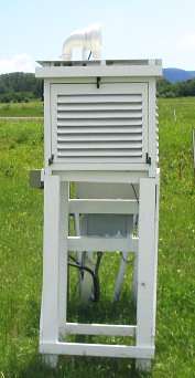 The
Stevenson screen was designed by Thomas Stevenson (1818-1887), a British
civil engineer, in order to more accurately measure air temperatures rather
than side effects like solar irradiation heating up the thermometers. To
reflect heat back, it is painted white, but better still would have been
reflective aluminium. It has louvered sides to let the air through but
not the sunlight. Once it became an accepted standard, the Stevenson Screen
is now spread all over the world. It now allows temperatures to be compared
wherever they are measured.
The
Stevenson screen was designed by Thomas Stevenson (1818-1887), a British
civil engineer, in order to more accurately measure air temperatures rather
than side effects like solar irradiation heating up the thermometers. To
reflect heat back, it is painted white, but better still would have been
reflective aluminium. It has louvered sides to let the air through but
not the sunlight. Once it became an accepted standard, the Stevenson Screen
is now spread all over the world. It now allows temperatures to be compared
wherever they are measured.
 In
a paper [1] scientists are reminded of the natural uncertainty (or inaccuracy)
in thermometer measurements, arising from reading errors, instrument errors,
time of day errors, poor location and weather short-term fluctuations.
It creates a band of almost 1 degree C around observations. In scientific
terms, it means that it cannot be said with certainty that the world has
warmed since 1880. Draw a horizontal line from just above 0 on left to
right and it will traverse through the grey envelope. In the words of the
authors:
In
a paper [1] scientists are reminded of the natural uncertainty (or inaccuracy)
in thermometer measurements, arising from reading errors, instrument errors,
time of day errors, poor location and weather short-term fluctuations.
It creates a band of almost 1 degree C around observations. In scientific
terms, it means that it cannot be said with certainty that the world has
warmed since 1880. Draw a horizontal line from just above 0 on left to
right and it will traverse through the grey envelope. In the words of the
authors:
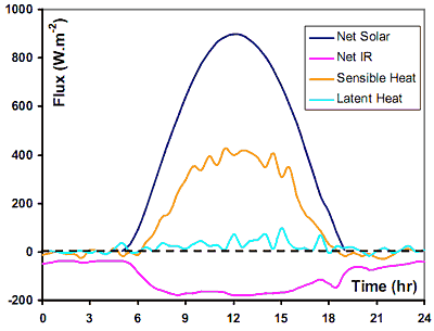
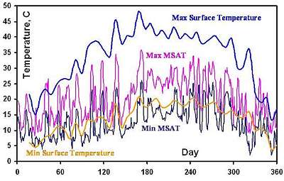 This
graph shows measured temperatures during a single year. MSAT means Meteorological
Surface Air Temperature, the temperature inside the Stevenson Screen. It
has two outomes, Min MSAT, the minimum temperature (black) and Max MSAT,
the maximum (magenta). The average between these is considered the surface
temperature for the global temperature datasets. But as you can see, it
does not represent the actual surface temperature, 1.5m lower, shown in
blue (Max) and yellow (Min). The average between these two is considerably
larger. [2] Also note that the Min MSAT follows the minimum surface temperature
and that Max MSAT comes close to the real average..
This
graph shows measured temperatures during a single year. MSAT means Meteorological
Surface Air Temperature, the temperature inside the Stevenson Screen. It
has two outomes, Min MSAT, the minimum temperature (black) and Max MSAT,
the maximum (magenta). The average between these is considered the surface
temperature for the global temperature datasets. But as you can see, it
does not represent the actual surface temperature, 1.5m lower, shown in
blue (Max) and yellow (Min). The average between these two is considerably
larger. [2] Also note that the Min MSAT follows the minimum surface temperature
and that Max MSAT comes close to the real average..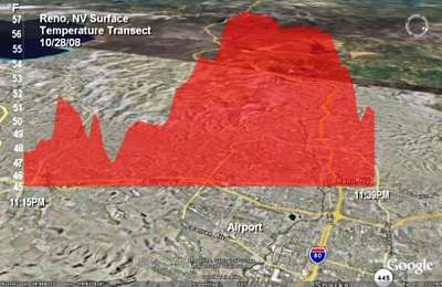 This
image (courtesy Anthony Watts) shows the urban heat island effect over
Reno California USA before midday. The temperature measured varies from
47-57ºF (by 5ºC). so the question is what is THE temperature
of Reno? Is it the average (51) or the minimum (47)? Clearly, the UHI
causes a formidable difference between cities and rural places and more
so with bigger cities. Its main problem lies in its unpredictability from
place to place and over time.
This
image (courtesy Anthony Watts) shows the urban heat island effect over
Reno California USA before midday. The temperature measured varies from
47-57ºF (by 5ºC). so the question is what is THE temperature
of Reno? Is it the average (51) or the minimum (47)? Clearly, the UHI
causes a formidable difference between cities and rural places and more
so with bigger cities. Its main problem lies in its unpredictability from
place to place and over time.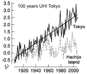 Tokyo
with its 18 million inhabitants and massive urbanisation and transport
systems, has a very significant UHI signature, as shown in this graph (from
Anthony Watts). It has increased by a massive 3ºC in the past century
and is still increasing further. By comparison nearby Hachijo island which
has also suffered some urbanisation, shows a modest temperature increase
of less than 0.5ºC in a century. Which of the two stations would you
exclude from a world temperature database? Guess what the people of Tokyo
are more interested in? Note also that temperature swings (a decadal cycle)
are larger at Hachijo, perhaps caused by swings in sea temperature.
Tokyo
with its 18 million inhabitants and massive urbanisation and transport
systems, has a very significant UHI signature, as shown in this graph (from
Anthony Watts). It has increased by a massive 3ºC in the past century
and is still increasing further. By comparison nearby Hachijo island which
has also suffered some urbanisation, shows a modest temperature increase
of less than 0.5ºC in a century. Which of the two stations would you
exclude from a world temperature database? Guess what the people of Tokyo
are more interested in? Note also that temperature swings (a decadal cycle)
are larger at Hachijo, perhaps caused by swings in sea temperature.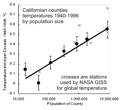 The
graph shown here was derived from 47 counties in California, averaging
their temperature trends for the period 1940-1996 and plotting them against
their population size. Rural stations on left and urban stations on right.
From the data points a straight line can be drawn which would cross the
zero temperature trend. Also shown on this graph are the six stations "X"
used by NASA GISS from which global averages are calculated. As can be
seen, five out of six are located where a significant Urban Heat Island
(UHI) effect is experienced, of about 0.6 degrees. Not shown is the historical
growth of these counties over the 56 years, but it is evident that much
of 'global warming' consists of the UHI. Many similar studies exist, all
consistently showing that UHI seriously pollutes the instrumental record.
The
graph shown here was derived from 47 counties in California, averaging
their temperature trends for the period 1940-1996 and plotting them against
their population size. Rural stations on left and urban stations on right.
From the data points a straight line can be drawn which would cross the
zero temperature trend. Also shown on this graph are the six stations "X"
used by NASA GISS from which global averages are calculated. As can be
seen, five out of six are located where a significant Urban Heat Island
(UHI) effect is experienced, of about 0.6 degrees. Not shown is the historical
growth of these counties over the 56 years, but it is evident that much
of 'global warming' consists of the UHI. Many similar studies exist, all
consistently showing that UHI seriously pollutes the instrumental record.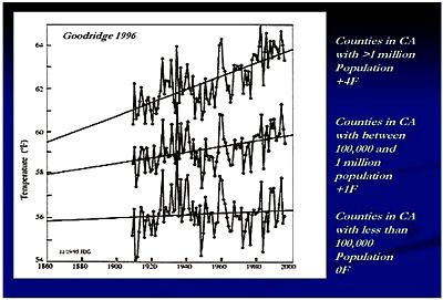 In
1996 Goodridge grouped Californian counties by population size and obtained
these three temperature curves for the 20th century, using standard temperature
datasets. Once more it showed that population density (UHI) is the main
contributor to 'warming'.
In
1996 Goodridge grouped Californian counties by population size and obtained
these three temperature curves for the 20th century, using standard temperature
datasets. Once more it showed that population density (UHI) is the main
contributor to 'warming'.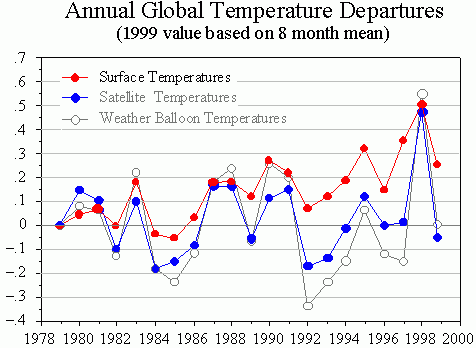 The
advantage of weather balloons is that they truly measure the air's temperature,
unaffected by Urban Heat Island effects. Satellite temperature measurement
also have this advantage, but cannot measure over a range of altitudes.
This graph compares the three methods over a period of 20 years. Note how
balloons and satellites agree, and how the surface temperatures show an
urban heat island effect of some +2 degrees. Not shown is how regular adjustments
aim to bring these measurements into agreement. For instance, the starting
point in this graph has been aligned this way, and perhaps 1998 as well.
The
advantage of weather balloons is that they truly measure the air's temperature,
unaffected by Urban Heat Island effects. Satellite temperature measurement
also have this advantage, but cannot measure over a range of altitudes.
This graph compares the three methods over a period of 20 years. Note how
balloons and satellites agree, and how the surface temperatures show an
urban heat island effect of some +2 degrees. Not shown is how regular adjustments
aim to bring these measurements into agreement. For instance, the starting
point in this graph has been aligned this way, and perhaps 1998 as well.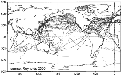 Ocean
surface temperatures have been measured by ships for several centuries.
First it was done by collecting surface water in a bucket while steaming
on, but later the engine's cooling water inlet was used. Unfortunately
this made a difference, because the water inlet is at some depth under
water. Today this may serve to advantage because satellite can measure
only the top few centimetres of the sea because infrared radiation is rapidly
absorbed by water. Because water continually evaporates from the sea, the
surface film is somewhat colder than a few metres down. This map from Reynolds
(2000) shows where the ships' tracks are, and that their measurements are
in no way representative of the entire oceans.
Ocean
surface temperatures have been measured by ships for several centuries.
First it was done by collecting surface water in a bucket while steaming
on, but later the engine's cooling water inlet was used. Unfortunately
this made a difference, because the water inlet is at some depth under
water. Today this may serve to advantage because satellite can measure
only the top few centimetres of the sea because infrared radiation is rapidly
absorbed by water. Because water continually evaporates from the sea, the
surface film is somewhat colder than a few metres down. This map from Reynolds
(2000) shows where the ships' tracks are, and that their measurements are
in no way representative of the entire oceans.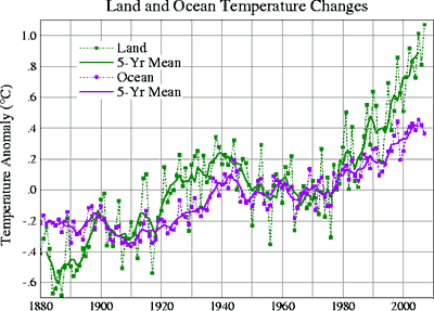 The
graph shows both land and ocean temperatures from thermometers, since 1880.
As can be seen, the land temperature rises more steeply than the sea temperature,
most likely caused by the Urban Heat Island effect. Even so, both follow
similar oscillations; a steep short decline followed by a long slow incline.
The sea warms by about 0.5 degrees per century whereas the land warms by
about 1.2 degrees per century. Compare this with the UHI effect of Tokyo
above. What is omitted from this graph is the steep decline before 1880.
The
graph shows both land and ocean temperatures from thermometers, since 1880.
As can be seen, the land temperature rises more steeply than the sea temperature,
most likely caused by the Urban Heat Island effect. Even so, both follow
similar oscillations; a steep short decline followed by a long slow incline.
The sea warms by about 0.5 degrees per century whereas the land warms by
about 1.2 degrees per century. Compare this with the UHI effect of Tokyo
above. What is omitted from this graph is the steep decline before 1880.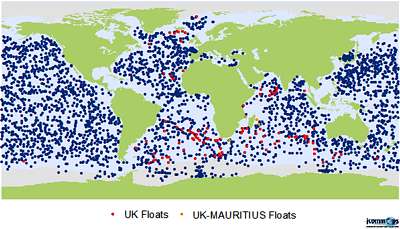 Since
the year 2000, and benefiting from technological advancement, an aggressive
programme was begun to measure the oceans entirely, with tide gauge stations,
moored buoys, drifters and ships of opportunity. The ARGOS satellite system
circles Earth to collect the data, while the AOML has responsibility for
the logistics of drifter deployment and quality control of the resulting
data [1]. The map shows the locations of ARGOS drifters from the USA (blue)
and UK (red/orange). Of course their positions change daily.
Since
the year 2000, and benefiting from technological advancement, an aggressive
programme was begun to measure the oceans entirely, with tide gauge stations,
moored buoys, drifters and ships of opportunity. The ARGOS satellite system
circles Earth to collect the data, while the AOML has responsibility for
the logistics of drifter deployment and quality control of the resulting
data [1]. The map shows the locations of ARGOS drifters from the USA (blue)
and UK (red/orange). Of course their positions change daily.
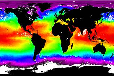 Since
satellites began to be used for measuring environmental variables (GOES),
both land and sea temperatures have been measured with good accuracy. The
map here shows average ocean temperatures for a given year. It is important
to remember that this represents only the very thin surface of the oceans.
Since
satellites began to be used for measuring environmental variables (GOES),
both land and sea temperatures have been measured with good accuracy. The
map here shows average ocean temperatures for a given year. It is important
to remember that this represents only the very thin surface of the oceans.
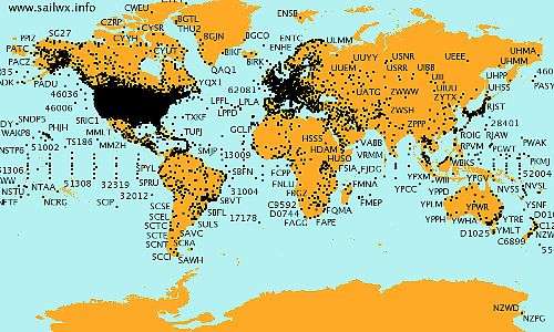
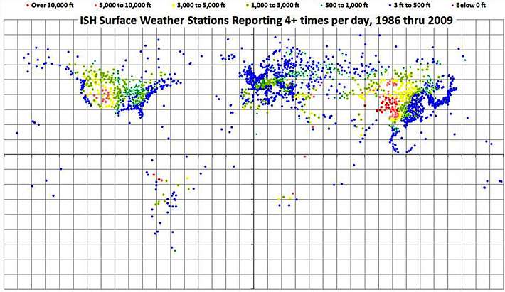
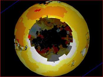
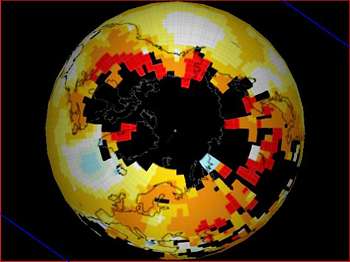
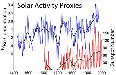 This
figure shows two different proxies of solar activity during the last several
hundred years. In red is shown the Group Sunspot Number (Rg) as reconstructed
from historical observations by Hoyt and Schatten (1998a, 1998b). In blue
is shown the beryllium-10 concentration (10E4 atoms/(gram of ice)) as measured
in an annually layered ice core from Dye-3, Greenland (Beer et al. 1994).
Beryllium-10 is a cosmogenic isotope created in the atmosphere by
galactic cosmic rays. Because the flux of such cosmic rays is affected
by the intensity of the interplanetary magnetic field carried by the solar
wind, the rate at which Beryllium-10 is created reflects changes in solar
activity. A more active sun results in lower beryllium concentrations (note
inverted scale on the blue plot). Note that the sun's variability is much
more than suggested by the satellite record (the solar constant).
This
figure shows two different proxies of solar activity during the last several
hundred years. In red is shown the Group Sunspot Number (Rg) as reconstructed
from historical observations by Hoyt and Schatten (1998a, 1998b). In blue
is shown the beryllium-10 concentration (10E4 atoms/(gram of ice)) as measured
in an annually layered ice core from Dye-3, Greenland (Beer et al. 1994).
Beryllium-10 is a cosmogenic isotope created in the atmosphere by
galactic cosmic rays. Because the flux of such cosmic rays is affected
by the intensity of the interplanetary magnetic field carried by the solar
wind, the rate at which Beryllium-10 is created reflects changes in solar
activity. A more active sun results in lower beryllium concentrations (note
inverted scale on the blue plot). Note that the sun's variability is much
more than suggested by the satellite record (the solar constant).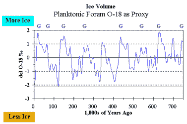 Oxygen-18
or 18O has two extra neutrons instead of the usual 8 (10n+8p).
It is a mysterious element that occurs in concentrations of around 0.2%
and is stable (not radioactive). Practical measurements have shown that
it correlates with temperature: higher concentrations mean lower temperatures,
but the why and how eludes somewhat. The graph shows 18-O variations in
foraminifers which are usually found on sea bottoms in the shallow coastal
zone.
Oxygen-18
or 18O has two extra neutrons instead of the usual 8 (10n+8p).
It is a mysterious element that occurs in concentrations of around 0.2%
and is stable (not radioactive). Practical measurements have shown that
it correlates with temperature: higher concentrations mean lower temperatures,
but the why and how eludes somewhat. The graph shows 18-O variations in
foraminifers which are usually found on sea bottoms in the shallow coastal
zone.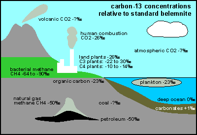 Carbon-13
is a natural stable isotope of carbon and has one extra neutron (7n + 6p).
It makes up about 1.1% of all natural carbon on Earth. Whereas isotopes
are normally detected by mass spectroscopy, carbon-13 can sensitively be
detected with Nuclear-Magnetic Resonance (NMR). It is also a mysterious
isotope that is preferentially avoided by plants. Thus wherever 13-C is
used, there is less of it. C-13 is always measured against a world standard
called PeeBee Belemnite or similar. Belemnite is a calcium-rich deposit
from the soft internal shells of ancient belemnite inkfish, with a delta-13-C
agreed to be the zero base.
Carbon-13
is a natural stable isotope of carbon and has one extra neutron (7n + 6p).
It makes up about 1.1% of all natural carbon on Earth. Whereas isotopes
are normally detected by mass spectroscopy, carbon-13 can sensitively be
detected with Nuclear-Magnetic Resonance (NMR). It is also a mysterious
isotope that is preferentially avoided by plants. Thus wherever 13-C is
used, there is less of it. C-13 is always measured against a world standard
called PeeBee Belemnite or similar. Belemnite is a calcium-rich deposit
from the soft internal shells of ancient belemnite inkfish, with a delta-13-C
agreed to be the zero base.
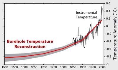 This
graph from Globalwarming Art (after Huang & Pollack, 1998) shows a
borehole temperature reconstruction (showing 1ºC warming), aligned
with the trace from the instrumental record from Brohan et al. 2006, (which
shows the most warming of all instrumental records, watch out!). The graph
goes back some 500 years, but the further back in time (depth), the bigger
the error rate and the flatter the curve, as also details disappear. The
basis for borehole temperature measurements stems from the fact that rock
is a very poor temperature conductor, but eventually, over time, a small
temperature change will happen deeper down.
This
graph from Globalwarming Art (after Huang & Pollack, 1998) shows a
borehole temperature reconstruction (showing 1ºC warming), aligned
with the trace from the instrumental record from Brohan et al. 2006, (which
shows the most warming of all instrumental records, watch out!). The graph
goes back some 500 years, but the further back in time (depth), the bigger
the error rate and the flatter the curve, as also details disappear. The
basis for borehole temperature measurements stems from the fact that rock
is a very poor temperature conductor, but eventually, over time, a small
temperature change will happen deeper down. 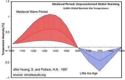 The
year before (1997) the same authors (Huang & Pollack) produced a radically
different graph, from the same 6000 boreholes and this one showed the Little
Ice Age and the Medieval Warm Period earlier on. The 1998 publication selected
358 boreholes out of the qualifying set of 6000. What made the authors
change their minds? The hockey stick was published in 1998. Co-incidence?
Peer pressure? Fraud?
The
year before (1997) the same authors (Huang & Pollack) produced a radically
different graph, from the same 6000 boreholes and this one showed the Little
Ice Age and the Medieval Warm Period earlier on. The 1998 publication selected
358 boreholes out of the qualifying set of 6000. What made the authors
change their minds? The hockey stick was published in 1998. Co-incidence?
Peer pressure? Fraud? Strengths
and weaknesses:
Strengths
and weaknesses:
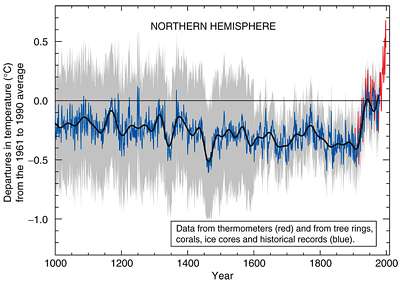 The
infamous hockey stick graph produced by Mann, Bradley & Hughes (98),
and used by the IPCC in their Third Assessment Report as the 'smoking
gun' of Global Warming, has been criticised and rebutted scientifically:
The
infamous hockey stick graph produced by Mann, Bradley & Hughes (98),
and used by the IPCC in their Third Assessment Report as the 'smoking
gun' of Global Warming, has been criticised and rebutted scientifically:
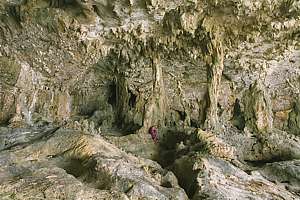 (Photo
of a sea cave in Niue. Can you see the person in the middle?)Dripstones
or stalagtites (hanging down) and stalagmites (growing upward
from below) form where ground water drips from a ceiling.
(Photo
of a sea cave in Niue. Can you see the person in the middle?)Dripstones
or stalagtites (hanging down) and stalagmites (growing upward
from below) form where ground water drips from a ceiling.
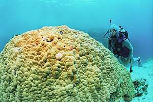 Corals
are animal polyps that live in clear sun-lit waters in symbiosis with plant
cells within their skins. They build extensive coral skeletons that join
up to make coral reefs. The individual hard corals are joined up by crustose
calcareous algae which are technically red sea weeds that also build limestone
skeletons. As coral reefs grow, they incorporate a chemical history of
the atmosphere, but their mass is too chaotic.
Corals
are animal polyps that live in clear sun-lit waters in symbiosis with plant
cells within their skins. They build extensive coral skeletons that join
up to make coral reefs. The individual hard corals are joined up by crustose
calcareous algae which are technically red sea weeds that also build limestone
skeletons. As coral reefs grow, they incorporate a chemical history of
the atmosphere, but their mass is too chaotic.
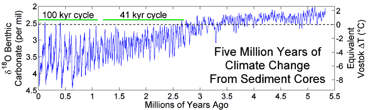
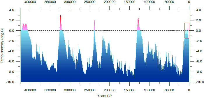
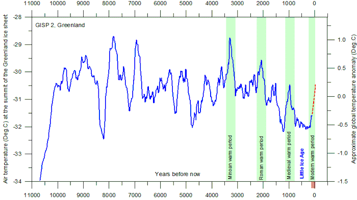
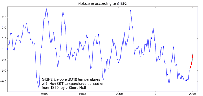
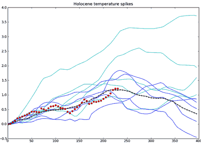 A
most interesting analysis was done by J Storrs Hall (
A
most interesting analysis was done by J Storrs Hall ( Average global
temperature has little meaning without viewing it in perspective, which
is what Australian wine maker Erland Happ did from publicly available NCEP
data [1]. As a wine maker he noticed that Australia has been cooling rather
than warming, and he set out on a quest to understand what the story is.
He divided the world into three zones, the arctic where hardly anyone lives
(blue zone), the northern hemisphere where most of the world lives (green
zone), and the southern hemisphere down to where no more people are found
(red zone). His results are shown in the three panels below.
Average global
temperature has little meaning without viewing it in perspective, which
is what Australian wine maker Erland Happ did from publicly available NCEP
data [1]. As a wine maker he noticed that Australia has been cooling rather
than warming, and he set out on a quest to understand what the story is.
He divided the world into three zones, the arctic where hardly anyone lives
(blue zone), the northern hemisphere where most of the world lives (green
zone), and the southern hemisphere down to where no more people are found
(red zone). His results are shown in the three panels below.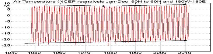
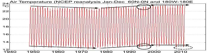
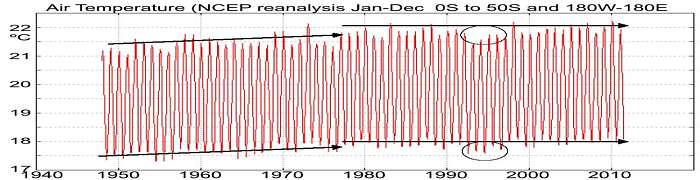
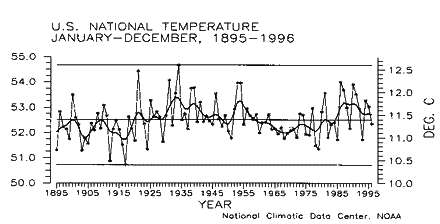 The
graph here shows average temperature over the USA from 1895 to 1996, spanning
a whole century. Even though it includes urban thermometers, it shows no
appreciable rise in temperature. The 1960-1970s were cooler whereas the
1930-1940s were warmer. Unanimously, rural records [1] have shown no significant
rise in temperatures. Please note that this is a very important scientific
test of the AGW hypothesis, since any exception to the hypothesis
(global + warming) disproves it. We may ask ourselves why the scientific
method has been abandoned when it comes to global warming.
The
graph here shows average temperature over the USA from 1895 to 1996, spanning
a whole century. Even though it includes urban thermometers, it shows no
appreciable rise in temperature. The 1960-1970s were cooler whereas the
1930-1940s were warmer. Unanimously, rural records [1] have shown no significant
rise in temperatures. Please note that this is a very important scientific
test of the AGW hypothesis, since any exception to the hypothesis
(global + warming) disproves it. We may ask ourselves why the scientific
method has been abandoned when it comes to global warming.
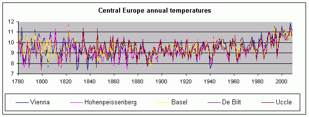
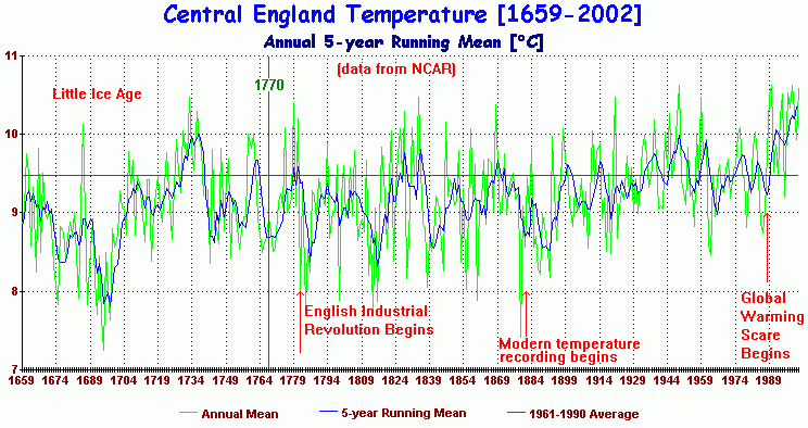
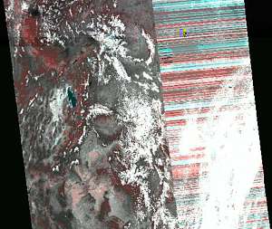 Where
'global warming' is involved, it has become common practice not to report
instrument failures, particularly where such faults produce lower temperature
readings. The satellite that first ignited the fury is NOAA-16. But as
we have since learned there are now five key satellites that have become
either degraded or seriously compromised, resulting in ridiculous temperature
readings. Even though the Indian government was long ago onto these faults,
researcher Devendra Singh tried and failed to draw attention to the increasing
problems with the satellite as early as 2004 but his paper remained largely
ignored outside of his native homeland. For at least five years and perhaps
longer, NOAA National Climatic Data Centre (NCDC) has been hushing up the
faults in their satellites [1], which is a cardinal sin for any scientist
or scientific institute. The picture shows how the path scanned, failed
to reproduce the landscape below, resulting in an erroneous stripy pattern,
now known as 'barcode'. The data was automatically fed into climate
records. This scandal places the entire satellite record in doubt [2],
and the use the IPCC made of it.
Where
'global warming' is involved, it has become common practice not to report
instrument failures, particularly where such faults produce lower temperature
readings. The satellite that first ignited the fury is NOAA-16. But as
we have since learned there are now five key satellites that have become
either degraded or seriously compromised, resulting in ridiculous temperature
readings. Even though the Indian government was long ago onto these faults,
researcher Devendra Singh tried and failed to draw attention to the increasing
problems with the satellite as early as 2004 but his paper remained largely
ignored outside of his native homeland. For at least five years and perhaps
longer, NOAA National Climatic Data Centre (NCDC) has been hushing up the
faults in their satellites [1], which is a cardinal sin for any scientist
or scientific institute. The picture shows how the path scanned, failed
to reproduce the landscape below, resulting in an erroneous stripy pattern,
now known as 'barcode'. The data was automatically fed into climate
records. This scandal places the entire satellite record in doubt [2],
and the use the IPCC made of it.
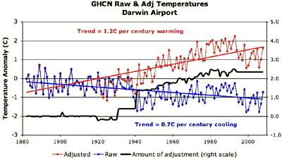 The
graph shows temperatures and their adjustments in Darwin (a smallish town
in NW Australia). The blue curve is actual temperature which suffered a
drop in 1940, thought to be 'unusual', but happening again around 1987.
The average trend of the raw data (blue) shows 0.7 degrees cooling per
century. After undocumented adjustments (black curve), the red curve was
arrived at, showing warming of 1.2 degrees per century. This is a very
blatant case of cooking the temperature, and many such cases have
been documented from all over the world. For more information, visit
The
graph shows temperatures and their adjustments in Darwin (a smallish town
in NW Australia). The blue curve is actual temperature which suffered a
drop in 1940, thought to be 'unusual', but happening again around 1987.
The average trend of the raw data (blue) shows 0.7 degrees cooling per
century. After undocumented adjustments (black curve), the red curve was
arrived at, showing warming of 1.2 degrees per century. This is a very
blatant case of cooking the temperature, and many such cases have
been documented from all over the world. For more information, visit 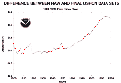 Steven
Goddard discovered that all US temperatures have been gradually adjusted
upward
by a whopping 0.5ºF without appropriate documentation. The reasoning
behind this adjustment was entirely arbitrary: "many sites were relocated
from city locations to airports and from roof tops to grassy areas. This
often resulted in cooler readings than were observed at the previous sites."
The graph shows the difference between what the thermometers read (RAW
data), and the temperatures corrected by the USHCN. One would have expected
that adjustments canceled one another out as thermometers are relocated.
Could one call this fraud?
Steven
Goddard discovered that all US temperatures have been gradually adjusted
upward
by a whopping 0.5ºF without appropriate documentation. The reasoning
behind this adjustment was entirely arbitrary: "many sites were relocated
from city locations to airports and from roof tops to grassy areas. This
often resulted in cooler readings than were observed at the previous sites."
The graph shows the difference between what the thermometers read (RAW
data), and the temperatures corrected by the USHCN. One would have expected
that adjustments canceled one another out as thermometers are relocated.
Could one call this fraud?
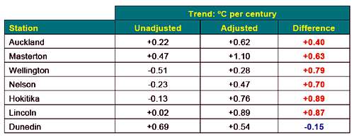 This
table is from the 7 important temperature stations of New Zealand, showing
raw and adjusted trends. Averaging the unadjusted trends arrives at +0.08ºC
per century, but after adjustment, the trend becomes +0.59ºC per century.
The New Zealand temperature database is managed and kept by NIWA who have
not been able to explain the adjustments, since the culprit, Jim Salinger
left. For more details see
This
table is from the 7 important temperature stations of New Zealand, showing
raw and adjusted trends. Averaging the unadjusted trends arrives at +0.08ºC
per century, but after adjustment, the trend becomes +0.59ºC per century.
The New Zealand temperature database is managed and kept by NIWA who have
not been able to explain the adjustments, since the culprit, Jim Salinger
left. For more details see 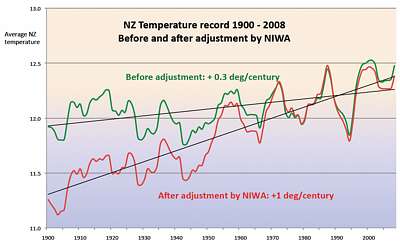 The
graph shown here of unadjusted (green) and adjusted (red) temperatures
shows the degree of fraud involved.One cannot believe that there are other
scientists willing to defend this fraud.
The
graph shown here of unadjusted (green) and adjusted (red) temperatures
shows the degree of fraud involved.One cannot believe that there are other
scientists willing to defend this fraud.
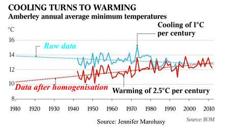 The
BOM was caught red-handed in "homogenising" Australia's temperature data,
always resulting in cooling the past while warming the present (red graph).
But Australian biologistJennifer Marohasy[1]
collected actual temperatures which reveal a different story (blue graph).
The
BOM was caught red-handed in "homogenising" Australia's temperature data,
always resulting in cooling the past while warming the present (red graph).
But Australian biologistJennifer Marohasy[1]
collected actual temperatures which reveal a different story (blue graph).
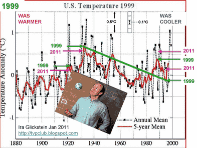
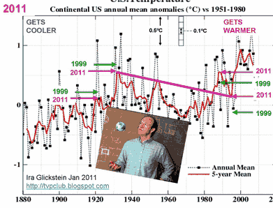
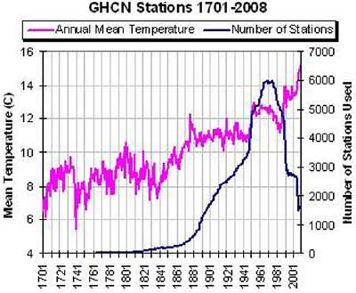 This
graph shows annual mean temperature (magenta) and the number of thermometers
taking part (dark blue). Thermometers were sparse before the Industrial
Revolution (1850) but gradually rose in numbers, mainly in industrialised
nations (Northern Hemisphere). After 1980 most were deselected in favour
of automated thermometers. Note how temperatures jumped, first when thermometer
numbers jumped up, and again when they dropped down.
This
graph shows annual mean temperature (magenta) and the number of thermometers
taking part (dark blue). Thermometers were sparse before the Industrial
Revolution (1850) but gradually rose in numbers, mainly in industrialised
nations (Northern Hemisphere). After 1980 most were deselected in favour
of automated thermometers. Note how temperatures jumped, first when thermometer
numbers jumped up, and again when they dropped down.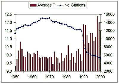 Here
is a detailed view of average temperature and thermometer numbers after
1950. Note how average temperature suddenly began to look like a hockey
stick. How did they do this? Mainly by promoting thermometers from warm
places and demoting those from cold places ( higher altitudes and remote
rural places).
Here
is a detailed view of average temperature and thermometer numbers after
1950. Note how average temperature suddenly began to look like a hockey
stick. How did they do this? Mainly by promoting thermometers from warm
places and demoting those from cold places ( higher altitudes and remote
rural places).
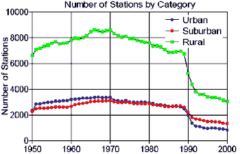
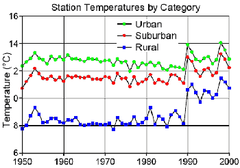
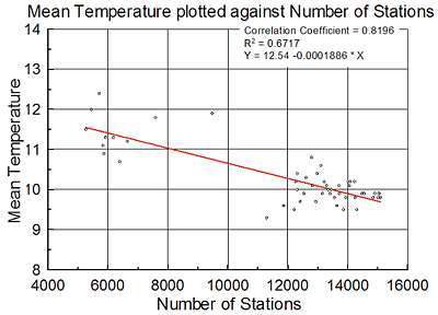
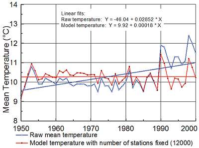
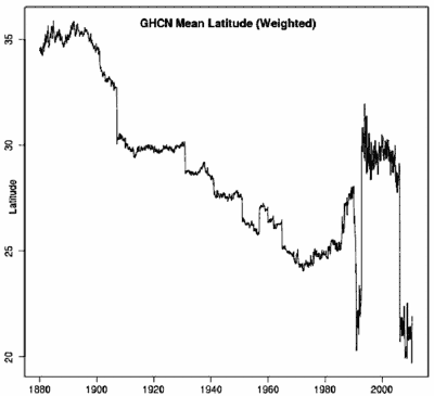 This
diagram from [2] above shows how over time, more warmer stations were selected.
Horizontal is time, over one century, and vertical average latitude, the
distance to the equator. The curve represents the average latitude of the
temperature stations used for calculating the world's temperature. One
century ago, their average latitude was 35 degrees, but gradually over
time, it changed to 20 degrees, with some inexplicable swings inbetween,
as more southern stations were included and northern stations dropped off.
Thus by design or by accident, more and more warmer thermometer stations
were used and/or less and less those from colder places. The result gives
substantial over-all warming.
This
diagram from [2] above shows how over time, more warmer stations were selected.
Horizontal is time, over one century, and vertical average latitude, the
distance to the equator. The curve represents the average latitude of the
temperature stations used for calculating the world's temperature. One
century ago, their average latitude was 35 degrees, but gradually over
time, it changed to 20 degrees, with some inexplicable swings inbetween,
as more southern stations were included and northern stations dropped off.
Thus by design or by accident, more and more warmer thermometer stations
were used and/or less and less those from colder places. The result gives
substantial over-all warming.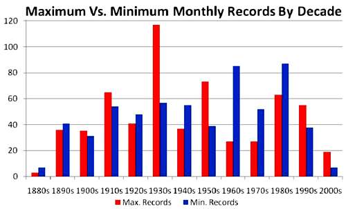 This
graph shows that the minimum and maximum temperature readings went out
of lock-step. Before 1920 their numbers were roughly equal, the maxes sometimes
outnumbering the mins. But since 1930 things went wrong, and the minimum
temperatures outnumbering the maximums, and since 1980 the maxes are in
the majority again, and since 2000 vastly outnumbering the mins, at a time
that the globe has been cooling. As a result the past was artificially
cooled as the present was artificially warmed. Thus the average
temperature has been doctored to fit the AGW hypothesis.
This
graph shows that the minimum and maximum temperature readings went out
of lock-step. Before 1920 their numbers were roughly equal, the maxes sometimes
outnumbering the mins. But since 1930 things went wrong, and the minimum
temperatures outnumbering the maximums, and since 1980 the maxes are in
the majority again, and since 2000 vastly outnumbering the mins, at a time
that the globe has been cooling. As a result the past was artificially
cooled as the present was artificially warmed. Thus the average
temperature has been doctored to fit the AGW hypothesis.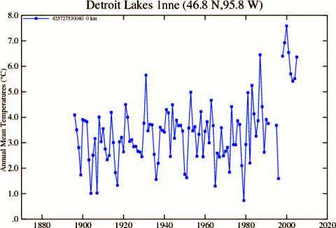 In
the year 2000, a most curious and massive jump occurred in the temperature
data held by NASA, affecting 48 states in the USA. It was not detected
by the data keepers but by an attentive outsider, Steve McIntyre. The IPCC
was over the moon with this sudden demonstration of catastrophic warming,
but when it was exposed as a year-2000 bug in the programs, the correction
was quietly made and hushed up. No longer was 1998 the warmest year on
record, as was trumpeted around the world. The important lesson is that
outsiders are needed to keep a watchful eye on all intended and unintended
data corruptions. Important to note is also that keeping temperature data
is not just a question of storing, but that there are massive computer
programs at work massaging and adjusting this data, which then becomes
'available' to the public as 'raw' data. What these programs do, has not
been documented and made public. It may take decades before the mess has
been sorted out - if it ever will.
In
the year 2000, a most curious and massive jump occurred in the temperature
data held by NASA, affecting 48 states in the USA. It was not detected
by the data keepers but by an attentive outsider, Steve McIntyre. The IPCC
was over the moon with this sudden demonstration of catastrophic warming,
but when it was exposed as a year-2000 bug in the programs, the correction
was quietly made and hushed up. No longer was 1998 the warmest year on
record, as was trumpeted around the world. The important lesson is that
outsiders are needed to keep a watchful eye on all intended and unintended
data corruptions. Important to note is also that keeping temperature data
is not just a question of storing, but that there are massive computer
programs at work massaging and adjusting this data, which then becomes
'available' to the public as 'raw' data. What these programs do, has not
been documented and made public. It may take decades before the mess has
been sorted out - if it ever will.